
Submitted:
03 July 2025
Posted:
03 July 2025
You are already at the latest version
Abstract
Interstitial lung diseases (ILD) significantly impact health and mortality, affecting mil-lions of individuals worldwide. During the COVID-19 pandemic, lung ultrasonography (LUS) became an indispensable diagnostic and management tool for lung disorders. However, utilising LUS to diagnose ILD requires significant expertise. This research aims to develop an automated and efficient approach for diagnosing ILD from LUS videos us-ing AI to support clinicians in their diagnostic procedures. We developed a binary classi-fier based on a state-of-the-art CSwin Transformer to discriminate between LUS videos from healthy and non-healthy patients. We used a multi-centric dataset from the Royal Melbourne Hospital (Australia) and the ULTRa Lab at the University of Trento (Italy) comprising 60 LUS videos. Each video corresponds to a single patient, comprising 30 healthy individuals and 30 patients with ILD, with frame counts ranging from 96 to 300 per video. Each video is annotated using the corresponding medical report as ground truth. The datasets used for training the model underwent selective frame filtering, in-cluding reduction of frame numbers to eliminate potentially misleading frames in non-healthy videos. This step was crucial because some ILD videos included segments of normal frames, which could be mixed with the pathological features and mislead the model. To address this, we eliminated frames with a healthy appearance, such as frames without B-lines, thereby ensuring that training focused on diagnostically relevant features. The trained model was assessed on an unseen, separate dataset of 12 videos (3 healthy and 9 ILD) with frame counts ranging from 96 to 300 per video. The model achieved an average classification accuracy of 91%, calculated as the mean of three testing methods: Random Sampling (92%), Key Featuring (92%), and Chunk Averaging (89%). In RS, 32 frames were randomly selected from each of the 12 videos, resulting in a classification with 92% accuracy, with specificity, precision, recall, and F1-score of 100%, 100%, 90%, and 95%, respectively. Similarly, KF, which involved manually selecting 32 key frames based on representative frames from each of the 12 videos, achieved 92% accuracy with specificity, precision, recall, and F1-score of 100%, 100%, 90%, and 95%, respectively. In contrast, the CA method, where the 12 videos were divided into video segments (chunks) of 32 consecutive frames, with 82 video segments, achieved an 89% classification accuracy (73 out of 82 video segments). Among the 9 misclassified segments in the CA method, 6 were false positives and 3 were false negatives, corresponding to an 11% misclassification rate. The accuracy differences observed between the three training scenarios were con-firmed to be statistically significant via inferential analysis. A one-way ANOVA conduct-ed on the 10-fold cross-validation accuracies yielded a large F-statistic of 2,135.67 and a small p-value of 6.7 × 10⁻²⁶, indicating highly significant differences in model perfor-mance. The proposed approach is a valid solution to fully automate LUS disease detec-tion, aligning with clinical diagnostic practices integrating dynamic LUS videos. In con-clusion, introducing the selective frame filtering technique to refine the dataset training reduced the effort required for labelling.
Keywords:
interstitial lung diseases
; interstitial syndrome
; B-lines
; lung ultrasound
; deep learning
; AI
; transformer
1. Introduction
Interstitial lung disease (ILD) is a severe pulmonary complication of connective tissue disease that can lead to significant morbidity and mortality [1]. ILD has a significant impact on health and mortality. According to the Global Burden of Disease data, approximately 4.7 million people worldwide were living with ILD in 2019 [2]. The prevalence of ILD has been on the rise over the past decades, with global estimates varying from 6 to 71 cases per 100,000 people. The impact of ILD extends beyond the disease itself, as patients often require ongoing treatments such as medications, oxygen supplementation, and frequent clinical follow-ups, which can place a burden on healthcare systems through increased resource consumption [2].
Sonographic Interstitial Syndrome (SIS) is a term used to describe the main manifestation of ILD, characterised by vertical lines extending from the lung interface. SIS is a major diagnostic sign of ILD and represents one of the most significant visual artefacts seen on lung ultrasound (LUS) images (3–5). SIS, also known as B-lines [5], comet tails [6], lung rockets [7], or light beams [8], is, in essence, a set of hyperechoic vertical lines that arise from the pleural line and extend to the bottom of the LUS image [9,10]. However, B-Lines are not exclusively a pathological finding because they can sometimes be observed in healthy individuals under certain conditions, particularly in elderly patients [11]. In such cases, isolated B-lines may appear in small numbers, symmetrically distributed, and confined to specific lung zones. This pattern contrasts with pathological B-lines, which are typically numerous, asymmetrical, and diffusely spread across multiple lung regions. Recognising these qualitative distinctions is essential for avoiding misdiagnosis when interpreting lung ultrasound scans. One of the biggest challenges in expanding the use of LUS is the steep learning curve; it takes considerable training and experience to accurately perform and interpret LUS videos [12]. This presents a major barrier to access, particularly in healthcare settings where trained professionals are scarce.
Several studies have utilised AI to enhance the robustness of the classifications and to learn more distinctive features from input LUS frames [13,14]. Some have shown the potential to classify COVID-19 patients from healthy patients, while others have explored AI tools’ capabilities in the automated detection of B-lines associated with conditions like pulmonary oedema and pneumonia (15–24). All these studies focused on frame-level analysis. Using frame-based data to train AI algorithms requires extensive clinician annotation efforts. Indeed, manual annotation of the data, particularly frame-by-frame labelling, is laborious and time-consuming, particularly due to the extensive number of frames that require labelling by clinicians. Beyond the logistical burden, relying solely on individual frames also poses a conceptual limitation: it may fail to capture temporal dynamics critical for accurate diagnosis. Unlike frame-based Deep Learning (DL) models that only examine static images, clinicians typically rely on the entire LUS video to examine lung conditions. They consider the dynamic changes, such as the movement and appearance of B-lines, and temporal changes, such as the texture, intensity, or spread of B-lines over the videos. These aspects provide contextual information for an accurate diagnosis.
Recent advances in AI have enabled real-time interpretation in ultrasound imaging, particularly where lightweight models are essential for deployment in remote or point-of-care (POC) settings. This advancement in AI models enables ultrasound video interpretation within noticeably short timeframes. Several studies reported high inference speeds for video interpretation—typically reported between 16 and 90 frames per second (FPS), depending on the chosen architecture and available computational resources (25–30). These studies have successfully demonstrated the feasibility of real-time AI implementation in multiple US applications, such as tumour segmentation, plaque detection, and cardiac assessments, where timely and accurate interpretation is critical for clinical decision-making. Therefore, exploring similar real-time AI tools for LUS is a promising yet insufficiently explored area of research, considering that clinical diagnostic decisions in LUS are based not on static frames like chest x-rays but on the temporal relationships between consecutive frames, such as the presence or absence of B-lines and evolving artefact patterns within LUS frames. These dynamic features require an AI tool that can process real-time videos holistically rather than relying solely on frame-by-frame analysis.
To date, only a single study has focused on using AI to classify entire LUS videos: Khan et al. [31] introduced an efficient method for LUS video scoring, focused in particular on COVID-19 patients. Using intensity projection techniques, their approach compresses entire LUS videos into a single image. The compressed images enable automatic classification to assess the patient’s condition, eliminating the need for frame-by-frame analysis and allowing for effective scoring without the need for frame-by-frame analysis. A convolutional neural network (CNN) based on the ResNet-18 architecture, the ImageNet-pretrained model, is then used to classify this compressed image, with the predicted score assigned to the entire video. This method reduces computational overhead and minimises error propagation from individual frame analysis while maintaining a high classification accuracy.
In contrast, our study employs a video-based training method, where a CSwin transformer is trained on a dataset of LUS videos [32]. This method involves utilising a transformer model to capture dynamic changes and feature progression across LUS frames, enabling it to learn how patterns, such as the movement or spread of B-lines, evolve throughout an LUS video rather than examining individual frames in isolation. Initially developed for natural language processing, CSwin transformer algorithms are DL neural networks that can also analyse temporal connections among images, such as in video classifications (33–36). Video-based training, instead, involves assigning a label to an entire video based on its content, allowing the model to classify whether a given video represents a healthy or unhealthy score. This work’s novelty lies in using the CSwin Transformer, for the first time in the context of LUS with advanced data filtering techniques before training. By carefully selecting the most relevant frames in an LUS video dataset, the model can better focus on distinguishing features between classes, healthy and non-healthy videos, and avoid being influenced by irrelevant frames containing features unrelated to the target classifications. This approach improves the model’s performance by focusing on the most relevant frames and lowers computational demands.
2. Materials and Methods
2.1. Datasets
The LUS datasets used in this study were fully anonymised. They were contributed by the Royal Melbourne Hospital (Melbourne, Australia) and the Ultrasound Laboratory Trento (ULTRa) at the University of Trento (Trento, Italy). The Melbourne Health Human Research Ethics Committee (HREC/18/MH/269) granted ethical approval for the Melbourne dataset. For the ULTRa dataset, ethical approvals were granted by the Ethical Committee of the Fondazione Policlinico Universitario Agostino Gemelli, Istituto di Ricovero e Cura a Carattere Scientifico (protocol 0015884/20 ID 3117) and the Fondazione Policlinico Universitario San Matteo (protocol 20200063198) and registered with the National Library of Medicine (NCT04322487).
The datasets, collected from multiple centres, included 225 patients, amounting to a total of 2,859 LUS videos. After reviewing the datasets, 60 unidentified videos/patients were included, and 12 videos/patients were reserved from the entire dataset for testing as an ‘unseen’ set. The dataset used for training and validation consisted of 60 LUS videos, of which 30 were from healthy patients and 30 from non-healthy patients, each video containing between 96 and 300 frames. A detailed distribution and splitting of the dataset are shown in Figure 1.
Each LUS video was labelled as either healthy or non-healthy (thus labelled IS), using corresponding medical reports based on clinical criteria adapted from internationally recognised, evidence-based guidelines for point-of-care ultrasound [5], summarised in Figure 2. Each video was independently validated by a LUS expert (MS), a senior staff member at the Queensland University of Technology with approximately 15 years of clinical experience as a sonographer. While pre-existing annotations from corresponding medical reports were available, MS systematically reviewed the videos to identify features characteristic of healthy lung tissue or IS, ensuring accuracy and consistency beyond the initial annotations.
Only LUS scans from the lower lung zones were included in this study, as these regions are widely recognised as the most sensitive for detecting early IS involvement. This selection is supported by Watanabe et al. [37], who highlighted the diagnostic value of assessing the basal lung regions in patients with connective tissue disease-associated ILD. Additionally, it was observed that different anatomical lung regions exhibited distinct sonographic features, even among patients with the same class label. For example, posterior-lower zones (e.g., RPL, LPL) commonly reveal confluent B-lines in patients with IS. In contrast, anterior regions (e.g., RANT, LANT) often display healthy features with sparser B-lines (1-2 B-lines) or A-line patterns, particularly in early disease presentations. Notably, LUS features of interstitial syndrome (IS) most commonly appeared in the lower regions. This highlights the value of focusing on specific, diagnostically relevant areas during training. Including multiple lung regions with varying or inconsistent features can introduce noise and confuse the model. As a result, 153 LUS videos, out of 225, were excluded because they did not meet the anatomical or diagnostic criteria.
2.2. Filtering Techniques
In this study, we considered 3 training scenarios, each using a different number of frames per video, as demonstrated in Figure 3. In Scenario 1 (S1), the first 96 consecutive LUS frames of each video were included, while in Scenario 2 (S2), only the first 32 consecutive LUS frames were included for both healthy and non-healthy datasets. In contrast, in Scenario 3 (S3), 32 frames that exhibited the key features indicative of IS (presence of B-lines in the non-healthy dataset) were selected. These frames were not necessarily consecutive and were selected from different parts of the video. In the healthy dataset, 32 frames were randomly selected using a simple Python code, ensuring a representative sample from across the video without focusing on visual features. Reducing frame counts aimed to eliminate potentially misleading frames in non-healthy videos. For example, in the video illustrated in Figure 3, out of a 120-frame video, 70 frames (highlighted in orange) show the liver organ, 14 frames show B-lines mixed with the liver appearance, and the last portion consists of 14 frames showing only B-lines. In this example, we selected the frames that showed the B-lines features, specifically from the last portion of the video where the disease features are most clear. We avoided using frames where the liver dominated or B-lines were mixed with liver tissue, as they may carry misleading frames that could influence model performance.
2.3. Dataset Splitting
In Scenarios 1, 2, and 3, a dataset of 72 videos—each representing one patient—was split into training, validation, and testing (unseen) sets, as shown in Figure 3 and Table 1. Approximately 77% of the videos (i.e., 56 videos) were randomly assigned to the training set, ≈6% (i.e., 4 videos) to the validation set, and the remaining ≈17% (i.e., 12 videos) to the testing set. Figure 3 shows an example of a dataset clip where different frame selection techniques were applied across the three experimental scenarios.
To improve the model’s robustness, we used 10-fold cross-validation. In each fold, 56 out of the 72 videos/patients were used for training, with a different set of 4 videos/patients (2 healthy and 2 non-healthy) set aside for validation. Over the 10 folds, 40 videos/patients were used for validation at least once, but not all 60 videos were included in validation since only 4 videos were utilised in each fold. Across the 10 folds, a total of 40 videos were included in validation at least once. Figure 4 provides details on how the data was divided for video-based training and validation in each fold.
2.4. DL Implementation
A binary classifier based on the CSwin Transformer was fine-tuned to classify LUS videos, with [1,0] representing healthy patients and [0,1] representing non-healthy patients (IS) (see Figure 5). The architecture used in this study is derived from the research conducted by Chen et al. in 2022 [38]. The training and validation datasets were pre-processed and rescaled, ensuring that proper image and volume scaling were applied before training. The original LUS dataset was provided in DICOM series and MP4 format. The MP4 files were first converted to DICOM (Digital Imaging and Communications in Medicine) format. All DICOM files then went through pre-processing steps and finally converted to Pickle format for the model training. A simple Python script was used to categorise the DICOM videos into two binary classes based on the ground truth labels corresponding to the medical reports: [1, 0] and [0, 1], healthy and non-healthy, respectively. Using binary formats [1, 0] and [0, 1] as one-hot encodings provide simplicity when computing evaluation metrics such as accuracy, precision, and confusion matrices. Each prediction from the model can be directly compared to the target one-hot label, where [1, 0] represents class 0 (healthy) and [0, 1] represents class 1 (non-healthy). Labelling the classes helps eliminate ambiguity when interpreting SoftMax outputs, which produce continuous probability values (e.g., 0.91) rather than discrete labels (e.g., 1). For instance, a model output of [0.91, 0.09] reflects a 91% confidence in the “healthy” class and 9% in the “non-healthy” class. All the DICOM videos were processed using the Pydicom library, resampling frames at a resolution of 288 × 288 × 32 or 288 × 288 × 96, depending on the frame number used in each scenario. A normalisation method achieved a single intensity value within the dataset. First, the 3D volume was reduced to a 2D array for scaling. Then, pixel data from all volumes were combined to set a uniform scaling factor and normalise each volume/video. Each video represented labels in binary form [1, 0] and [0, 1] for healthy and non-healthy cases, respectively. A visualisation pipeline was used to verify LUS videos and their crop labels, including frame-by-frame inspection, in order to ensure accurate labelling.
The model was trained using the Adam optimiser, with a learning rate of 0.0001. The training was performed on a Linux system using two NVIDIA TITAN RTX GPUs, each with 24GB VRAM, driver version 535.129.03, and CUDA 12.2. The model was trained with a batch size of 1 across 500 epochs. Each fold required approximately 2 hours, and with 10 folds, the total training time amounted to approximately 20 hours. The performance metrics were reordered and analysed using the TensorBoardX library, resulting in real-time visualisation of loss and accuracy across both training and validation stages.
For each scenario (S1, S2, and S3), the mean validation accuracy from 10 folds was aggregated for comparison at an inferential statistical level. One-way analysis of variance (ANOVA) was then applied to examine whether any significant differences between the three situations at a statistical level were present. In addition, post-hoc pairwise comparisons were used, utilising Tukey’s Honest Significant Difference (HSD) to explore differences in model performance. In addition, Cohen’s d-effect size was computed for each comparison to evaluate the improvements within each scenario. All statistical calculations were performed using the SciPy [39] and statsmodels libraries [40] in Python.
2.5. Training Loss Across Scenarios
This study used the cross-entropy loss as the primary loss function to assess our model’s performance in a multi-class classification setting. The cross-entropy loss function evaluates the difference between the predicted probability distribution for each class and the ground class labels.
The cross-entropy loss is calculated as follows:
A binary classifier was used to represent the healthy and non-healthy patients (1, 0) and (0, 1), respectively. For instance, consider a healthy patient represented by the label (1, 0). If the model predicts probabilities close to (0.9, 0.1), indicating 90% confidence that the patient is healthy, the cross-entropy loss will be low because the prediction closely aligns with the ground-truth label. The loss for this prediction is calculated as:
In contrast, if the model predicts (0.3, 0.7) probabilities for the same healthy patient, the loss will be higher. In this case, the model is only 30% confident that the patient is healthy, which diverges from the actual label. The cross-entropy loss for this prediction is:
2.6. Testing Methods
We assessed the performance of the trained model using 12 unseen cases (3 healthy and 9 IS), with varying numbers of frames ranging from 96 to 300 in each video. The imbalanced dataset was due to the limited availability of healthy cases. Non-healthy cases are typically much higher in a clinical setting since data collection protocols often focus on non-healthy cases. We applied three different testing approaches to thoroughly evaluate the model’s generalisation to unseen data (as shown in Figure 6).
The first approach was based on Random Sampling (RS), as shown in Figure 6 (orange), which involved randomly selecting a subset of frames from each video for testing. It evaluated how well the model generalised when encountering random frames from unseen datasets, providing insight into the model’s ability to handle data variability, especially when key feature frames (such as B-lines) were not present in all frames in a video or were mixed with other frames that were not representatives of the class.
The second approach was Key Featuring (KF), as shown in Figure 6 (blue). This approach focused on the most relevant representative frames for classification that contain B-lines featured, a key feature of IS, to evaluate the model’s performance when dealing with the most informative frames in a video.
The last approach was Chunk Averaging (CA), as shown in Figure 6 (green). In this approach, each video was divided into video segments, with a classification made for each chunk as an individual video segment to produce a classification. This approach assessed the model’s consistency across consecutive frames and provided a more robust evaluation, particularly useful when the LUS video contained variability between non-healthy and healthy frames.
3. Results
3.1. Performance Across Scenarios: Training Phase
Figure 7 shows the average performance of the model over 500 epochs for each scenario, with shaded regions representing the standard deviation across the 10 folds. Performance variations across the different scenarios are noticeable, particularly emphasising how the filtering method affects the model’s outcomes.
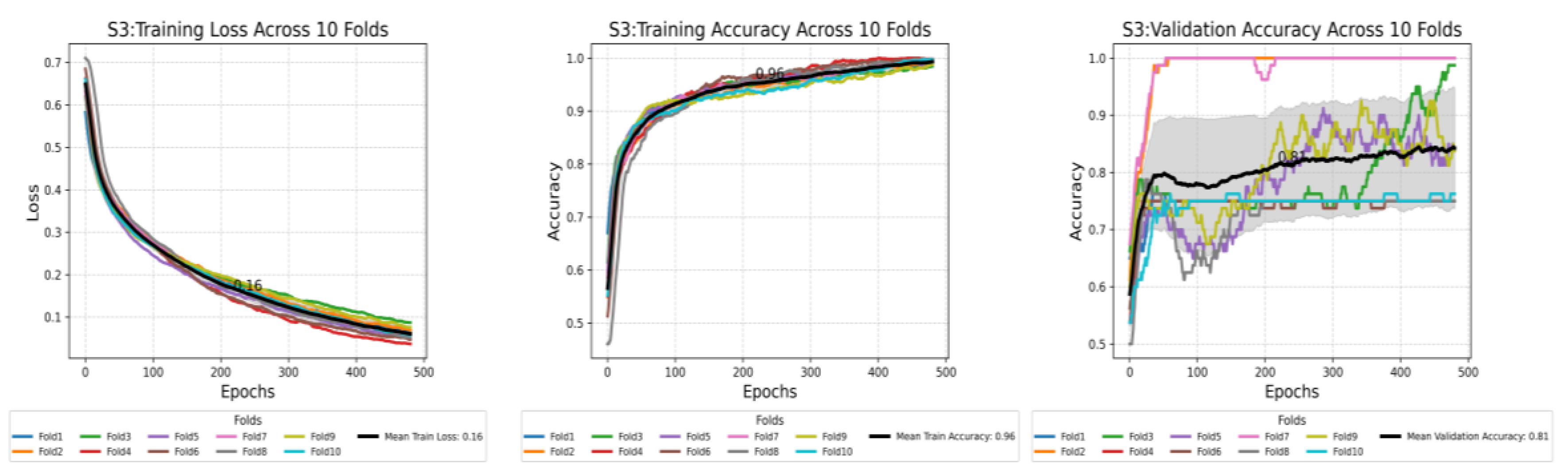
Training loss decreased across all scenarios but at varying rates. The best median training loss in the epochs was observed in S3 (0.16), indicating the training stability and efficiency. S2 (0.33) demonstrated a reasonable reduction in loss, while S1 (0.63) exhibited the highest loss, suggesting the slowest learning, leading to lower training stability and efficiency (see Figure 7a).
Training accuracy increased linearly in all scenarios. It was optimal in S3 (0.96) with excellent learning performance. Medium performance was found in S2 (0.87), whereas the worst performance was found in S1 (0.57), with poor learning performance (see Figure 7b).
Validation accuracy varied significantly between the scenarios. S3 (0.81) achieved the highest and most consistent validation accuracy, showing the best generalisation on the validation data. S2 (0.72) displayed a slight reduction in generalisation, while S1 (0.57) exhibited the lowest accuracy and increased variability, indicating poor generalisation stability (see Figure 7c).
The results show that S3 is the most valuable, with high training and validation accuracy, suggesting that the data filtering in this scenario provided the best output from the CSwin Transformer model. Scenarios 1 and 2 performed significantly worse, with a higher training loss and lower accuracy in training and validation. This indicates that including the first consecutive frames for training in these scenarios is unsuitable for model training and generalisation. Details for the training performance for all cross-10 folds for all scenarios are provided in Figure 8.
Additionally, the accuracy differences between the three scenarios are consistent with the results of inferential statistical analysis. One-way ANOVA of mean accuracies for 10-fold cross-validation established the model performance across the three scenarios to be significantly different, as indicated by an F-statistic of 2,135.67 and a p-value of 6.7 × 10⁻²⁶ (p < 0.001). This result supports the fact that at least one of the scenarios is significantly different from the others, thus requiring further additional pairwise comparisons using Tukey’s HSD and effect size estimation (Cohen’s d). Figure 8 and Table 2 summarise the mean validation accuracies, 95% confidence intervals, and the results of all pairwise comparisons between scenarios.
3.2. Performance Across Scenarios: Testing Phase
The model’s overall performance is assessed across the three training scenarios, where 32 LUS frames were randomly sampled (RS) from the LUS videos for testing. As shown in Figure 9, in S1, the DL model correctly classified only 1 healthy video, while 3 were misclassified as IS. For the IS class, 6 videos were correctly classified, with 2 videos incorrectly flagged as healthy. This scenario showed inferior performance, particularly with a high error rate in classifying healthy videos, correctly identifying only 33% (1 out of 3). In S2, the model correctly classified 2 healthy videos, with only 1 misclassified as IS. The model demonstrated outstanding performance for the IS videos, correctly classifying all videos without any misclassifications. This scenario showed better performance in classifying IS videos with high accuracy (9 out of 9 videos = 100%) and in classifying healthy videos with good accuracy (2 out of 3 videos = 67%). In S3, similarly to S2, the model classified 2 healthy videos, with 1 misclassified video as IS. The IS class was again classified perfectly, with all videos correctly classified (100%). This scenario showed better performance in classifying IS with high accuracy (9 out of 9 videos = 100%) and in classifying healthy videos with good accuracy (2 out of 3 videos = 67%). In general, as shown by the radar chart in Table 3 and Figure 10, the performance of the model for all scenarios increased as the number of frames went down during training, and using a selective frame method (S3) produced the highest classification outcome in S2 and S3 (92%). More detailed results for other testing methods, KF and CA, are provided in Appendices A, B, and C, respectively. These results offer a comparison of the model’s accuracy in each scenario.
In S1, the first 96 frames from each video were included in the training without filtering applied, while in S2, only the first 32 frames were used. In S3, a selective set of 32 frames was included in each video, using a filtering technique that excluded frames from IS videos that show no B-line features.
3.3. Detailed Performance of Scenario 3 (S3)
S3 shows superior performance across the evaluated metrics. This section provides in-depth testing using RS, KF, and CA (detailed in the 2.6 Testing Methods section). Figure 11 shows the confusion matrices for S3 using RS, KF, and CA. RS and KF methods showed high classification accuracy, each achieving 92%. The DL model used in both methods correctly classified 2 out of 3 healthy videos and all 9 IS videos. On the other hand, the CA method, which splits LUS videos into smaller video segments of 32 frames each, with a total of 82 video segments, achieved an overall accuracy of ~89%. The model correctly classified 15 healthy segments (~71%), while 6 healthy segments (~29%) were misclassified as IS. Of 61 total video segments, 58 (~95%) were correctly classified for IS segments, while only 3 (~5%) were misclassified as healthy. This resulted in a slightly lower accuracy compared to the other methods. Detailed performance results for Scenarios 1 and 2 are provided in Appendix B and Appendix C, respectively.
Following the performance of the DL model using different testing methods, it is critical to explore the confidence scores by the model’s classifications across various testing methods. The confidence score provides insights into this model’s performance and decision-making process. The heatmap in Figure 12 shows that KF maintains high confidence values, usually close to 1, indicating high confidence in the model classification. On the contrary, the RS method is more scattered, with a remarkable drop into low confidence, especially in healthy videos 1 and 3, 0.54 and 0.52, respectively, and in non-healthy video 8 with a confidence value of 0.54, which shows a high degree of uncertainty against those classifications.
For the CA method, the confidence level overall remained high, but there were some misclassifications. Particularly, among Non-healthy videos 4, 6, and 8, partial misclassifications can be seen by yellow markers in the heatmaps, where the model falsely flagged some video segments for those videos. Additionally, Healthy video 1 was partially misclassified (marked in orange), while Healthy video 2 was entirely misclassified, with all its segments incorrectly categorised (marked in black).
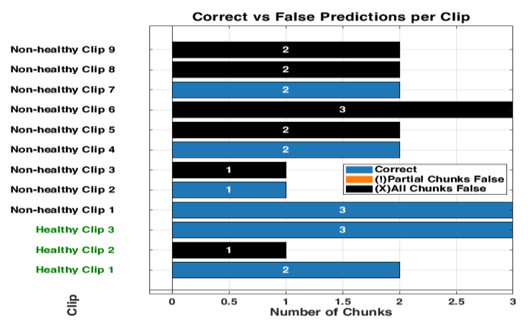
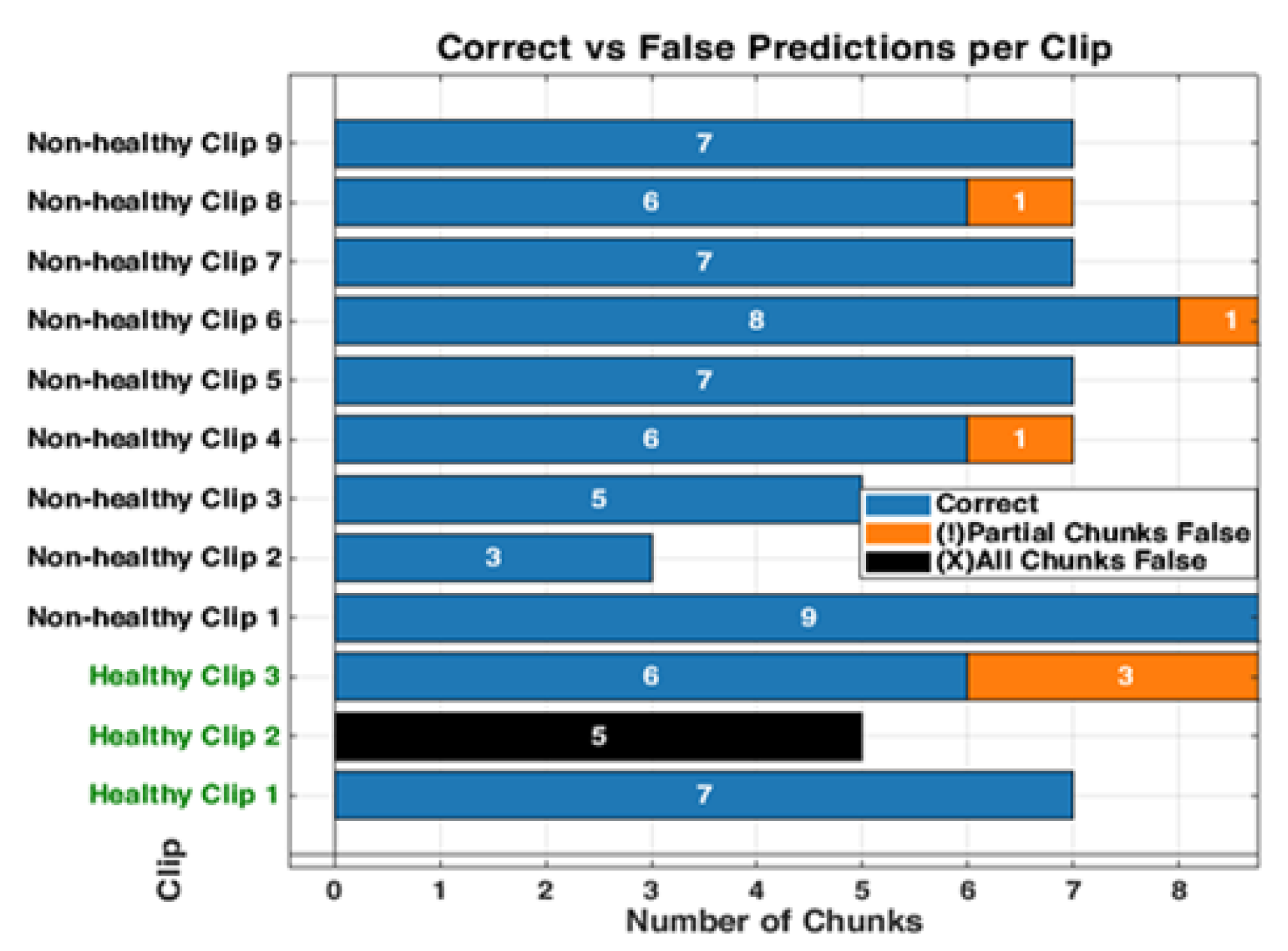
At the chunk level, Figure 13 visualises the model’s classifications for each chunk across 12 videos. The overall classification accuracy was approximately 89% (73 out of 82 segments correctly classified). The model demonstrated limited performance for the healthy videos (videos 1–3) and correctly classified only two of the three videos. Healthy videos 1 and 3, consisting of 7 and 9 chunks, respectively, were predominantly or fully classified correctly. In contrast, Healthy Video 2, comprising 5 chunks, was misclassified (in black, Figure 13).
Meanwhile, the model performance was more variable in non-healthy videos. Non-healthy videos 4, 6, and 8 had partial misclassifications, where one chunk each was erroneously classified, as shown in orange (Figure 13). The remaining non-healthy videos were classified entirely correctly, and the chunks were all correctly classified. Notably, no entirely wrong chunks (black) were displayed across any videos. This would suggest that the model performed well even in more challenging cases, where videos were segmented into chunks.
The misclassifications (in orange and black, Figure 13) were confined to individual chunks within healthy videos 1 and 2 and non-healthy videos 4 and 8. Figure 14 shows the model’s misclassifications for these videos, with representative frames: examples (a) and (b) correspond to Non-healthy videos 8 and 4, respectively. In contrast, example (c) represents an example frame of Healthy video 2. These examples in Figure 14 show how the model partially misclassified certain chunks despite correctly identifying most others within the same video. For instance, video 8 (Figure 14a) contained B-lines—a diagnostic feature of interstitial syndrome (IS)—yet one chunk was incorrectly classified. In video 4 (Figure 14b), the model misclassified a chunk showing an empty or non-diagnostic video segment. For the healthy cases, video 2 (Figure 13c) was the only video in which the model showed a complete misclassification, with all five chunks incorrectly classified as (IS). This represents the single case of full misclassification across the entire test set. More detailed results for other scenarios (S1 and S2) can be found in Appendices B and D, respectively. These results compare the model’s accuracy, misclassifications, and confidence levels in each scenario.
3.4. Inference Time per Video (Real-Time Detection)
The developed model achieved an average inference time of 0.87 seconds for the ultrasound segment (32 frames per segment) using dual NVIDIA TITAN RTX GPUs (24 GB each). The model was further evaluated by testing it on 9 video segments, each consisting of 32 frames, extracted from a single ultrasound case, resulting in 288 frames. The total inference time for processing all 9 segments was approximately 7.83 seconds. CPU inference was also assessed to evaluate deployment feasibility in a resource-constrained setting. The inferencing was conducted on a system with an Intel Core i7 processor (4.0 GHz, 4 cores) and 16 GB of RAM. On this setup, the model demonstrated an average inference time of approximately 7.8 seconds per 32-frame segment, equating to a throughput of approximately 4 FPS, with a total inference time for all 9 segments (288 frames) of approximately 70.2 seconds. More details can be found in Figure 15.
4. Discussion
The findings in this study highlight the effectiveness of selective frame filtering in improving model performance via video-based training with the CSwin Transformer, as demonstrated in Scenario 3 (S3). The experimental training performed in S3 features the significance of our approach in selecting frames within videos prior to the training process, as it can significantly influence the model’s performance and result in apparent differences across all performance metrics when compared to Scenario 1 (S1) and Scenario 2 (S2). The statistical result verifies that the frame filtering implemented in S3 drastically improves the model’s ILD classification accuracy. The ANOVA analysis (p < 0.001) proves the presence of differences, and Tukey’s HSD shows that all pairwise comparisons between the three scenarios are statistically significant. Furthermore, Cohen’s d values exceeding 8 highlight substantial effect sizes. When considering the confidence intervals, Scenario 3 had the highest mean accuracy (0.808), suggesting it delivered the strongest performance overall.
Overall, this work highlights the effectiveness of filtering frames from each LUS video applied prior to training, leading to high classification performance in Scenario 3. The improved performance of the model in this scenario can be attributed to the removal of misleading frames, driving the model to focus on those that prominently feature key diagnostic frames, such as B-lines. This technique allowed the model to distinguish between healthy and non-healthy videos accurately. The misclassifications observed within all testing methods show the model’s nuanced performance. Within non-healthy videos, for instance, video 8 (Figure 14a) shows key diagnostic features—specifically B-lines—where the model correctly classified most of the chunks, although some errors still occurred. This implies that while the model can identify important markers of IS, it could encounter challenges when processing chunks containing only a few frames with diagnostic features visible (B-lines). The misclassification in video 3 (Figure 14b) presents an interesting case. Although the chunk was classified as healthy, the frames were empty or contained non-diagnostic content. This outcome can be interpreted positively, demonstrating the model’s sensitivity to non-diagnostic content within the LUS video. Though the model erroneously flagged this case as a negative, its ability to correctly classify non-diagnostic chunks shows its strong spatial reasoning in each small chunk. This indicates that the model does not overlook any LUS video segments but instead scans each segment in a small portion of frames to make context-aware classification. The model’s ability to correctly label empty or featureless frames as healthy demonstrates that the model has learned to associate the absence of diagnostic features with a healthy class label. This highlights the model’s capability to rely on the presence of diagnostic markers for accurate decision-making.
For the healthy videos, classification accuracy demonstrated inconsistent performance, as detailed in Section 3.3. Although videos 1 and 3 were mostly classified correctly across all three testing methods (RS, KF, and CA), video 2 was completely misclassified. This may be attributed to the short lines resembling B-lines, as illustrated in Figure 14c. In the normal lung, horizontal reverberation artefacts are called A-lines. However, under suboptimal conditions—such as poor probe angling or inadequate proper skin contact—A-lines can interact with the pleural interface, producing vertical lines known as Z-lines. These vertical lines, presenting as low-intensity and poorly defined, originate from the pleural line and may resemble B-lines [41,42]. This misclassification shows the model’s susceptibility to vertical artefacts that mimic true B-lines and reveals a diagnostic limitation in distinguishing pathological features from normal ones. One plausible reason for this limitation could be that the training dataset does not include enough examples of healthy example frames, especially those with normal features like Z-lines.
Compared to existing literature, which primarily used a frame-based DL model [13,14], this research emphasises the advantages of a video-based approach that accounts for the temporal relationships between LUS frames. As frame-based models often lose critical dynamic information across an entire LUS video, the video-based model in this study captures temporal variations from LUS frames for accurate diagnosis. Although prior research has applied AI to classify individual LUS frames, the classification of entire LUS videos has not been widely explored. In only a single study, the use of a method to compress a video into a single-image representation sacrifices the temporal depth that may be necessary for thorough diagnostic analysis [31]. In contrast, our AI model captures these temporal variations to improve accuracy and address a gap in video-based LUS classification, demonstrating how selective filtering techniques enhance model performance. This work addresses this gap and demonstrates how selective filtering of LUS frames improves the performance of the video-based model.
Additionally, the developed model shows practical viability for real-time inferencing, achieving an average latency time of 0.87 seconds per segment, 32 frames each (approximately 37 FPS), which exceeds the threshold for real-time clinical deployment (25–30). In this context, real-time inferencing means that the model can process video at a rate equal to or faster than the ultrasound machine’s frame acquisition (30 FPS ), thereby enabling medical experts to receive immediate diagnostic feedback during scanning. This level of performance not only validates the model’s suitability for point-of-care (POC) use but also highlights its potential for integration into mobile computing platforms. It can be valuable in remote and emergency settings with limited computational resources and time.
Despite the promising results noted in this study, the dataset used was relatively small, particularly for healthy videos in the testing phase. This reflects the nature of data collection in clinical settings where non-healthy cases are more commonly recorded. In addition to the challenges of dataset size, an important consideration is the inherent complexity of LUS acquisition. The captured LUS videos may contain portions representing healthy and non-healthy regions, as seen in the testing videos in Figure 14b. As the sonographer performs the acquisition, based on their hands-on experience and the patient’s status, they may be able to capture key diagnostic features within the LUS video. They may include a mix of diagnostic and non-diagnostic frames. Therefore, LUS acquisition, while convenient and portable, can introduce variability in the quality and consistency of the captured frames within LUS videos. The quality of the captured LUS videos can be influenced by both the patient’s status and the sonographer’s expertise. Depending on these factors, the captured video might include a mix of representative diagnostic and non-diagnostic or non-representative frames within the LUS video. Including all the captured videos can impact the model’s performance and cause ambiguity during training, as evident in Scenario 1 (S1), where raw LUS videos contain a mix of representative and non-representative frames (96 frames). In Scenario 2 (S2), a small number of frames from 32 without applying any filtering were used. However, this approach did not address the presence of non-informative or irrelevant content, as within the 32 frames, a mix of representative diagnostic and non-diagnostic or non-representative frames may be present. Therefore, the filtering technique was implemented during training to address the variability in LUS videos in S3, where it minimised the number of frames from 96 to 32. Applying the filtering technique in S3, where the representative portions of the ultrasound videos are only included, allows the model to focus on relevant features, such as B-lines in pathological cases, contributing to improved performance during evaluation.
Another limitation of this work is that the model developed in Scenario 3 (S3) was trained using a fixed-length sequence input of 32 frames per LUS video, and it is constrained to work only on videos as inputs of the same length during inference. This limit may impact the model’s ability to generalise to LUS videos with varying frame lengths, potentially limiting adaptability. Therefore, inputs of LUS video exceeding 32 frames require being segmented into multiple chunks (video segments). Future research could investigate the adaptation of LUS videos with variable sequence lengths to handle videos of different durations. Future work could also explore training AI lightweight classifiers for the frame selection process, which could speed up the workflow and improve the model’s accuracy. Furthermore, assessing the model with even larger datasets will be a more rigorous test of generalizability for the model. It will also be interesting to verify whether similar improvements in the performance of this approach can be replicated for other LUS disease classifications beyond IS.
5. Conclusions
This study explored the use of a video-based DL approach with the CSwin Transformer model to classify LUS videos, focusing on improving accuracy through selective frame filtering. The results show that filtering techniques, especially in Scenario 3, significantly enhanced the model’s performance by removing irrelevant frames and concentrating on key diagnostic features like B-lines. The proposed approach is a valid solution to improve fully automated IS detection in LUS videos, which aligns with clinical methods that leverage dynamic and static data for diagnostic purposes. This work shows the potential of selective frame filtering in combination with DL video models for improving the diagnostic performance of LUS. This approach increases the performance of diagnostic tools based on AI. It allows them to be more integrated into practice in real clinical settings where data quality and patient status often vary. Future studies need to address this approach’s refinement or even extend the diagnosis to other pulmonary conditions apart from IS.
Author Contributions
KM, the main co-author, wrote the main manuscript and conducted the model training, validation, and testing. MA, DF, and JD provided critical revisions and approved the last version of the manuscript. MS and CE were responsible for clinical image validation and revisions. DC and LD contributed to data collection and clinical discussion.
Funding
Not applicable
Institutional Review Board Statement
Not applicable
Informed Consent Statement
Not applicable
Data Availability Statement
The datasets used in the study are not publicly available due to [institutional policies, however, are available from the corresponding author upon reasonable request. Acknowledgments: The authors would like to express their sincere gratitude to the Royal Melbourne Hospital (Australia) and the ULTRa Lab at the University of Trento (Italy) for granting access to the dataset used in this work.
Conflicts of Interest
The authors declare no conflicts of interest.
Appendix A
Figure A1.
S1: Training Loss and Accuracy (1st and 2nd plots from the left): The training loss plot showed variability across the folds, stabilizing around 0.63, while the mean training accuracy reached approximately 0.57, indicating the correct prediction rate. Validation Accuracy (last plot from the left): The plot shows considerable fluctuation, with a mean value of around 0.57, suggesting limited generalization to the validation data.
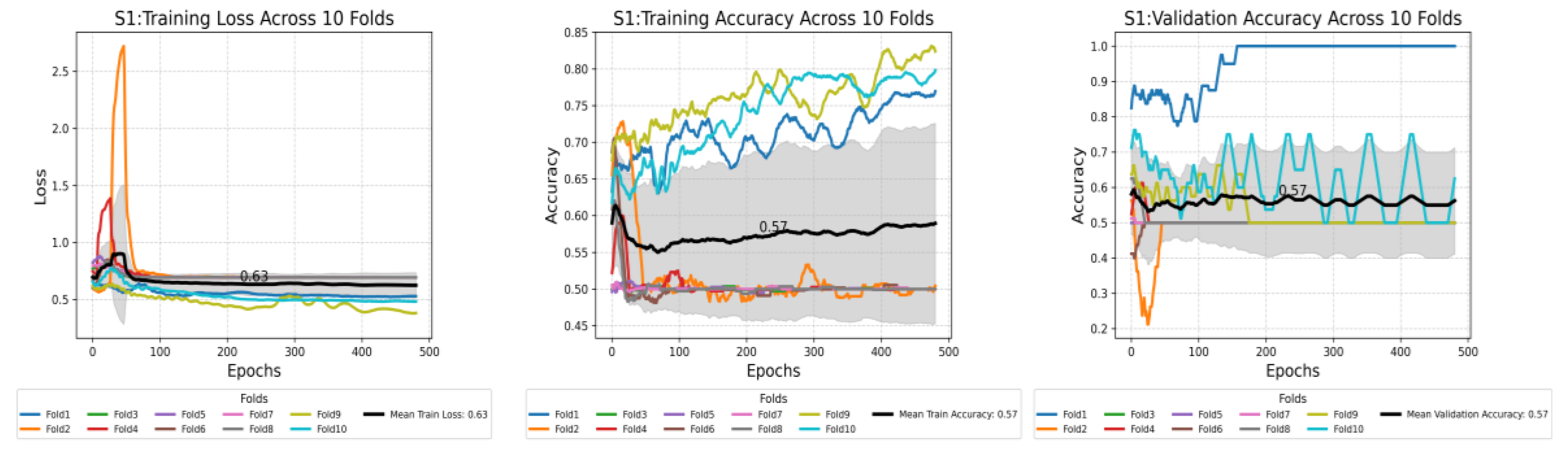
Figure A2.
S2: Training Loss and Accuracy (1st and 2nd plots from the left): The training loss plot showed variability across the folds, stabilizing around 0.33, while the mean training accuracy reached approximately 0.87, reflecting a high proportion of correct classifications. Validation Accuracy (last plot from the left): the plot was more stable than S1, with a mean value of around 0.72, suggesting good generalization to the validation dataset.
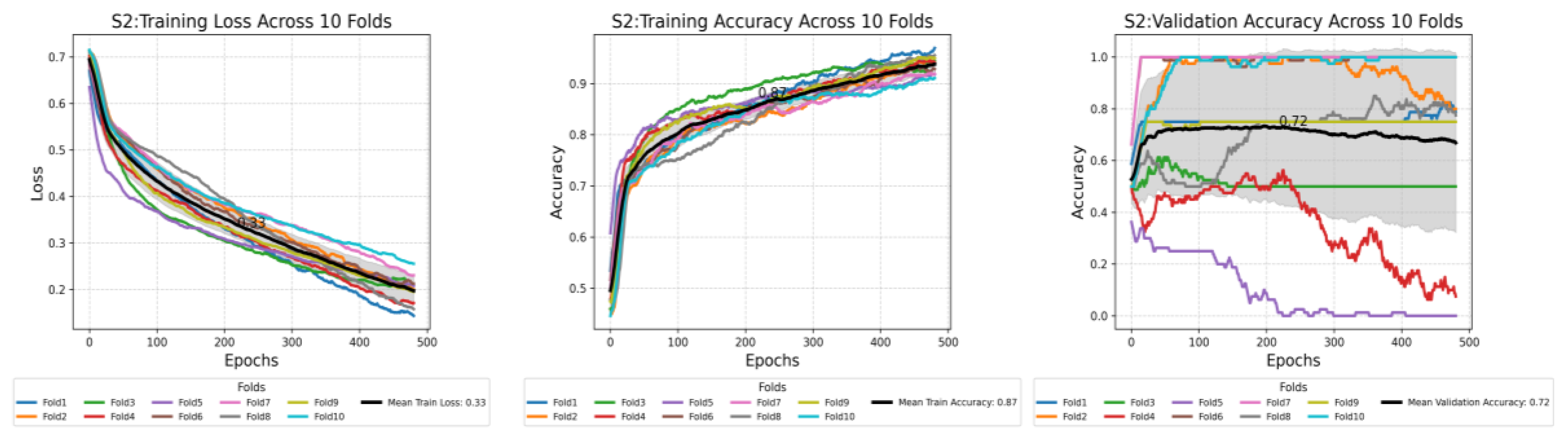
Figure A3.
S3: Training Loss and Accuracy (1st and 2nd plots from the left): The training loss plot shows variability across the folds, stabilizing around 0.33, while the mean training accuracy reached approximately 0.96, reflecting a high proportion of correct classifications. Validation Accuracy (last plot from the left): the plot was more stable than S2, with a mean value of around 0.81, suggesting the best generalization to the validation dataset.
Appendix B
Figure A4.
Confusion matrices comparing three methods of testing for Scenario 1. The matrices illustrate the classification performance between “Healthy” and “IS” classes using three different testing methods: Randomly Sampled Frames (left), Key Featuring Selected Frames (middle), and Chunk Averaged Frames (right). Randomly Sampled Frames: The model correctly classified 1 healthy clip and misclassified 5 as IS. It correctly classified 4 Is clips, while 2 were misclassified as healthy. Key Featuring Selected Frames: In this method, 1 healthy clip was classified correctly, with 4 misclassified as IS. For IS, 5 were classified correctly, and 2 were misclassified as healthy. Chunk Averaged Frames: This approach resulted in 5 correct classifications for healthy clips and 10 misclassifications as IS. For IS, 8 were correctly classified, and 1 was misclassified as healthy.
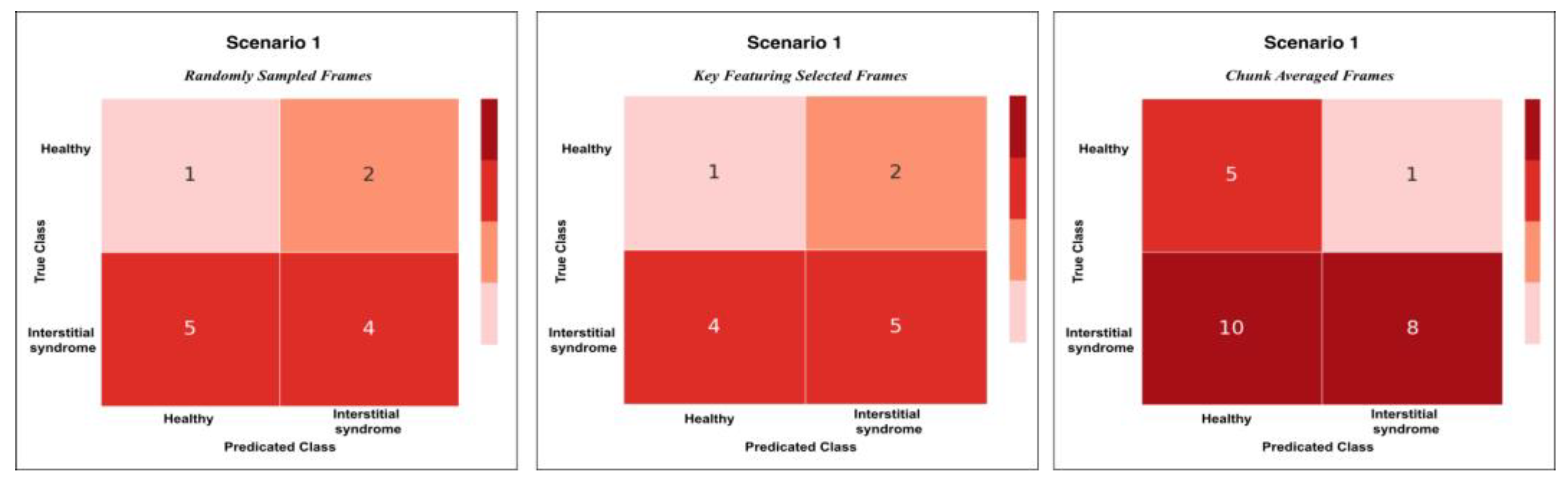
Figure A5.
The heatmap provides a comparison of confidence scores across three different testing methods—RS, KF, and CA—applied to both healthy and non-healthy videos. Each square in the heatmap shows how confident the model was in its misclassifications for each video using the corresponding method. Darker shades of blue represent higher confidence levels (~0.7 to 1.0), while lighter shades indicate lower confidence (~0.5 to 0.7). The colour legend at the bottom indicates false (red), partial false (orange), and completely false chunks (black).
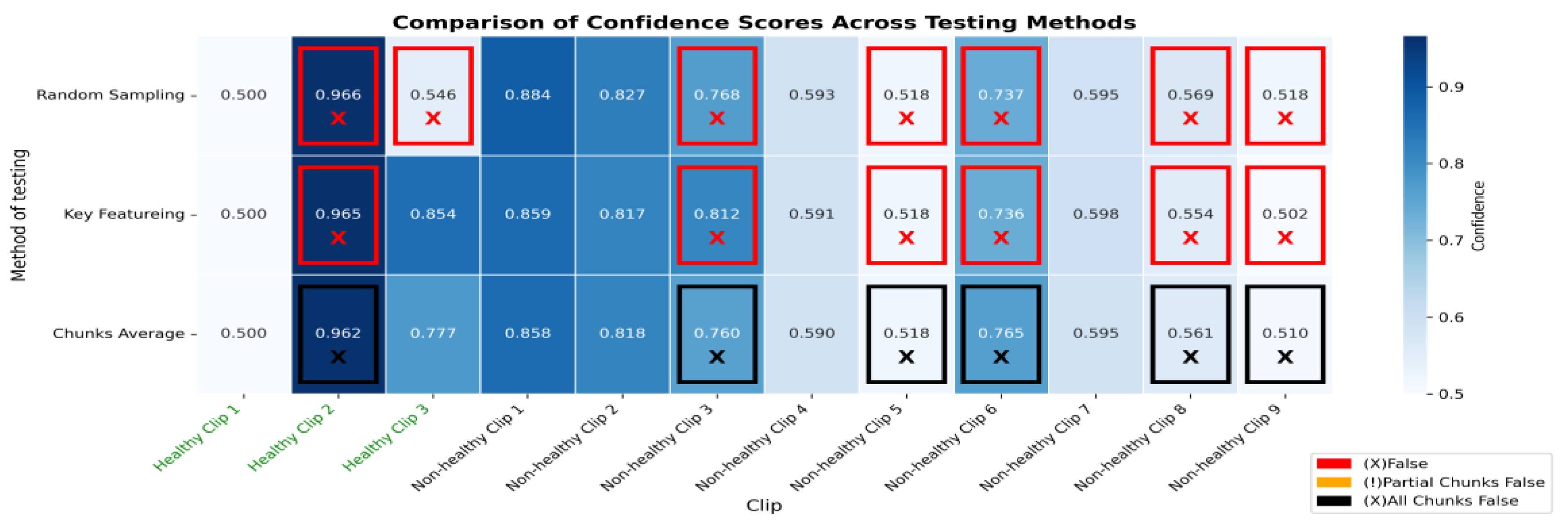
Figure A6.
The bar graph for S1 shows the number of chucks in each clip. Each of those bars is segmented, showing the correct classifications in blue and partial misclassification in orange, and all chunks false in black. The horizontal axis defines the number of chunks, while the vertical axis enumerates the clips that belong either to a healthy or non-healthy clip. The orange segments are to indicate where certain chunks in a clip are classified incorrectly, while the blue segments reflect the correctly classified segments.
Appendix C
Figure A7.
Confusion matrices comparing three methods of testing for Scenario 2. The matrices illustrate the classification performance between “Healthy” and “Interstitial Syndrome (IS)” classes using three different testing methods: Randomly Sampled Frames (left), Key Featuring Selected Frames (middle), and Chunk Averaged Frames (right). Randomly Sampled Frames: The model correctly classified 2 healthy clips and misclassified 1 as IS. It correctly classified 9 IS clips, while none were misclassified as healthy. Key Featuring Selected Frames: In this method, 2 healthy clips were classified correctly, with 1 misclassified as IS. For IS, 9 were classified correctly, and none were misclassified as healthy. Chunk Averaged Frames: This approach resulted in 13 correct classifications for healthy clips and 8 misclassifications as IS. For IS, 58 were correctly classified, and 3 were misclassified as healthy.
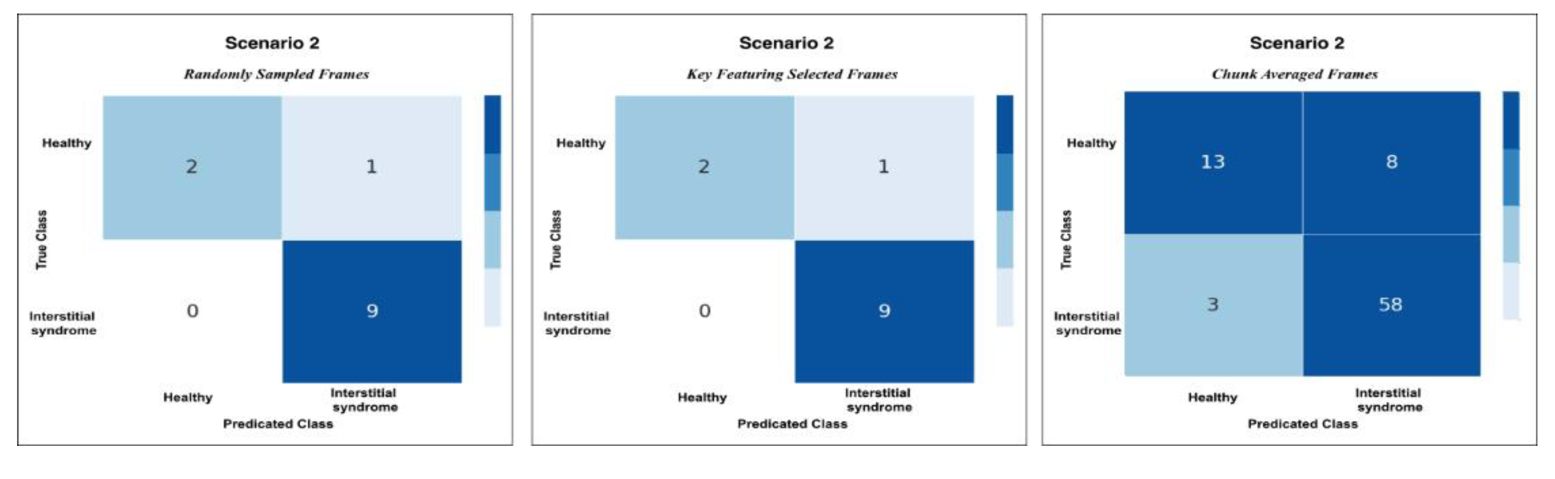
Figure A8.
The heatmap provides a comparison of confidence scores across three different testing methods—RS, KF, and CA—applied to both healthy and non-healthy videos. Each square in the heatmap shows how confident the model was in its misclassifications for each video using the corresponding method. Darker shades of blue represent higher confidence levels (~0.7 to 1.0), while lighter shades indicate lower confidence (~0.5 to 0.7). The colour legend at the bottom indicates false (red), partial false (orange), and completely false chunks (black).
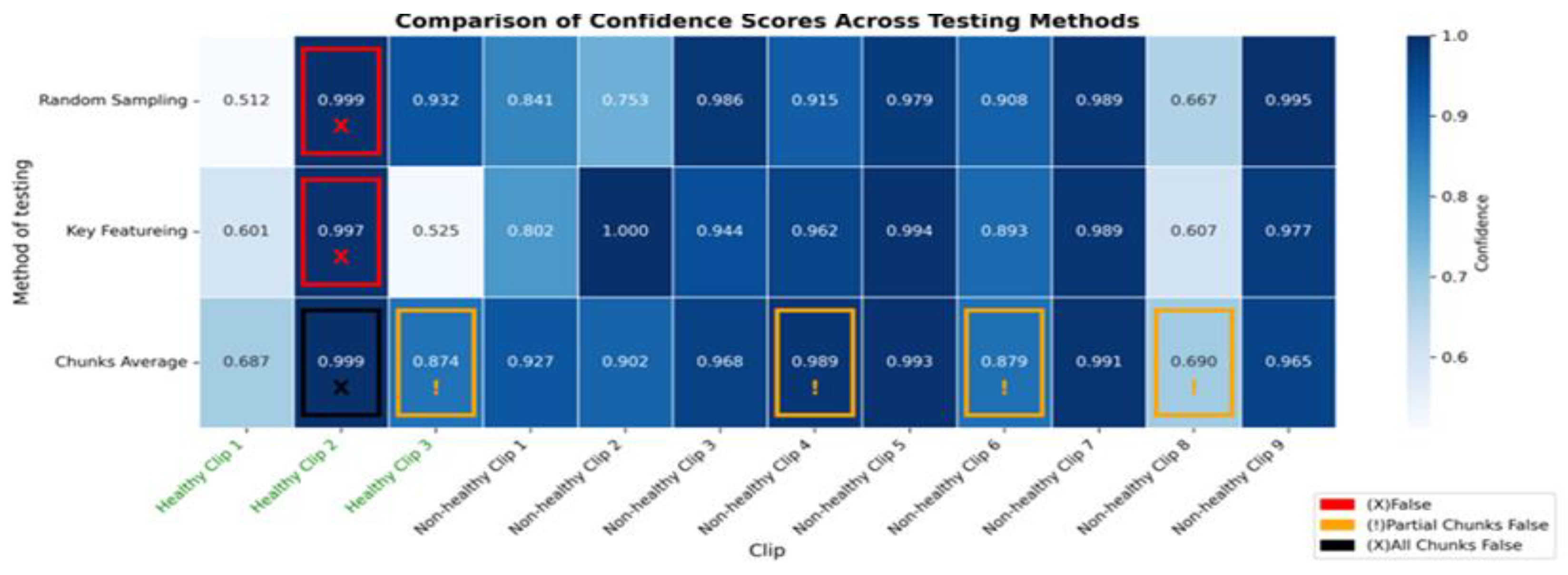
Figure A9.
The bar graph for S2 shows the number of chucks in each clip. Each of those bars is segmented, showing the correct classifications in blue and partial misclassifications in orange, and all chunks false in black. The horizontal axis defines the number of chunks, while the vertical axis enumerates the clips that belong either to a healthy or non-healthy clip. The orange segments are to indicate where certain chunks in a clip are classified incorrectly, while the blue segments reflect the correctly predicted segments.
References
- Wang Y, Gargani L, Barskova T, Furst DE, Cerinic MM. Usefulness of lung ultrasound B-lines in connective tissue disease-associated interstitial lung disease: A literature review. Arthritis Res Ther. 2017;19(1):206–206.
- Jeganathan N, Corte TJ, Spagnolo P. Editorial: Epidemiology and risk factors for interstitial lung diseases. Front Med [Internet]. 2024 Mar 6 [cited 2024 Aug 21];11. Available from: https://www.frontiersin.org/journals/medicine/articles/10.3389/fmed.2024.1384825/full.
- Dietrich CF, Mathis G, Blaivas M, Volpicelli G, Seibel A, Wastl D, et al. Lung B-line artefacts and their use. J Thorac Dis [Internet]. 2016 Jun [cited 2023 Mar 2];8(6). Available from: https://jtd.amegroups.com/article/view/7571.
- Mento F, Khan U, Faita F, Smargiassi A, Inchingolo R, Perrone T, et al. State of the Art in Lung Ultrasound, Shifting from Qualitative to Quantitative Analyses. Ultrasound Med Biol [Internet]. 2022 Dec 1 [cited 2023 Mar 16];48(12):2398–416. Available from: https://www.sciencedirect.com/science/article/pii/S0301562922004823.
- Volpicelli G, Elbarbary M, Blaivas M, Lichtenstein DA, Mathis G, Kirkpatrick AW, et al. International evidence-based recommendations for point-of-care lung ultrasound. Intensive Care Med. 2012 Apr;38(4):577–91.
- Ziskin MC, Thickman DI, Goldenberg NJ, Lapayowker MS, Becker JM. The comet tail artifact. J Ultrasound Med [Internet]. 1982 [cited 2023 Sep 11];1(1):1–7. Available from: https://onlinelibrary.wiley.com/doi/abs/10.7863/jum.1982.1.1.1.
- Lichtenstein D, Mézière G, Biderman P, Gepner A, Barré O. The Comet-tail Artifact. Am J Respir Crit Care Med [Internet]. 1997 Nov [cited 2023 Sep 11];156(5):1640–6. Available from: https://www.atsjournals.org/doi/full/10.1164/ajrccm.156.5.96-07096.
- Volpicelli G, Lamorte A, Villén T. What’s new in lung ultrasound during the COVID-19 pandemic. Intensive Care Med [Internet]. 2020 Jul 1 [cited 2023 Sep 11];46(7):1445–8. Available from: . [CrossRef]
- Soldati G, Smargiassi A, Inchingolo R, Sher S, Nenna R, Valente S, et al. Lung Ultrasonography May Provide an Indirect Estimation of Lung Porosity and Airspace Geometry. Respiration [Internet]. 2014 Nov 5 [cited 2023 Oct 10];88(6):458–68. Available from: . [CrossRef]
- Volpicelli G, Fraccalini T, Cardinale L. Lung ultrasound: are we diagnosing too much? Ultrasound J [Internet]. 2023 Mar 29 [cited 2023 Apr 17];15(1):17. Available from: . [CrossRef]
- Dietrich CF, Mathis G, Blaivas M, Volpicelli G, Seibel A, Wastl D, et al. Lung B-line artefacts and their use. J Thorac Dis [Internet]. 2016 Jun [cited 2024 Oct 21];8(6). Available from: https://jtd.amegroups.org/article/view/7571.
- Marini TJ, Rubens DJ, Zhao YT, Weis J, O’connor TP, Novak WH, et al. Lung ultrasound: The essentials. Radiol Cardiothorac Imaging. 2021;3(2):e200564–e200564.
- Wang J, Yang X, Zhou B, Sohn JJ, Zhou J, Jacob JT, et al. Review of Machine Learning in Lung Ultrasound in COVID-19 Pandemic. J Imaging. 2022;8(3).
- Zhao L, Lediju Bell MA. A Review of Deep Learning Applications in Lung Ultrasound Imaging of COVID-19 Patients. BME Front. 2022 Feb 15;2022:9780173.
- Baloescu C, Rucki AA, Chen A, Zahiri M, Ghoshal G, Wang J, et al. Machine Learning Algorithm Detection of Confluent B-Lines. Ultrasound Med Biol. 2023;49(9):2095–102.
- Brusasco C, Santori G, Bruzzo E, Trò R, Robba C, Tavazzi G, et al. Quantitative lung ultrasonography: a putative new algorithm for automatic detection and quantification of B-lines. Crit Care [Internet]. 2019;23:null. Available from: https://www.semanticscholar.org/paper/ca058bdd544700759405f9da3136f510783222db.
- Erfanian Ebadi S, Krishnaswamy D, Bolouri SES, Zonoobi D, Greiner R, Meuser-Herr N, et al. Automated detection of pneumonia in lung ultrasound using deep video classification for COVID-19. Inform Med Unlocked [Internet]. 2021 Jan 1 [cited 2023 Jun 9];25:100687. Available from: https://www.sciencedirect.com/science/article/pii/S2352914821001714.
- Kulhare S, Zheng X, Mehanian C, Gregory C, Zhu M, Gregory K, et al. Ultrasound-Based Detection of Lung Abnormalities Using Single Shot Detection Convolutional Neural Networks. 2018; Available from: https://www.semanticscholar.org/paper/fb19ad31431cf68a75a20bd209d05162a3976c8c.
- Liu RB, Tayal VS, Panebianco NL, Tung-Chen Y, Nagdev A, Shah S, et al. Ultrasound on the Frontlines of COVID-19: Report From an International Webinar. Acad Emerg Med. 2020;27(6):523–6.
- Lucassen R, Jafari M, Duggan N, Jowkar N, Mehrtash A, Fischetti C, et al. Deep Learning for Detection and Localization of B-Lines in Lung Ultrasound. 2023; Available from: https://www.semanticscholar.org/paper/6489a6f15db3cb06388050bafe3d606835931f79.
- Pare JR, Gjesteby LA, Telfer BA, Tonelli MM, Leo MM, Billatos E, et al. Transfer Learning for Automated COVID-19 B-Line Classification in Lung Ultrasound. In: 2022 44th Annual International Conference of the IEEE Engineering in Medicine & Biology Society (EMBC). 2022. p. 1675–81.
- Wang Y, Zhang Y, He Q, Liao H, Luo J. Quantitative Analysis of Pleural Line and B-Lines in Lung Ultrasound Images for Severity Assessment of COVID-19 Pneumonia. IEEE Trans Ultrason Ferroelectr Freq Control. 2022;69(1):73–83.
- Arntfield R, VanBerlo B, Alaifan T, Phelps N, White M, Chaudhary R, et al. Development of a convolutional neural network to differentiate among the etiology of similar appearing pathological B lines on lung ultrasound: a deep learning study. BMJ Open. 2021;11(3):e045120.
- Perera S, Adhikari S, Yilmaz A. Pocformer: A Lightweight Transformer Architecture For Detection Of Covid-19 Using Point Of Care Ultrasound. In IEEE; 2021. p. 195–9. (IEEE International Conference on Image Processing ICIP; vols 2021-).
- Hu Z, Nasute Fauerbach PV, Yeung C, Ungi T, Rudan J, Engel CJ, et al. Real-time automatic tumor segmentation for ultrasound-guided breast-conserving surgery navigation. Int J Comput Assist Radiol Surg. 2022 Sep;17(9):1663–72.
- Automated and real-time segmentation of suspicious breast masses using convolutional neural network | PLOS One [Internet]. [cited 2025 Apr 10]. Available from: https://journals.plos.org/plosone/article?id=10.1371/journal.pone.0195816.
- Wei Y, Yang B, Wei L, Xue J, Zhu Y, Li J, et al. Real-time carotid plaque recognition from dynamic ultrasound videos based on artificial neural network. Ultraschall Med - Eur J Ultrasound [Internet]. 2024 Oct [cited 2025 Apr 10];45(5):493–500. Available from: http://www.thieme-connect.de/DOI/DOI?10.1055/a-2180-8405.
- Nurmaini S, Nova R, Sapitri AI, Rachmatullah MN, Tutuko B, Firdaus F, et al. A Real-Time End-to-End Framework with a Stacked Model Using Ultrasound Video for Cardiac Septal Defect Decision-Making. J Imaging [Internet]. 2024 Nov [cited 2025 Apr 10];10(11):280. Available from: https://www.mdpi.com/2313-433X/10/11/280.
- Zhang TT, Shu H, Tang ZR, Lam KY, Chow CY, Chen XJ, et al. Weakly supervised real-time instance segmentation for ultrasound images of median nerves. Comput Biol Med. 2023 Aug;162:107057.
- Ou Z, Bai J, Chen Z, Lu Y, Wang H, Long S, et al. RTSeg-net: A lightweight network for real-time segmentation of fetal head and pubic symphysis from intrapartum ultrasound images. Comput Biol Med. 2024 Jun;175:108501.
- Khan U, Afrakhteh S, Mento F, Mert G, Smargiassi A, Inchingolo R, et al. Low-complexity lung ultrasound video scoring by means of intensity projection-based video compression. Comput Biol Med [Internet]. 2024 Feb 1 [cited 2024 Oct 8];169:107885. Available from: https://www.sciencedirect.com/science/article/pii/S0010482523013501.
- Dong X, Bao J, Chen D, Zhang W, Yu N, Yuan L, et al. CSWin Transformer: A General Vision Transformer Backbone with Cross-Shaped Windows. 2021.
- Al-hammuri K, Gebali F, Kanan A, Chelvan IT. Vision transformer architecture and applications in digital health: a tutorial and survey. Vis Comput Ind Biomed Art [Internet]. 2023 Jul 10 [cited 2024 Aug 21];6(1):14. Available from: . [CrossRef]
- He K, Gan C, Li Z, Rekik I, Yin Z, Ji W, et al. Transformers in Medical Image Analysis: A Review. Medical Image Analysis. 2022;76:102445.
- Li J, Chen J, Tang Y, Wang C, Landman BA, Zhou SK. Transforming medical imaging with Transformers? A comparative review of key properties, current progresses, and future perspectives. Med Image Anal [Internet]. 2023 Apr [cited 2024 Aug 21];85:102762. Available from: https://www.ncbi.nlm.nih.gov/pmc/articles/PMC10010286/.
- Vafaeezadeh M, Behnam H, Gifani P. Ultrasound Image Analysis with Vision Transformers—Review. Diagnostics [Internet]. 2024 Mar 4 [cited 2024 Aug 21];14(5):542. Available from: https://www.ncbi.nlm.nih.gov/pmc/articles/PMC10931322/.
- Watanabe S, Yomono K, Yamamoto S, Suzuki M, Gono T, Kuwana M. Lung ultrasound in the assessment of interstitial lung disease in patients with connective tissue disease: Performance in comparison with high-resolution computed tomography. Mod Rheumatol [Internet]. 2025 Jan 1 [cited 2025 May 6];35(1):79–87. Available from: . [CrossRef]
- Chen J, Frey EC, He Y, Segars WP, Li Y, Du Y. TransMorph: Transformer for unsupervised medical image registration. Med Image Anal [Internet]. 2022 Nov 1 [cited 2024 Oct 30];82:102615. Available from: https://www.sciencedirect.com/science/article/pii/S1361841522002432.
- Virtanen P, Gommers R, Oliphant TE, Haberland M, Reddy T, Cournapeau D, et al. SciPy 1.0: fundamental algorithms for scientific computing in Python. Nat Methods. 2020;17(3):261–72.
- Statsmodels: Econometric and Statistical Modeling with Python. In: Proceedings of the 9th Python in Science Conference.
- Goffi A, Kruisselbrink R, Volpicelli G. The sound of air: point-of-care lung ultrasound in perioperative medicine. Can J Anesth Can Anesth [Internet]. 2018 Apr [cited 2025 Apr 7];65(4):399–416. Available from: http://link.springer.com/10.1007/s12630-018-1062-x.
- Smargiassi A, Zanforlin A, Perrone T, Buonsenso D, Torri E, Limoli G, et al. Vertical Artifacts as Lung Ultrasound Signs: Trick or Trap? Part 2- An Accademia di Ecografia Toracica Position Paper on B-Lines and Sonographic Interstitial Syndrome. J Ultrasound Med [Internet]. 2023 [cited 2023 Sep 6];42(2):279–92. Available from: https://onlinelibrary.wiley.com/doi/abs/10.1002/jum.16116.
Figure 1.
The above pie charts show the distribution and splitting of the LUS dataset used in this work. Dataset, 58.3% of videos [35] are from Trento datasets, and 41.7% [25] are from Melbourne datasets. All videos are equally divided into 50% [30] healthy and 50% [30] non-healthy classes. For training and validation, the dataset is split into 93.3% [56] and 6.7% [4] respectively.
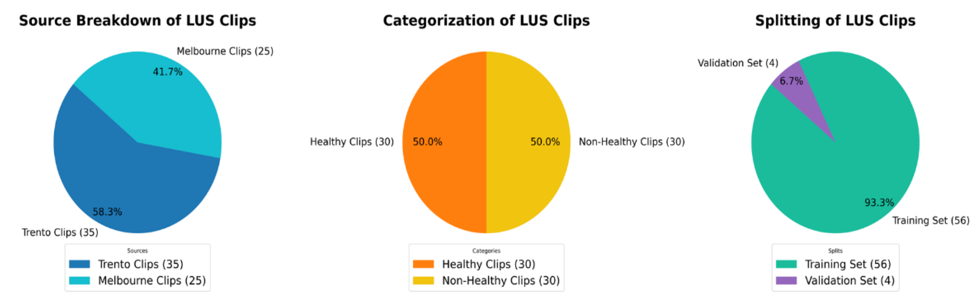
Figure 2.
An overview of the guidelines for identifying IS and normal LUS videos used in the labelling process. A, (marked in yellow), IS is distinguished by the presence of three B-lines. These B-lines are associated with four key characteristics: they move in tandem with lung sliding and lung pulse, extend to the bottom of the screen without fading, and appear laser-like. In contrast, B, representing a healthy lung (marked in green), which is defined by A-lines, which defined as horizontal spaced, echogenic lines that appear below the pleural line.
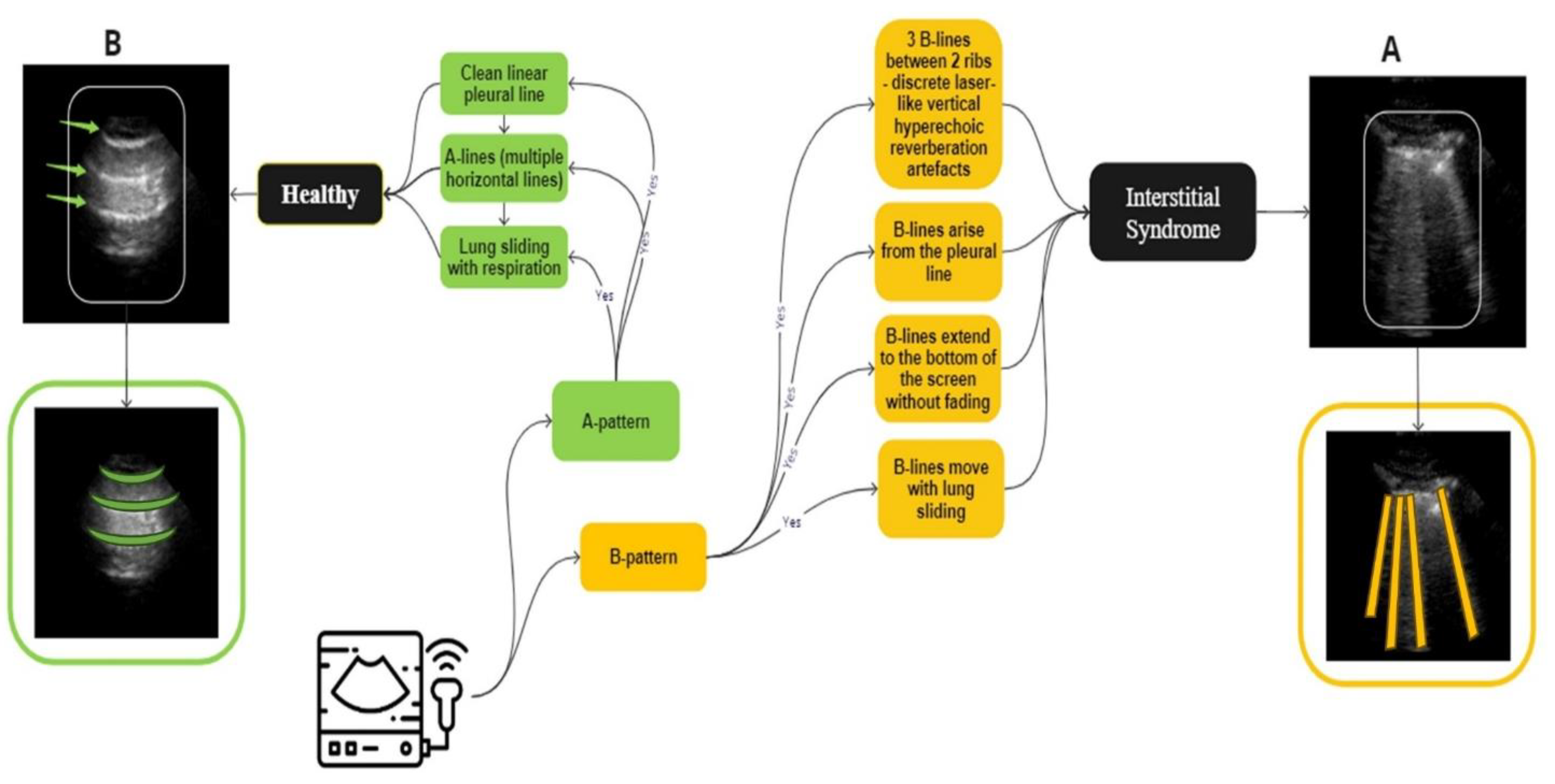
Figure 3.
A three-step process diagram illustrates the selection, filtering, and dataset splitting of Lung LUS videos used in the training of our models. The process begins with an example of 120 frames segmented into multiple portions, followed by applying 3 different scenarios where each one has different types and numbers of frames. This clip, consisting of 120 frames, is selected for illustration purposes and is not representative of all samples in the dataset, as actual video lengths varied. In this example, approximately 70 frames show the liver region, 14 frames include mixed features of liver with partial B-lines images, and 36 frames show clear B-lines. In S1, the first 96 frames cover the liver and the B-line regions. S2 included the first 32 consecutive frames, regardless of anatomical content. S3 targeted 32 diagnostically relevant frames from expert-annotated segments corresponding to liver, partial B-lines, and clear B-lines. These filtered datasets were constructed independently and used separately during model training and evaluation to assess how different temporal sampling strategies influence classification performance.
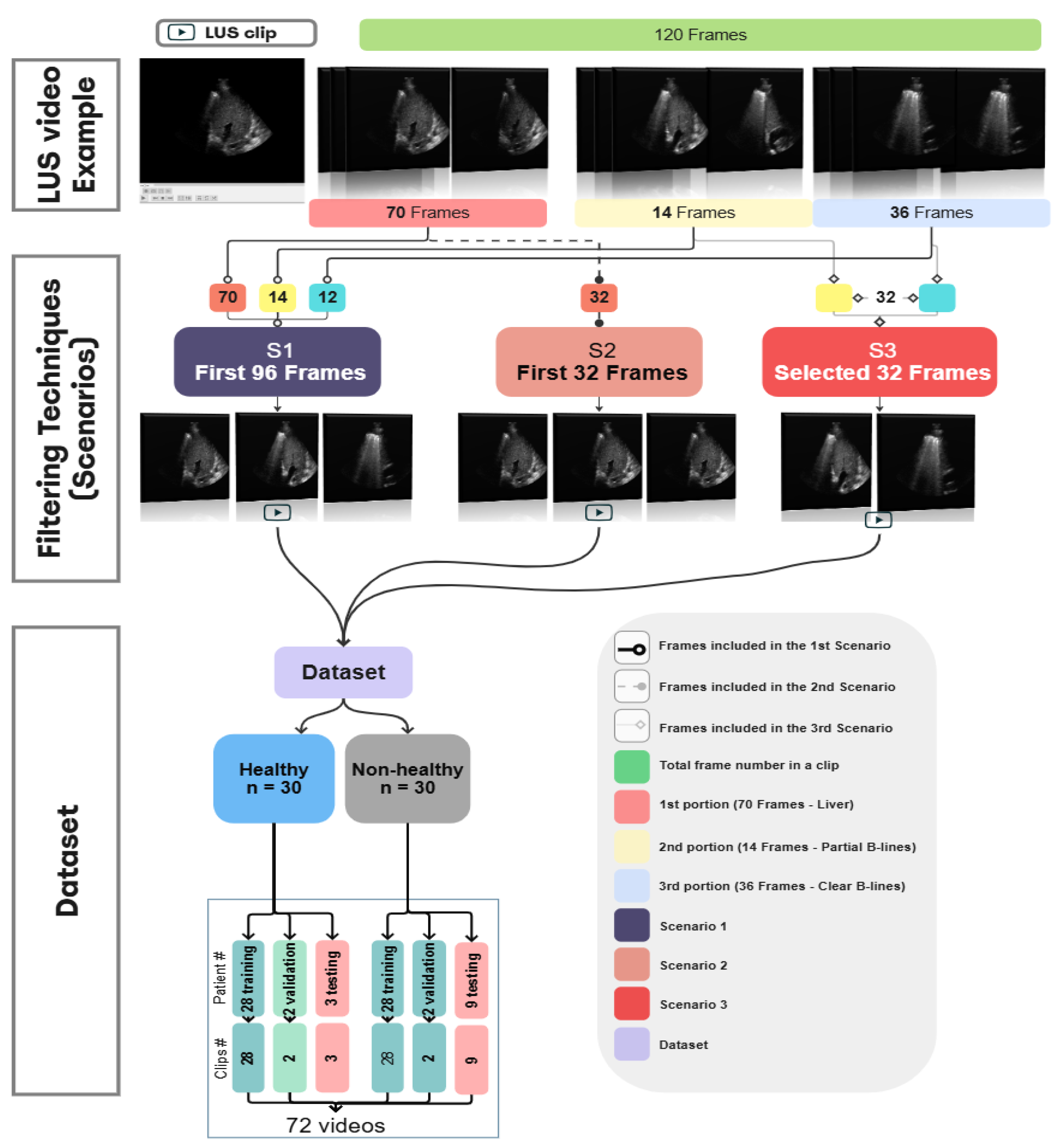
Figure 4.
The dataset split into training and validation sets using 10-fold cross-validation. The Dataset had 56 videos (one per patient) assigned to the training set, and 4 videos to the validation set in each fold.
Figure 4.
The dataset split into training and validation sets using 10-fold cross-validation. The Dataset had 56 videos (one per patient) assigned to the training set, and 4 videos to the validation set in each fold.
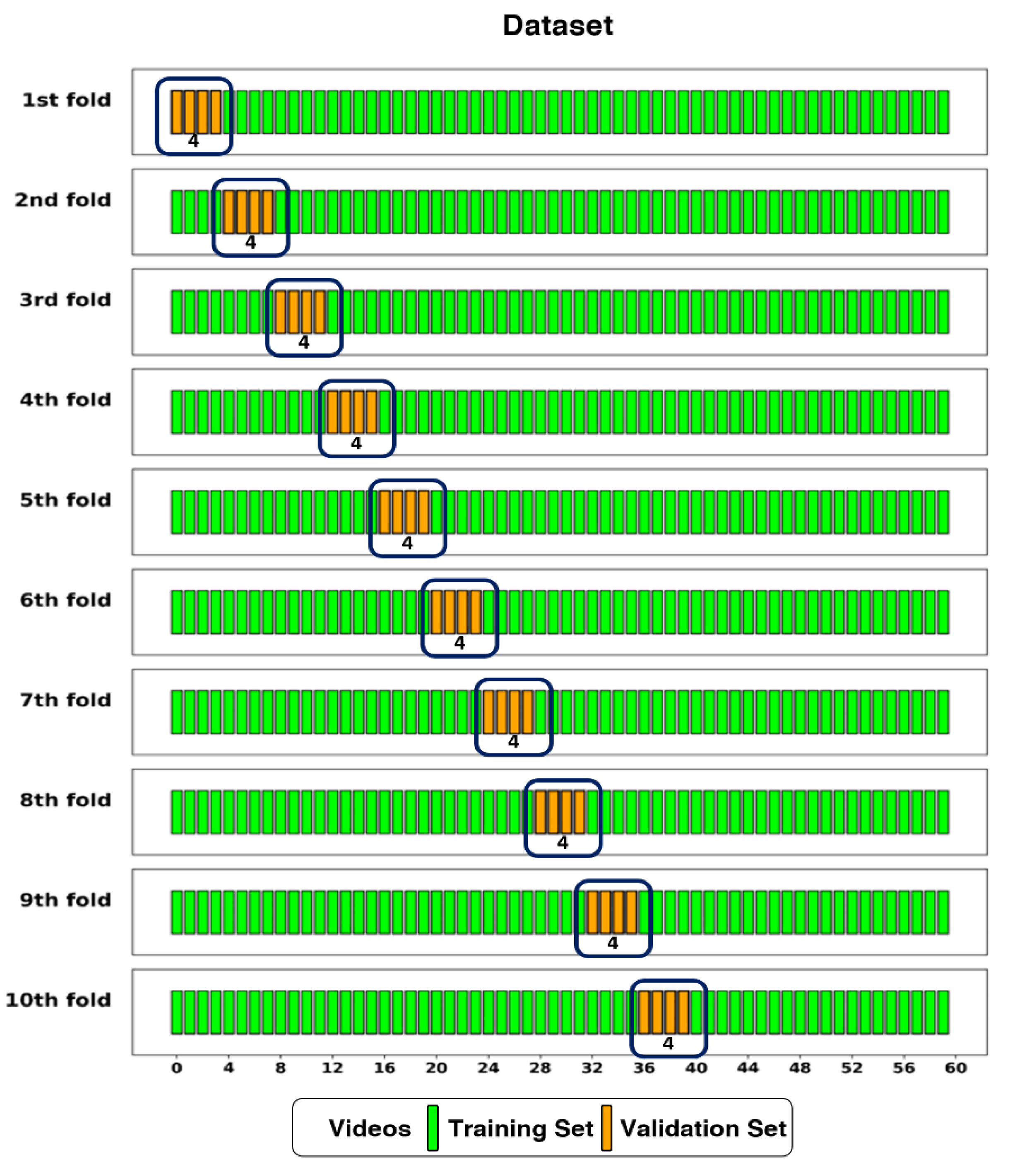
Figure 5.
This diagram shows the architecture of a CSwin Transformer model applied to Lung Ultrasound (LUS) video training. The input LUS videos are segmented into patches and processed through a series of transformer blocks and patch merging operations. The model output is a binary classification, identifying the lung condition as either ‘Healthy’ or ‘Unhealthy’ based on SoftMax activation.
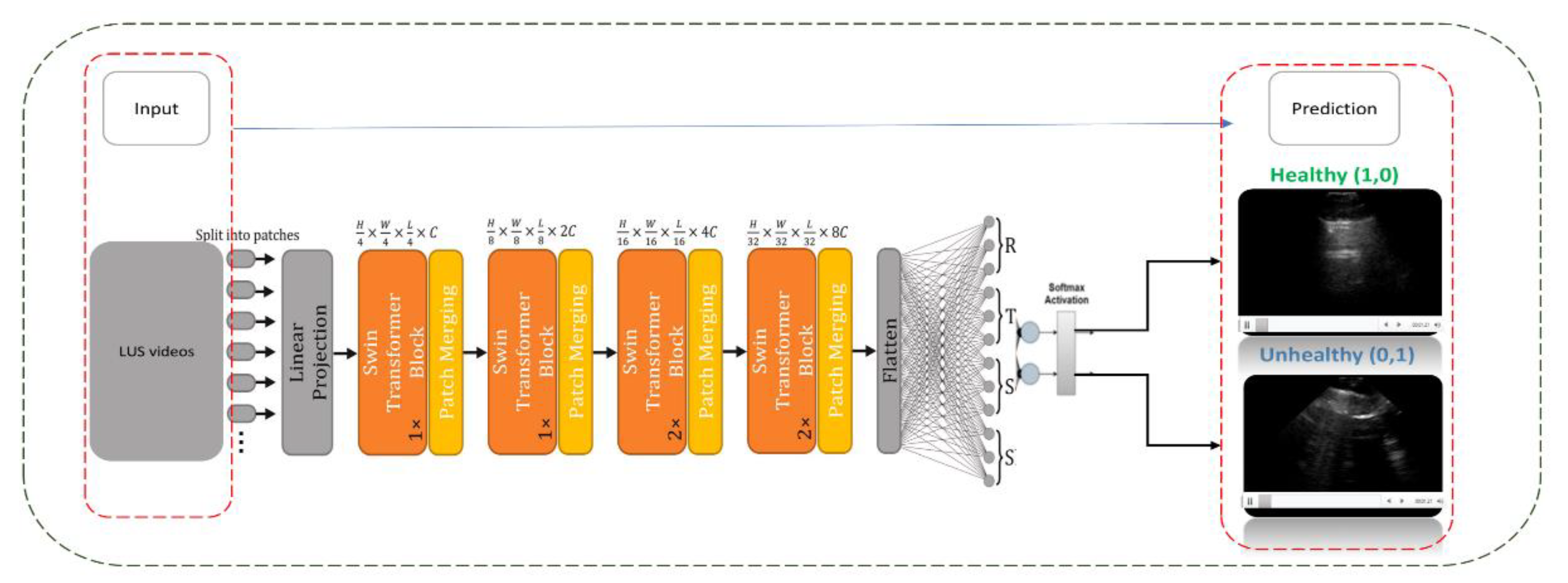
Figure 6.
An example of three frame selection methods for testing: Random Sampling (orange), Key Featuring (blue), and Chunk Averaging (green), applied to an example video of 120-frame.
Figure 6.
An example of three frame selection methods for testing: Random Sampling (orange), Key Featuring (blue), and Chunk Averaging (green), applied to an example video of 120-frame.
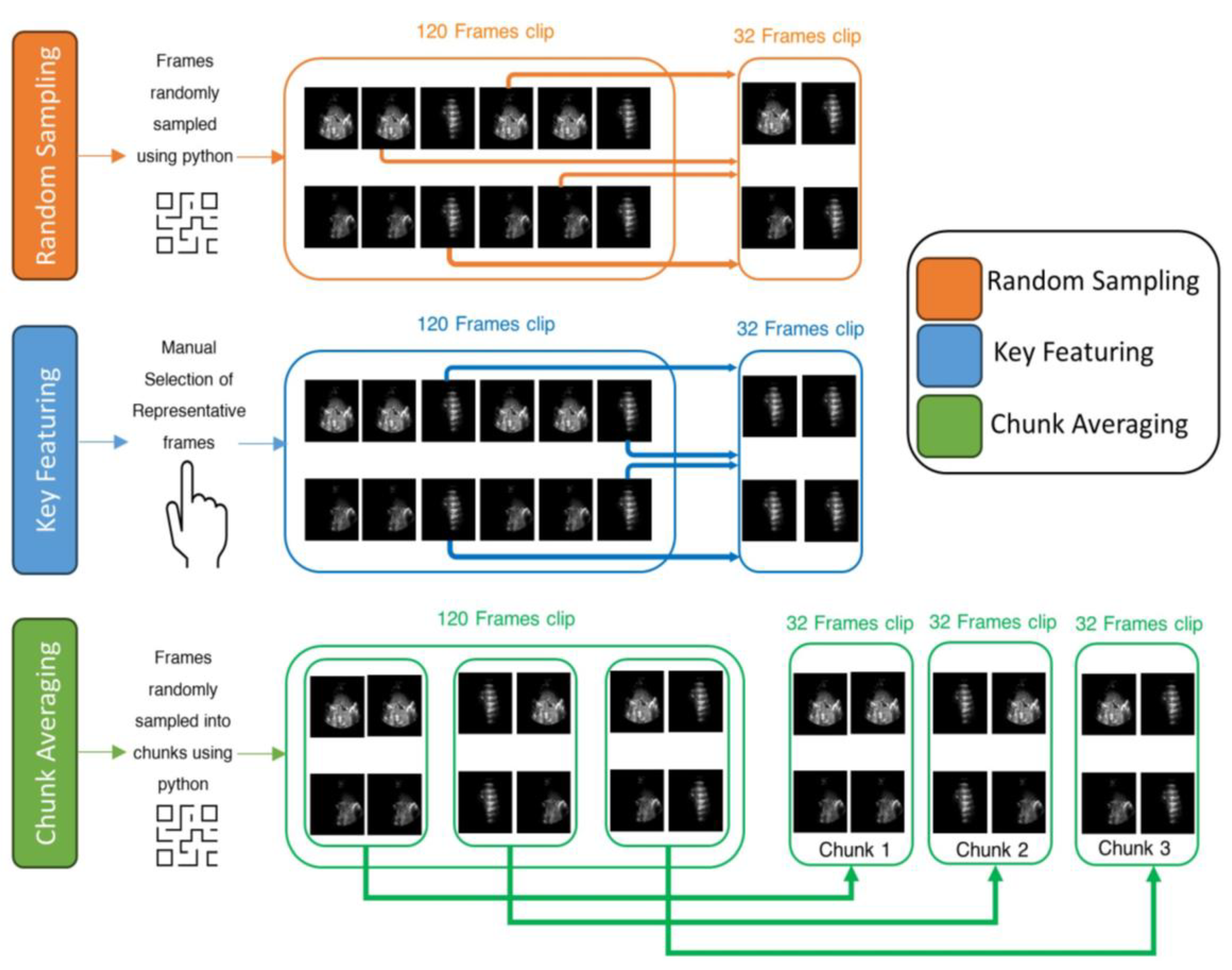
Figure 7.
This plot shows the compression of training loss (a), training accuracy (b), and validation accuracy (c) against three different scenarios used in this study. Each plot displays the average performance metric over 500 epochs, with the shaded area representing the standard deviation. Furthermore, each plot displays all the values at the midpoint epoch for each scenario, along with legends, to facilitate easy reference to the values.
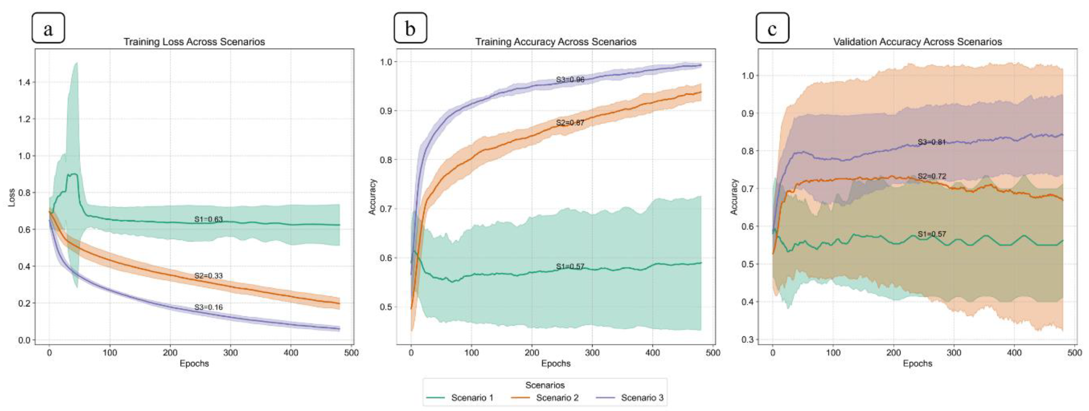
Figure 8.
Pairwise comparison of mean validation accuracy between scenarios, based on 10-fold cross-validation. Each pair (e.g., S1 vs S2) shows the mean and 95% confidence interval for both scenarios. Scenario 3 outperform Scenario 1 and Scenario 2 with clear non-overlapping intervals, indicating statistically significant differences in performance.
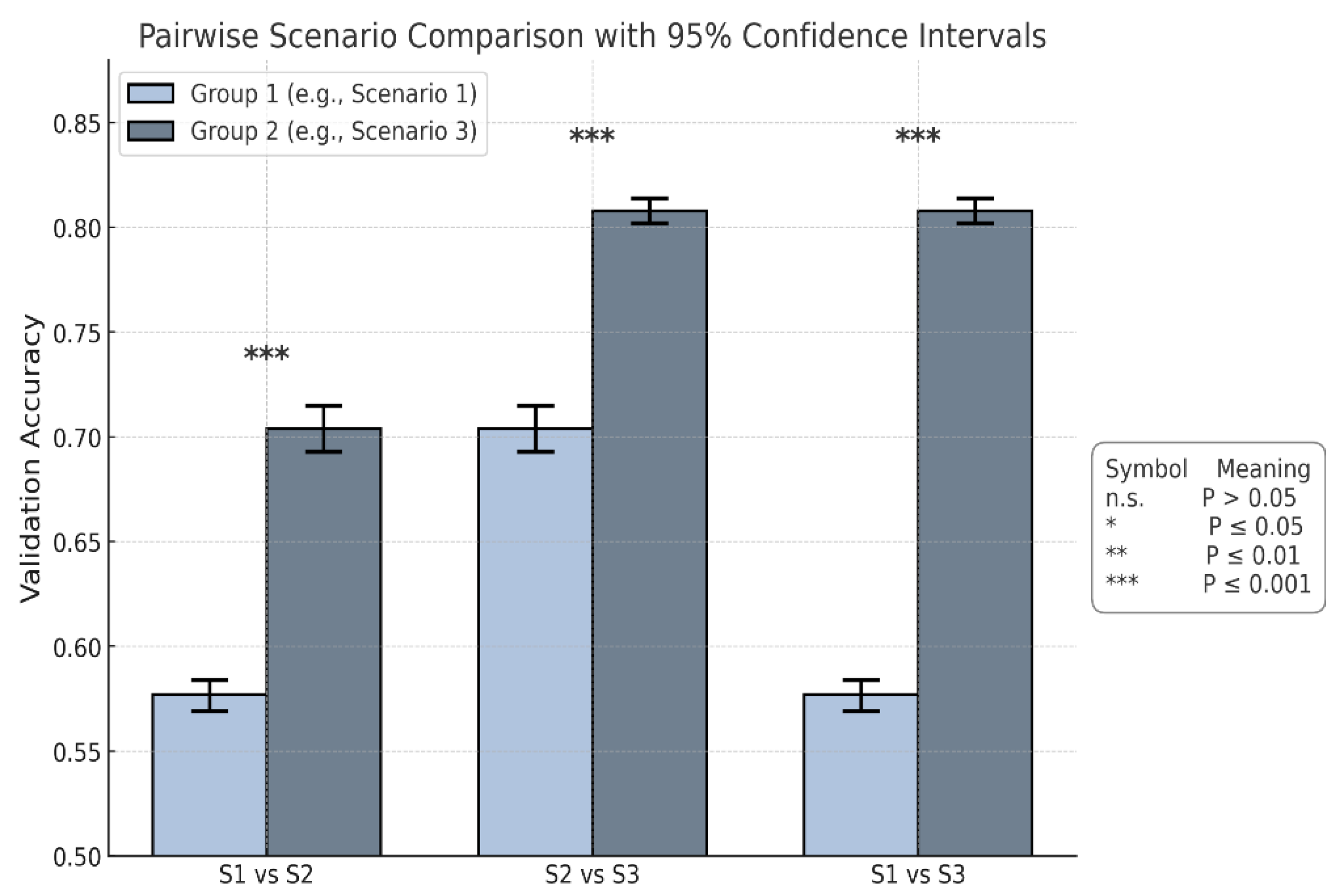
Figure 9.
This plot shows the confusion matrix of the best trained model on the unseen test set of 12 videos (3 healthy and 9 non-healthy) within three training scenarios: From left, Scenario 1 with 5 misclassifications, medial, Scenario 2 and 3 with 1 misclassification.
Figure 9.
This plot shows the confusion matrix of the best trained model on the unseen test set of 12 videos (3 healthy and 9 non-healthy) within three training scenarios: From left, Scenario 1 with 5 misclassifications, medial, Scenario 2 and 3 with 1 misclassification.
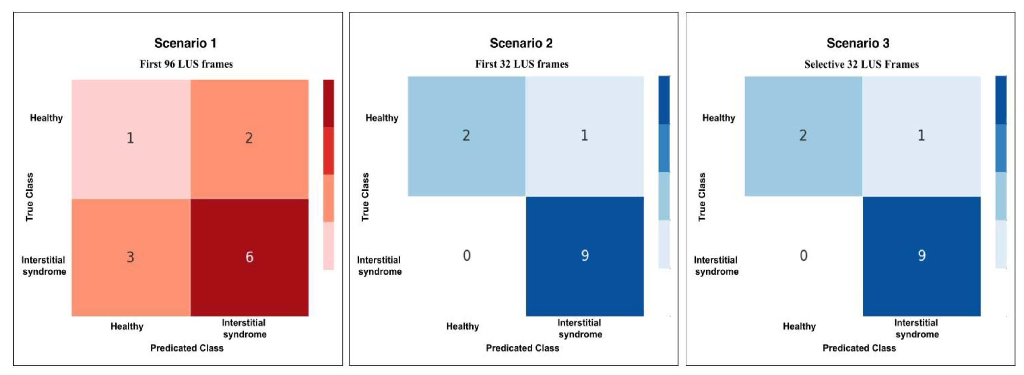
Figure 10.
The radar chart shows the performance metrics for all scenarios: Scenario 1 (S1), Scenario 2 and 3 combined (S2+S3), across performance metrics: Accuracy, Specificity, Precision, Recall, and F1-score.
Figure 10.
The radar chart shows the performance metrics for all scenarios: Scenario 1 (S1), Scenario 2 and 3 combined (S2+S3), across performance metrics: Accuracy, Specificity, Precision, Recall, and F1-score.
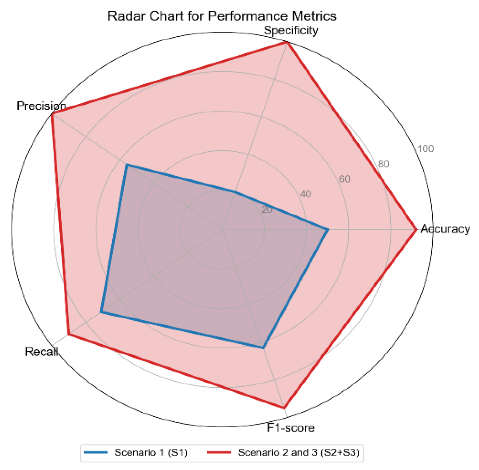
Figure 11.
Confusion matrices for Scenario 3 using the three methods of testing; RS, KF, and CA methods. Both RS and KF achieved 92% accuracy classification, while CA, showed minor misclassifications with an accuracy 89%.
Figure 11.
Confusion matrices for Scenario 3 using the three methods of testing; RS, KF, and CA methods. Both RS and KF achieved 92% accuracy classification, while CA, showed minor misclassifications with an accuracy 89%.
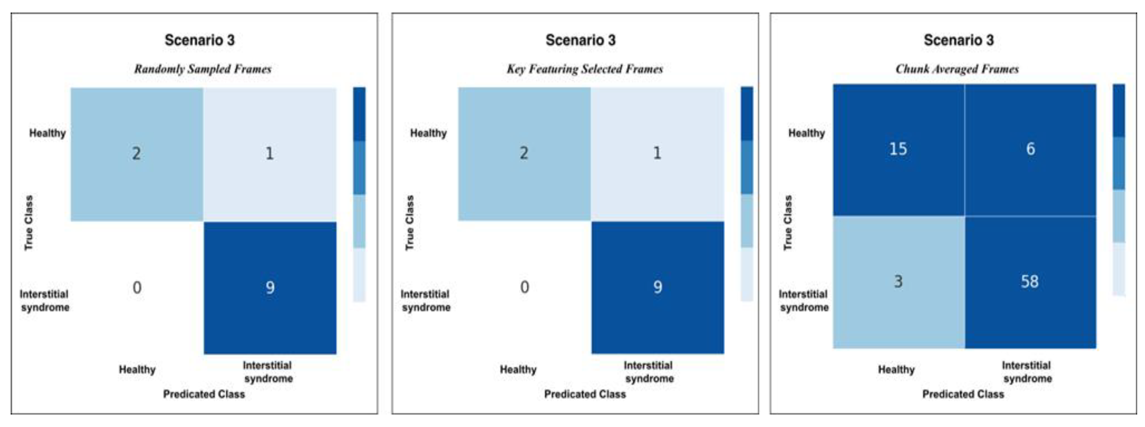
Figure 12.
The heatmap provides a comparison of confidence scores across three different testing methods—RS, KF, and CA—applied to both healthy and non-healthy videos. Each square in the heatmap shows how confident the model was in its misclassifications for each video using the corresponding method. Darker shades of blue represent higher confidence levels (~0.7 to 1.0), while lighter shades indicate lower confidence (~0.5 to 0.7). The colour legend at the bottom indicates false (red), partial false (orange), and completely false chunks (black).
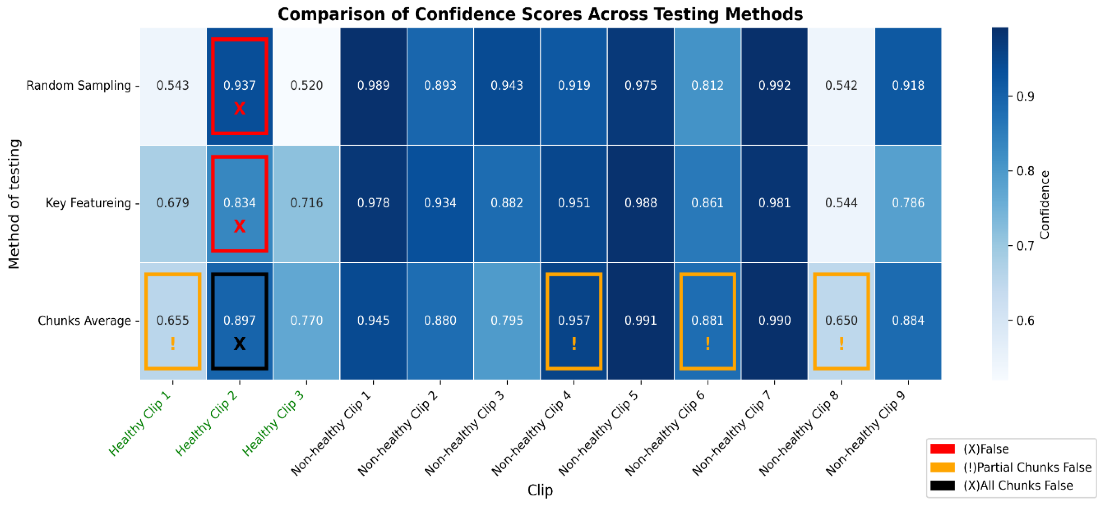
Figure 13.
The bar graph shows the classification performance on 12 testing videos. Each of those bars is segmented to present each chunk, showing the correct classifications in blue and partial misclassifications in orange, and all chunks false in black. The horizontal axis defines the number of chunks, while the vertical axis enumerates the videos that belong either to a healthy or non-healthy video. The orange segments are to indicate where certain chunks in a video are misclassified, while the blue segments reflect the correctly classified segments.

Figure 14.
The figure shows examples of misclassifications for testing LUS videos. The blue bars represent correctly classified chunks in each video, while the orange boxes show the chunks that were misclassified by the model. LUS frames from chuck, non-healthy video 8 and video 4, (labelled “a” and “b” respectively), the model correctly classified most chunks in video 8 but flagged one chunk incorrectly and displays frames with visible B-lines (indicative of IS). In non-healthy video 4 (labelled “b”), which LUS frames show a nearly empty and no diagnostic features found, the model misclassified one chunk. In Healthy video 2 (labelled c), the model misclassified all chunks, as shown by the black bar. The LUS frames from this video display A-Lines artefacts.
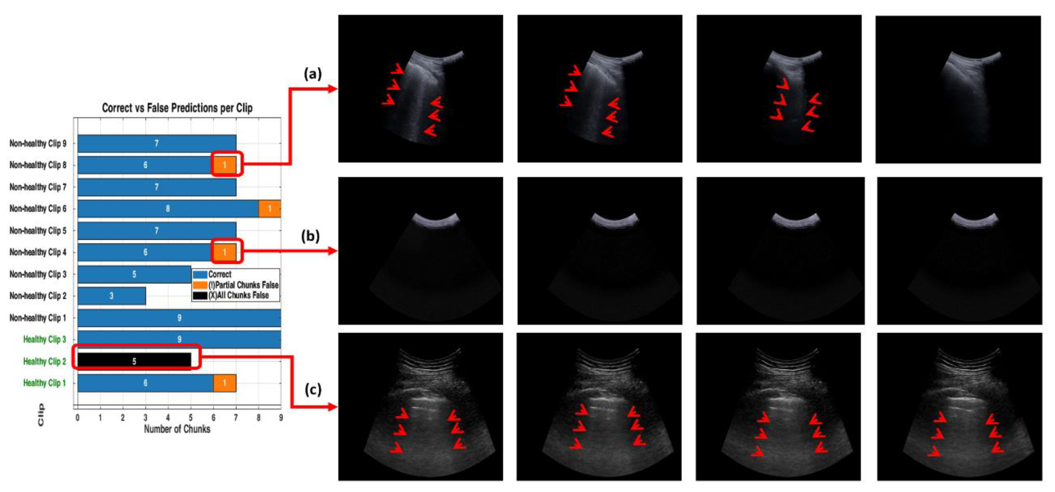
Figure 15.
This figure compares the inference time performance between a dual-GPU setup and an Intel Core i7 CPU when processing 32-frame ultrasound segments. Blue bars indicate the average inference time per segment, while green bars represent the total time required to process 9 segments (equivalent to a 288-frame LUS video). Dashed lines and Δ annotations highlight the differences between per-segment and total processing times. The GPU system achieves real-time performance with an average of 0.87 seconds per segment, whereas the CPU setup requires approximately 7.8 seconds per segment.
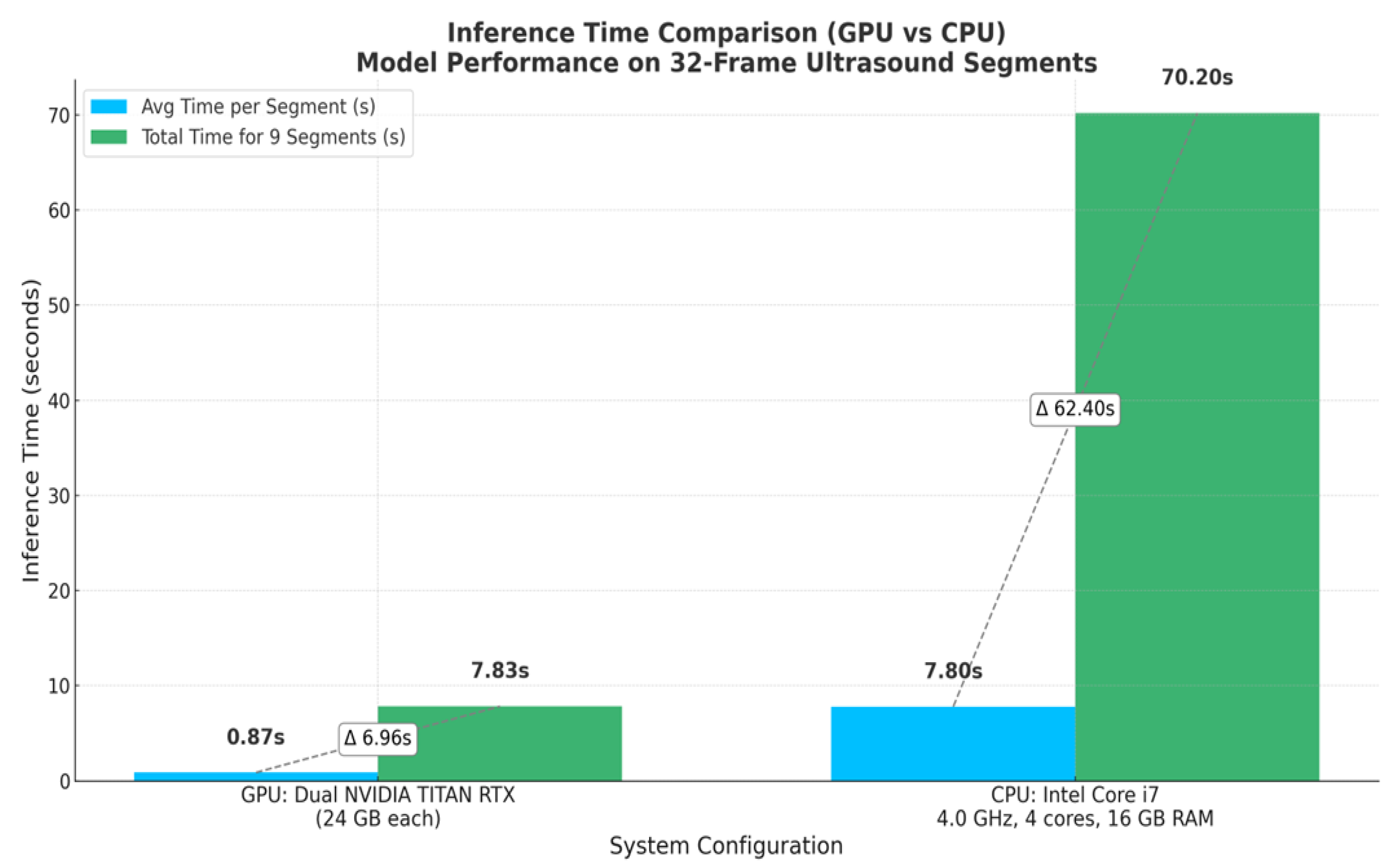

Table 1.
This table shows how patients and videos were divided into training, validation, and testing sets.
Table 1.
This table shows how patients and videos were divided into training, validation, and testing sets.
| Healthy Patients (H) | Non-healthy Patients (NH) | Training Set | Validation Set | Testing Set (Unseen) | Total | |||
| % | no | % | no | % | no | Videos/ Patients | ||
| 33 | 39 | ≈ 78% | 56 (26H + 26NH) |
≈ 6 % | 4 (2H + 2NH) |
≈ 17 % | 12 (3H +9 NH) |
72 |
Table 2.
presents the mean validation accuracy, 95% confidence intervals, and pairwise statistical comparisons between the 3 scenarios in this work. The best-performing scenario is highlighted in bold.
Table 2.
presents the mean validation accuracy, 95% confidence intervals, and pairwise statistical comparisons between the 3 scenarios in this work. The best-performing scenario is highlighted in bold.
| Scenario | Mean Accuracy |
95% Confidence Interval |
Compared To |
Mean Difference |
p-value | Cohen’s d | Effect Size Interpretation |
| Scenario 1 | 0.577 | [0.569, 0.584] | S2 | 0.127 | *** | 9.69 | Extremely large |
| Scenario 2 | 0.704 | [0.693, 0.715] | S3 | 0.104 | *** | 8.54 | Extremely large |
| Scenario 3 | 0.808 | [0.802, 0.814] | S1 | 0.231 | *** | 24.10 | Extremely large |
Note: Significance in p-values is indicated as follows: n.s. = not significant (p > 0.05); * = p ≤ 0.05; ** = p ≤ 0.01; *** = p ≤ 0.001.
Table 3.
Performance metrics across scenarios (S1–S3).
| Performance metrics | ||||||
| Accuracy | Specificity | Precision | Recall | F1-score | ||
| Scenario 1 (S1) | 50% | 20% | 56% | 71% | 63% | |
| Scenario 2 (S2) | 92% | 100% | 100% | 90% | 95% | |
| Scenario 3 (S3) | 92% | 100% | 100% | 90% | 95% | |
Disclaimer/Publisher’s Note: The statements, opinions and data contained in all publications are solely those of the individual author(s) and contributor(s) and not of MDPI and/or the editor(s). MDPI and/or the editor(s) disclaim responsibility for any injury to people or property resulting from any ideas, methods, instructions or products referred to in the content. |
© 2025 by the authors. Licensee MDPI, Basel, Switzerland. This article is an open access article distributed under the terms and conditions of the Creative Commons Attribution (CC BY) license (http://creativecommons.org/licenses/by/4.0/).
Copyright: This open access article is published under a Creative Commons CC BY 4.0 license, which permit the free download, distribution, and reuse, provided that the author and preprint are cited in any reuse.


