
Submitted:
27 March 2025
Posted:
30 March 2025
You are already at the latest version
Abstract
This paper provides an in-depth examination of Exploratory Spatial Data Analysis (ESDA), an extension of the exploratory data analysis concepts introduced by John Tukey in the 1970s. ESDA is designed to uncover hidden patterns and relationships in spatial data that are not apparent through traditional statistical methods. It incorporates techniques such as spatial visualization, dynamic linking, and spatial autocorrelation analysis to investigate spatial distributions and relationships across different datasets. By employing maps, histograms, scatter plots, and other graphical representations, ESDA enables the interactive exploration of spatial dependencies and heterogeneities. The integration of geographic information systems (GIS) tools like Luc Anselin’s GeoDa software enhances the ability of ESDA to handle complex spatial data structures and to visualize geographical data effectively. This paper discusses various ESDA methodologies tailored to analyze continuous, discrete, and spatial-temporal data, emphasizing their critical role in the development of econometric models. Additionally, it underscores the importance of spatial context in statistical analysis, advocating for the consideration of both physical and socio-cultural dimensions of space in understanding patterns and processes that influence human behavior and environmental dynamics. The detailed review also covers the use of ESDA in multiple disciplines, illustrating its versatility and effectiveness in providing insightful analyses that inform better decision-making in fields ranging from urban planning to environmental science.
Keywords:
ESDA
; thematic maps
; continuous variables
; discrete variables
; econometric models
1. What Is Exploratory Spatial Data Analysis (ESDA)
Exploratory spatial data analysis (ESDA) was developed from a-spatial exploratory data analysis (EDA). EDA is generally viewed to have originated in the 1960s as a reaction by computationally oriented statisticians to the primary focus on mathematics and modeling in their discipline. It was first comprehensively outlined in the classic book by John Tukey (Tukey 1977). His presentation stressed the value of investigating the raw data by means of a range of graphic devices, several of which were developed by Tukey himself, like the box plot.
ESDA is widely used in spatial statistics, spatial econometrics and geostatistics (see Bivand 2010). It is a set of techniques and methods used to analyze and visualize spatial data in order to uncover patterns, trends, and relationships that might not be immediately apparent. Common techniques used in ESDA include spatial visualization (e.g., thematic maps) and spatial autocorrelation analysis. ESDA allows the user to manipulate various ‘views’ of the data: maps, histograms, box plots, scatter plots, etc. The map is just another view, integrated into the overall scheme (Figure 1). It is a dynamic linking and brushing of various views (Anselin 2023): map, box plot, frequency histogram, data table, etc.
Why incorporate maps and, in general, tools from geography into exploratory analysis? The answer could be found in the French philosopher and sociologist Henri Lefebvre, who affirmed in his work "The Production of Space": “space matters” (Lefebvre 1992). The idea behind this statement emphasizes the importance of understanding space not just as a physical entity but also as a social and cultural construct that plays a significant role in shaping human experiences and interactions. In fact, social phenomena are often not independent of the geographical space in which they occur. For example, in cities one can find certain neighborhoods with high-income households surrounded by neighborhoods with high-income households, and vice versa: spatial concentrations of neighborhoods with lower-income families. These conditions are framed by Tobler's First Law of Geography: "Everything is related to everything else, but near things are more related than distant things" (Tobler 1970, p 236).
Hence, space can play an important role in determining the processes to be modelled. For this cause, one of the reasons why ESDA is relevant is the need to perform an exploratory analysis of the variables included in a spatial econometric model prior to its estimation, especially the dependent variable. Table 1 presents some basic ESDA methods that are suitable for analyzing various types of dependent variables in possible econometric models.
In fact, ESDA has developed different methods depending on the nature of the variable(s) involved: if only one variable is involved, we speak of univariate ESDA, and if two or more variables are involved, we speak of bivariate or multivariate ESDA, respectively. And within each ESDA categories, there are different methods depending on the type of the analyzed variable.
In this paper, an introduction to ESDA, its origins and main applications is provided. A first chapter is dedicated to describing some basic ESDA techniques for continuous and discrete variables, focusing on methods like histograms, bar charts, and thematic maps to visualize univariate data distributions. A second chapter presents some basic multivariate ESDA that explores relationships, structures and spatial patterns among multiple variables, employing, among others, scatter plots for continuous data to assess correlations and linear –and nonlinear– relationships, and using tools like the parallel coordinate plot and, for discrete data, the co-location maps, highlighting how these techniques help identify patterns, clusters, and outliers in complex data sets. The Conclusion section, References, and Appendix A close.
2. Basic Univariate ESDA
2.1. For Continuous Variables
In the current section, I focus on techniques to describe the distribution of one variable at a time (univariate). This variable, in turn, can be continuous or discrete. A continuous variable is a variable such that there are possible values between any two values. Continuous variables represent measurable amounts (e.g. monetary quantities, water volume or weight).
The ESDA of one continuous variable makes sense in itself, but also as part of the identification phase of a continuous dependent variable econometric model. This is the case of the spatial linear regression, trend surface, spatial expansion, spatial ridge, spatial lasso, spatial partial least squares, Geographically Weighted Regression, etc.
Generally speaking, exploratory analysis for continuous variables is a critical initial step in understanding the distributions, trends, and patterns within a dataset. Univariate ESDA seeks representation of central tendency and identification of outliers of spatial distributions (Anselin 2023, Ch. 4; Chasco and Vallone, 2023). Next, we present three basic representations: histogram, boxplot and thematic maps (quantile map, natural breaks map and box map).
2.1.1. Histogram
It is the representation of the general distribution of the values of a variable. It is also a discrete representation of the density function of a continuous variable. The range (In descriptive statistics, the range of a data set () is determined by subtracting the smallest value (sample minimum, ) from the largest value (sample maximum, ) in the set: . The range is given in the same units as the data and serves as a measure of statistical dispersion, like the variance and standard deviation.) of the variable is divided into a number of equal intervals (or bins), and the number of observations that fall within each bin is depicted proportional to the height of a bar.
The main challenge in creating an effective visualization is to find a compromise between too much detail (many bins, containing few observations) and too much generalization (few bins, containing a broad range of observations).
The histogram allows assessing about the shape of a distribution, detecting the existence of skewness and asymmetry. This graph is particularly useful for variables of a continuous nature, as it makes it easier to visualize their distribution by grouping these values into different categories or classes. In the example presented in Figure 2, a certain normality can be seen in the variable represented. If the standard deviation is multiplied by 2 and this quantity is added/subtracted to/from the mean (The mean of a variable (), often referred to as the arithmetic average, is calculated by dividing the sum of all values of this variable by the sample size: .), an interval of approximately (430,000; 452,000) is obtained in which about 95% of the probability mass is found, being the remaining 5% distributed between the two tails of the distribution. (In statistics, the normal distribution, also known as Gaussian distribution, represents a type of continuous probability distribution. The general form of its probability density function is . Normal distributions are commonly used to represent real-valued random variables with unknown distributions due to the Central Limit Theorem, which asserts that the average of multiple samples from a random variable with a defined mean and variance will approximate a normal distribution as the sample size increases, assuming certain conditions are met.
The normal distribution is symmetric around the mean value, which is also equal to the mode and median. It is unimodal and the total area between the curve and the x-axis, is equal to one. Approximately 68% of values from a normal distribution fall within one standard deviation (σ) of the mean, about 95% within two standard deviations, and roughly 99.7% within three standard deviations. This phenomenon is referred to as the 68-95-99.7 (empirical) rule, or the three-sigma rule. The most fundamental form of a normal distribution is the standard normal distribution, which occurs when the mean is 0 and the variance is 1.)
2.1.2. Box Plot
Method of representation based on the calculation of the quartiles and the median of a variable, as well as obtaining the upper and lower quartiles or adjacent values. (In statistics, quartiles are a specific type of quantile that divides the data into four equal parts once the data is sorted from lowest to highest. There are three quartiles that segment the data into four groups. The first quartile (Q1), or lower quartile, marks the 25th percentile, meaning 25% of the data falls below this point. The second quartile (Q2) is the median, indicating that half of the data lies below this value. The third quartile (Q3), or upper quartile, is the 75th percentile, where 75% of the data is below this point.) The ‘box’ is a rectangle that is constructed in such a way that the lower value of the box is the first quartile (containing 25% of the observations) and the upper value is the third quartile (containing 75% of the observations). The median is highlighted in the middle of the box with a circle and a horizontal line (Figure 3).
The values are obtained by adding/subtracting to the median the product of the values of the third (first) quartile by 1.5 times (or 3 times) the interquartile range. The outliers are values located above (or below) the aforementioned peaks, which may not exist (when the variable has values highly concentrated near the median).
2.1.3. Thematic Maps
Standard exploratory data analysis uses tools that allow to observe the distribution of data (such as histograms), but not their geographical location. One way to observe the spatial distribution of variables is through the use of thematic maps. A thematic map is a cartographic representation of a spatial variable using symbols and colors that highlight differences in values. When the regions are colored based on the values of a variable, the thematic map is called “choropleth map” while a so called “graduated symbol map” would map the same data using a symbol sized proportionately to the data amount and placed within each county on the map. Choropleth maps are the most commonly used in ESDA. There are several choropleth maps depending on the way the continuous data is classified or divided into discrete intervals.
- (1)
- Quantile map
Quantile maps are thematic maps representing the overall spatial trend of a variable by dividing and grouping the data into categories with equal numbers of observations (Figure 4). The quantiles are values that divide a data sample into a number of categories so that each category (as far as possible) contains an equal number of observations (when the number of categories is 4, 5 or 6, we speak of quartiles, quintiles or sextiles, respectively).
The quantile map is not useful in cases where the variable in question has a distribution far away from the normal distribution. It is not useful when the variable is very asymmetric or contains a large number of observations with similar values as there will be quantiles that cannot be defined as the same number of observations cannot be assigned to the different groups (Figure 5). In these cases, we must either increase or decrease the number of quantiles, to avoid null values in some of them, or use another map that is more suitable for representing highly non-normal variables.
- (2)
- Natural breaks map
A natural breaks map uses a nonlinear algorithm to group observations such that the within-group homogeneity is maximized, following the path-breaking work of Jenks (1977), among others. In essence, this is a clustering algorithm in one dimension to determine the break points that yield groups with the largest internal similarity, i.e., the smallest internal variance (In statistics, variance () measures the spread of a random variable's values () around its mean, calculated as the expected value of the squared differences from the mean: . Standard deviation (), derived as the square root of variance, quantifies the amount of variation or dispersion in a set of data values. Variance serves as the second central moment of a distribution and represents the covariance of the variable with itself.) (Figure 6). The algorithm to obtain the optimal break points is quite complex.
The format of the legend in the natural breaks map differs slightly from the one used in other map types. Each interval is depicted as half open, with the lower value included - shown by the left square bracket [ - and the upper value excluded - shown by the right parenthesis). Similarly, the bounds of the lowest and highest category are shown, not the lowest and highest value as before.
- (3)
- Box map
In the box map, the category bounds are connected to the visualization of the distribution of a variable in a box plot. The point of departure is a quartile map. The four categories are extended to six bins, to separately identify the lower and upper outliers (Figure 7). The definition of outliers is a function of a multiple of the inter-quartile range (IQR), the difference between the values for the 75 and 25 percentiles. As is customary, there are two options for these cut-off values, or hinges in a box plot: 1.5 and 3.0. The box map uses the same convention.
The box map is used to identify extreme values and/or outliers in a spatial distribution. The outliers are elements of discontinuity in a variable, that is, they are exceptionally low/high values of the variable with respect to the rest of the distribution, which may not be representative of the overall distribution. They could affect the behavior of statistical tests. ESDA often detects, as outliers, values that are simply data entry errors or rare events, for which there is no explanation, in which case it is advisable to remove them, to avoid distortions in the subsequent analysis.
There are some other choropleth maps like the unique-values map, the percentile map, the standard deviation map and the cartogram. In practice, it is important to go beyond using a single map type, and to compare the similarities and differences between the patterns suggested by the various map classifications.
2.2. For Discrete Variables
In mathematics and statistics, a quantitative variable may be continuous or discrete if it is typically obtained by measuring or counting, respectively (Wikipedia 2025). A discrete variable within a specific range of real values is defined as one where each permissible value within the range is separated by a positive minimum distance from its nearest allowable neighbor. Common examples are variables that must be integers: categorical, ordinal, or only the integers 0 and 1.
The ESDA of one discrete variable makes sense in itself, but also as part of the identification phase of a discrete dependent variable econometric model. This is the case of qualitative response models: spatial count data models, binary spatial models, spatial logit and spatial probit models, etc.
Next, we present three representations: bar chart, unique values map and co-location map.
2.2.1. Bar Chart
A bar chart is not technically a histogram, since categories do not imply necessarily any order. It is a chart that presents discrete variables with rectangular bars with heights or lengths proportional to the values that they represent (Figure 8). A bar graph shows comparisons among discrete categories. One axis of the chart shows the specific categories being compared, and the other axis represents a measured integer value. The bars can be plotted vertically or horizontally.
The histogram divides the categories as if they were not integer but real numbers, even including decimals. The most appropriate in this case, where the categories express districts of Madrid, is the bar chart, which makes it clear that each category corresponds to an integer number. On the vertical axis, the values of the variable: number of census sections present in each district are presented.
2.2.2. Unique Values Map
Unique values maps use different colors or symbols to shade or represent objects with different values for an attribute (Figure 9). In this map, each category representing a variable must be distinguished by a different integer value, though those values are typically not meaningful, and the numerical values do not imply any ordering of the categories. Unique-values Map can be made based on any point, line or area vector layer. The unique values map gives each census tract on the map the color corresponding to the district to which it belongs. The legend indicates, for each district, the number and color assigned, as well as the number of corresponding census tracts.
2.3. Map Classification, Legends and Colors
A map classification is the process of binning the observations from a continuous distribution into discrete categories, each of these corresponding to a different color (or shading) on the map. There have been proposals to visually represent the full continuity of the distribution, e.g., by the use of a full color spectrum (Brewer 1997). However, this quickly becomes impractical for larger data sets. Alternatively, symbols with different sizes and/or colors can be used as well.
The number of categories and how the cut-off or break points are determined are usually based endogenously by exploiting the properties of the underlying distribution. Common methods use, for example, the quantiles of the distribution, in a quantile map, or divide the range of the variable into a number of equal intervals, similar to what is customary for a histogram.
The legend is the way in which the map classification is symbolized, typically positioned next to the map itself. The choice of color can have major impacts on the perception of value and pattern in the map. For example, red colors are typically associated with hot locations, whereas blues are associated with cold. More importantly, red is often used to represent or imply danger, especially in political maps. Regarding the gradation of values represented in the legend bar, three broad categories can be distinguished:
- (a)
- For maps where the values represented are ordered and follow a single direction, from low to high, a sequential legend is appropriate. Such a legend typically uses a single tone and associates higher categories with increasingly darker values.
- (b)
- In contrast, for the maps representing the extreme values of a variable, the focus should be on the central tendency (mean or median) and how observations sort themselves away from the center, either in downward or upward direction. An appropriate legend for this situation is a diverging legend, which emphasizes the extremes in either direction. It uses two different tones, one for the downward direction (typically blue) and one for the upward direction (typically red or brown).
- (c)
- Finally, for categorical data a qualitative legend is appropriate; that is, no order should be implied (no high or low values) and the legend should suggest the equivalence of categories.
3. Basic Multivariate ESDA
Multivariate analysis is based on the principles of multivariate statistics. Typically, it is used to address situations where multiple measurements are made on each experimental unit and the relations among these measurements and their structures are important.
3.1. For Continuous Variables
3.1.1. Scatter Plot
A scatter plot, often employed to evaluate the correlation (Pearson’s correlation coefficient is a statistical metric that quantifies the degree to which two variables are linearly associated, indicating their tendency to move together at a consistent rate. It is defined as the quotient between the covariance of these variables and the product of their respective standard deviation: . It is frequently used to depict straightforward relationships without implying causality. The correlation coefficient, varying from -1 to 1, indicates the strength and direction of a linear relationship between two variables. An absolute value of 1 signifies a perfect linear equation where all observations lie precisely on a line. If the coefficient is +1, increases with ; if it is -1, decreases as increases. A correlation of 0 means there is no linear association between the variables. Correlation analysis has limitations. It does not consider the influence of other variables beyond the two examined, nor does it establish causation, and it is ineffective at describing relationships that are curvilinear.) between two variables, consists of a diagram with two perpendicular axes, each representing one of the variables (Anselin 2023). Points on the plot represent observation pairs (X, Y). Commonly, a linear regression line is drawn through these points to provide a summary of the relationship between the variables. The regression (Simple linear regression in statistics is a model that uses one explanatory variable to predict the dependent variable through a linear function. It deals with two-dimensional sample points, mapping one independent variable to one dependent variable (typically represented as x and y in a Cartesian coordinate system).) is:
where a is the intercept, b is the slope, and u is a random error term. The method used to estimate the coefficients involves minimizing the sum of squared residuals, a process known as least squares fit or ordinary least squares (OLS). (OLS is a method used in simple linear regression to determine the best-fit line by minimizing the sum of the squares of the differences between observed and predicted values of the dependent variable, that is the sum of squares of the regression error term: . This optimization technique seeks to find the line that most closely aligns with the data points, providing unbiased estimates for the intercept () and slope () parameters in the model. The slope can also be expressed as: . In the case of a simple linear regression with standardised variables, the standard deviation of both variables is one and, therefore, the slope will coincide with the correlation coefficient. In this case, since , the intercept is equal to the mean value of the dependent variable.)
The intercept a is the average of the dependent variable (y) when the explanatory variable (x) is zero. The slope shows how much the dependent variable changes on average (∆y) for a one unit change in the explanatory variable (∆x). Hence, the scatterplot can be of great help in identifying relationships between variables in a regression model: both between the explanatory variables x (to study multicollinearity), and between the variable y and each of the x (possible non-linearity, intensity of correlation, etc.).
There are two important issues which must be considered: non-linear regressions and standardization of the x and y variables.
- (1)
- Non-linear relationships
The regression technique used on the scatter plot assumes a linear relationship between variables. This approach may not be suitable when the relationship is non-linear, such as in the case of second-degree polynomial or U-shaped relationships or shows complex sub-patterns in the data (Figure 10).
An alternative consists of a so-called local regression fit, which is a nonlinear procedure that computes the slope from a subset of observations on a small interval on the X-axis, weighting down values furthest from the center of the interval (like a kernel smoother). As the interval (the bandwidth) moves over the full range of observations, the different slopes are combined into a smooth curve (see, for example, Loader 2004).
A local regression fit reveals potential nonlinearities in the bivariate relationship or may suggest the presence of structural breaks. Two common implementations are Locally Weighted Scatterplot Smoother (LOWESS) and Local Polynomial Regression (LOESS), which apply different fitting algorithms. GeoDa implements the LOWESS function, which is based on the function called “lowess” in the R stats package. It has the following smoothing parameters: bandwidth, number of iterations, and delta factor.
- -
- The bandwidth is the proportion of points in the plot that influence smoothing at each value, so as larger values give more smoothness. For example, the default bandwidth of 0.20 implies that for each local fit (centered on a value for X), about one fifth of the range of X-values is considered.
- -
- Iterations: are the number of “robustifying” iterations which should be performed. Using smaller values will speed up the smoothing.
- -
- Delta factor: Small values of delta speed up computation because local polynomial fit is only computed for a small amount of data at each data point, filling in the fitted values for the skipped points with linear interpolation.
- (2)
- Standardization of the x, y variables
When both y and x are standardized (mean of zero and variance of one), the slope of the regression line matches the correlation coefficient between the two variables, with the intercept being zero (Figure 11). It is important to recognize that while correlation represents a symmetric relationship, regression does not, leading to a different slope if the roles of explanatory and dependent variables are reversed. Like linear regression, the correlation coefficient is also limited to measuring linear relationships between variables, as evidenced by its equivalence to the regression slope among standardized variables.
Hence, the scatter plot or point cloud is a description of the relationship or dependence between two x–y variables. The shape of this point cloud reflects the degree of correlation between the two variables, which may be zero (if the points form a circle), linear (if the points represent an ellipse) or non-linear (if the points take any other shape). The simplest and most useful function in most cases is the line. In this case, the dependence between the variables is measured through the linear correlation coefficient. The statistical significance of this coefficient measure whether the relationship between the two variables is linear or not, and whether there are certain outliers that detract from its representativeness.
3.1.2. Scatter Plot Matrix
A scatter plot matrix displays the bivariate relationships between various pairs of variables. The individual scatter plots are organized in a matrix format where each variable alternately appears on the X-axis and the Y-axis (Figure 12).
When utilized with standardized variables (mean zero and variance one), the scatter plot matrix serves as the visual equivalent of a correlation matrix. Typically, these matrices illustrate the linear relationships between variables, although the plots themselves are not symmetrical. Moreover, certain variables may not suitably function as both dependent (on the Y-axis) and explanatory (on the X-axis). For instance, while elevation might influence socio-economic outcomes, it is unlikely that socio-economic factors could reciprocally impact elevation.
3.1.3. Parallel Coordinate Plot
In the parallel coordinate plot (PCP), data points are replaced by data lines, allowing a large number of variables to be considered. This approach was originally suggested by Inselberg (1985), and it has become a main feature in many visual data mining frameworks. In a PCP, each variable is depicted as a parallel axis, with each observation illustrated by a line connecting points across these axes. The addition of axes allows for the easy incorporation of more than three variables. The main visual limitation is the number of observations which can result in an overly congested display of lines (Figure 13).
Hence, the observations are represented in the form of multiple segments that link their position on each axis according to the values of the variables they adopt. Each variable is rescaled so that the minimum value is on the far left and the maximum on the far right.
A primary aim of using PCP is to identify clusters and outliers within a multi-attribute space. Clusters appear as groups of lines that track similar trajectories. Outliers in a PCP are those lines that significantly deviate in pattern from the majority, resembling outlying points in a multidimensional scatter. The main use of this graph is to identify clusters of values or outliers in certain observations that may also be spatial in nature. Data standardization makes that data points on each axis are given in standard deviational units and become directly comparable between different variables. It is also useful to detect outliers (Figure 14).
3.2. For Discrete Data: Co-Location Map
A co-location map combines the information from two or more categorical variables into a unique values map that shows those locations where the categories match. In essence, the process boils down to finding those locations where the codes for different categorical variables match (Anselin 2023).
When the variables under consideration take on binary values, a co-location map can be constructed by hand as a unique values map of the product of the respective indicator variables. Only those locations that take on a value of 1 for all variables will be coded as one in the resulting unique values map. However, a co-location map is different in that it also provides information on matches of locations with 0 for all variables, as well as on the locations of mismatches. In sum, rather than just two categories (match and no match), there are three: match of 1, match of 0, and mismatch.
When the variables pertain to multiple categories, the logic of the co-location map is the same, but it must be applied with caution. It is based on the equality of the categorical codes for each variable (Figure 15). It is up to the user to ensure that the categories across variables are meaningful, since the co-location is based on the variables having the same code. For example, this is useful when comparing the extent to which the quartiles across different variables occur at the same locations.
3.3. For Rates or Proportions
Rates or proportions are formed by dividing a numerator by a denominator. Typically, the numerator represents a specific event, like the occurrence of a disease, and the denominator represents the population at risk. This type of data is widely used in fields like public health and criminology. However, the underlying principles are also applicable to any ratio or proportion, such as the unemployment rate, which is calculated as the number of unemployed individuals in a region relative to the labor force, or other per capita measures, like gross regional product per capita. These variables are called by Anselin (2023) “spatially intensive” because they are not directly related to the size of the observational unit, being the only ones suitable for representation on choropleth maps. On the other side, the so-called “spatially extensive” variables, like all population-derived variables (total population, number of housing units, count of crimes, etc.), have larger values in larger observational units, and vice versa. These variables ought to be standardized in a manner that showcases intrinsic variation, as opposed to variations stemming from the size of the observational unit. This can easily be achieved by dividing by a certain measure of size (Figure 16).
The ESDA of variable of rates makes sense in itself, but also as part of the identification phase of an econometric model with a dependent variable of ratio. This is the case of the spatial logit and probit models, which can be considered a special case of a proportion (e.g., the proportion of success is either 0% or 100%), the tobit model, the beta regression model or fractional response models. The tobit models, which are traditionally censored data, when censoring is at 0 or 1. The spatial beta regression is designed for modeling rates taking values in the open interval (0, 1), which can handle data that exhibit skewness or are bounded at both ends (0 and 1), unlike linear regression models. The spatial fractional response models are used when the response variable can be a fraction or proportion that does not necessarily fall into a binary category but includes 0 and 1 as possible outcomes.
3.3.1. Raw Rate Map
A raw rate or crude rate map is an unadjusted rate or proportion where denotes the numerator's value for unit and indicates the matching denominator, as in Equation (2), as follows:
Hence, is a spatially intensive variable of . This variable is normalized by , which must be a relevant scale factor like the total population in unit or another aggregate like total area. The classic example is to use the population at risk, such as the population exposed to the risk of a disease. This implies that the rate is interpreted as an estimate for the underlying risk.
3.3.2. Relative Risk or Rate
Relative rate or relative risk is the ratio of the observed rate at a specific location to a reference rate. The concept of “risk” has many meanings but in this context, it represents the probability of an event occurring. There are two emblematic examples: the standardized mortality rate (SMR) in demography and public health, and the location quotient (LQ) in regional economics. Specifically, LQ is used for the proportion of employment in a specific sector. The approach involves comparing the observed rate in a small area with a national or regional benchmark. Relative risk or rate can be defined as follows:
for reference risk level or aggregated (national, regional) benchmark, which is, in turn, calculated by taking the ratio of the total of all numerators to the total of all denominators:
If the ratio would be uniformly applicable across all observations, it would represent the expected value for each respective observation. In fields like demography and public health, this expected value might correspond to the anticipated number of deaths or disease incidences. In regional economics, it could represent the anticipated proportion of employment -within a specific sector- matching the reference proportion. Generally, this concept can be articulated as:
Specifically, it compares the observed number of events () against the expected number of events () that would occur if a reference risk level (benchmark) were applied. Therefore, the relative risk is not only the ratio of the observed rate over the reference rate, but, equivalently, the observed number of events over the expected number of events:
If a unit's rate aligns with the (regional) reference rate, its relative risk equals one. Rates above one indicates an excess, while rates below one indicates a deficit. The interpretation varies by context. For instance, in disease analysis, a relative risk greater than one suggests higher-than-expected disease prevalence in the area. Conversely, in regional economics, a location quotient above one indicates that employment in a particular sector exceeds local demand, suggesting it is an export-oriented sector.
3.3.3. Excess Risk Map
An excess risk map is a unique type of rate map that classifies observations according to whether they are below or above the benchmark relative risk rate of one (Figure 17). It features a divergent legend, with blue shades representing values less than one and brown shades for values more than one. The classification intervals include 1-2, 2-4, and greater than 4 for higher values (double and four times the reference rate), and 0.5-1, 0.25-0.5, and less than 0.25 for lower values (half and one fourth the reference rate).
3.3.4. Empirical Bayes Smoothed Rate Map
In numerous empirical studies, the primary focus consists of understanding the spatial distribution of the underlying risk or likelihood of an event. Given that this risk varies geographically, it is depicted through a conceptual 'risk surface'—an unobserved entity that requires estimation.
The crude rate effectively estimates unknown risks because it is unbiased, hitting the target on average. (If the numerator of the ratio variable represents the number of successes or occurrences and the denominator represents the total opportunities for the event to happen, then their division gives a direct estimate of the likelihood or probability of the event per unit of the population. According to the Law of Large Numbers, the average of the results obtained from a large number of trials or sample size (e.g. districts) should be close to the expected value and will tend to become closer as more trials are performed: . On its side, the Central Limit Theorem supports the use of ratio variables as unbiased estimators by stating that when an adequate sample size is used, the distribution of the sample ratios will approximate a normal distribution centered around the true probability: .) However, its precision, or variance, is not constant (heteroskedastic), fluctuating with the size of the population at risk, primarily due to the nature of how it is calculated—by dividing one quantity by another. The variance in these types of variables is affected because in smaller denominators, the ratio is more sensitive to changes in the numerator: even a slight change in the numerator, such as the occurrence of a new single case, can lead to significant fluctuations in the ratio, thereby increasing the variance.
Conversely, in larger populations, changes in the numerator have a less pronounced effect on the ratio, resulting in lower variance. The larger the denominator, the more it dilutes the impact of changes in the numerator. Heteroskedasticity can lead to inefficiencies in estimation and difficulties in inferential procedures, such as hypothesis testing and the construction of confidence intervals, also complicating the interpretation of maps, particularly in identifying outliers.
Moreover, creating meaningful maps is challenging in spatial units with no observed events. To improve precision across these variables, several methods have been proposed that trade off some bias in order to increase overall precision, by “borrowing strength”. Here, some methods to refine risk estimates through rate smoothing will be discussed (Appendix A presents more formally some important concepts related to variance instability and Bayesian statistics).
The Empirical Bayes (EB) method utilizes the Poisson-Gamma model, (The Poisson-Gamma or Gamma-Poisson distribution is a statistical distribution for overdispersed count data. It is a versatile two-parameter family of continuous probability distributions. The exponential distribution and chi-squared distribution are special cases of the gamma distribution. There are two equivalent parameterizations in common use: 1) With a shape parameter and a scale parameter and 2) with a shape parameter α and a rate parameter . Bayesian statisticians prefer the parameterization, while the parameterization with and appears to be more common in econometrics and other applied fields (Wikipedia 2025a).) in which the observed event count (O) is treated as a result of a Poisson distribution with a stochastic intensity (mean or expected value), denoted as (being stochastic and deterministic). The Bayesian component involves using a prior Gamma distribution for the risk parameter . Consequently, this approach yields a specific form for the posterior distribution, which is also Gamma, characterized by specific mean and variance values:
where and are the shape and rate parameters of the prior Gamma distribution. (A Gamma distribution, characterized by shape parameter α and scale parameter , has a mean of the product of its shape and scale parameters: and the variance is .)
In the EB method, the parameters and are derived from the data. The EB smoothed rate is calculated as a weighted average of the raw rate (denoted as ) of each small area, and the prior estimate (denoted as ), which is the reference rate (the overall state or regionwide) average or a similar benchmark (From here, is the equivalent of .), with weights based on the population at risk in those areas. The fundamental concept of smoothing entails borrowing strength from a larger geographical area () to refine the initial estimate derived from raw data (the crude rate, ). Since is the unbiased estimator of the underlying risk (), this method introduces some bias as a trade off in order to increase overall precision:
In practical terms, this means that areas with smaller populations at risk will see more significant adjustments to their rates, while larger areas will experience minimal adjustments (Anselin, Lozano-Gracia, and Koschinky 2006).
In this case, the weights are as follows:
In the EB method, the mean and variance of the prior, which define the rate () and shape parameters () of the Gamma distribution, are derived from the data. For this estimate is simply the reference rate or aggregated benchmark: . The estimate of the variance is as follows:
Although straightforward to compute, the estimate for the variance may result in negative values. When this occurs, the typical solution is to assign a value of zero to . Consequently, the weight is also set to zero, effectively aligning the smoothed rate estimate () with the reference rate ().
The impact of Empirical Bayes smoothing is that the initial raw rate is adjusted towards the overall rate based on the size of the population: regions with larger populations experience minimal adjustment, while regions with smaller populations may see significant alterations in their smoothed rates (Figure 18).
3.4. For Space-Time Data
There are ESDA methods which enables the display of a variable's progression over time using maps and graphs, akin to comparative statics (Anselin 2023). However, a notable drawback is its orientation towards cross-sectional analysis. Specifically, each time period is treated as a distinct cross-sectional variable, offering considerable versatility in variable grouping but lacking inherent temporal awareness and a structured panel data framework. The ESDA of space-time data makes sense in itself, but also as part of the identification phase of panel data econometric models like spatial panels and difference-in-difference, among others.
3.4.1. Space-Time Box Plot
To evaluate how the distribution of a spatial variable changes over time , , plotting box plots side-by-side can be very effective. This side-by-side arrangement is the standard approach when using the box plot feature for a variable that is grouped by time. Combining descriptive statistics with visual representations of the distribution offers a powerful method for analyzing broad trends over time (Figure 19).
3.4.2. Time-Wise Autoregressive Scatter Plot
When dealing with variables that change over time, you can generate a scatter plot comparing the values of the same variable at two different times. The slope of the linear fit in this plot represents the serial autoregressive coefficient, indicating the relationship between the variable's value in one period and its value in the preceding period. In more technical terms, this slope is the coefficient in a linear regression of on (Figure 20).
3.4.3. Space-Time Choropleth Map
A thematic map shows the spatial distribution of a single variable. However, since any map classification is by design relative to each point in time to which the variable refers, this may lead to an unsatisfactory outcome. In order to better represent the absolute changes considered in different moments of time, a set of custom categories must be created taking, for example, a time period as a reference. In Figure 21, the 2018 period categories have been taken as a reference to build the categories for all thematic maps. This allows us to see not only the spatial evolution of the variable, but a somewhat “deflated” temporal evolution.
3.4.4. Treatment Effect Analysis: Averages Chart
The true strength of the Averages Chart stems from its ability to compare how the distribution of a variable differs between two subsets of data over time. This is especially useful in treatment effect analysis, where one set of observations undergoes a policy or treatment from a start to an end point. A target variable, or outcome, is measured for both time periods—before and after the implementation of the policy. The goal is to determine if the treatment significantly impacted the target variable by comparing its temporal change against that of a control group.
In the example used, the target variable is , retail wages per hour of less skilled workers in the United States of America (USA). It considers a policy experiment, where from 2000 to 2016 approximately, Amazon applied a targeted set of policies aimed at diversifying its business and gaining market share. In this way, the company experienced its peak expansion in the country with the launch of products such as Amazon Prime, Amazon Fresh, Amazon Music and Amazon Kindle, etc., specifically in certain states where it has a strong presence (more than 15,000 employees in 2021), which will be the treated group. The treated states are depicted in a unique value map for AMZ, with their selection highlighted in Figure 22.
The Averages Chart in GeoDa allows applying two methods: the Difference-in-Means test applied statically to the variable at different points in time and a more complete treatment effect analysis, implemented through the Difference-in-Difference test.
- (1)
- Difference-in-Means test
The primary function of this chart is to depict and quantify the difference in the mean of a variable between selected observations and their complement, the unselected observations. In GeoDa, this analysis is not conducted using a conventional t-test of difference in means (A t-test is a statistical method utilized to compare the means of two groups. It is employed in hypothesis testing to assess whether a specific treatment influences the target population, or to determine if there is a significant difference between two groups. , where and are the means of the two groups being compared, is the pooled standard error of the two groups, (for the pooled standard deviation and the total sample), and , denote the number of observations in each group. A higher t-value indicates that the difference between the group means exceeds the pooled standard error, suggesting more difference between the groups. (Scribbr 2025).).
However, GeoDa use an F-statistic (The F-statistic fundamentally evaluates whether the inclusion of an explanatory variable yields a statistically significant improvement in model fit relative to a model containing only the intercept, or the overall mean. The computation of this statistic involves the regression sum of squared residuals () and the total sum of squared deviations of the dependent variable from its mean (). The resulting F-statistic in the context of the simple regression, with a constant and a binary (dummy) variable, is given by: , where , which implies that the F-statistic is evaluated with degrees of freedom equal to 1 and . See Anselin and Rey (2014), pp. 98-99.), which is derived from a regression that incorporates an indicator variable for the selection (assigned a value of 1 for selected observations and 0 for others). The F-statistic, which assesses the significance of the joint slopes in this regression, essentially serves the same purpose as a t-test on the coefficient of the indicator variable, given that there is only one slope involved.
To carry out a simple static difference in means test, we must specify the study variable (in our example, retail wage per hour, ), the treated group (e.g., selecting the states on the unique values map) and the period for which the average test analysis must be performed (2016, in this case). Figure 23 shows the average chart of retail wages per hour for the group of selected (treated) states with more than 15,000 employees of Amazon in 2021, the group of the rest of states (untreated) and the overall group, for the year 2016.
The F value of 4.28 allows to reject the null hypothesis of equality of means between groups with approximately 96% confidence. Therefore, it can be concluded that, in 2016, the average retail wage per hour in the selected or treated USA states is significantly lower than the average retail wage per hour in the untreated states while in the baseline year (2000), it was higher.
- (2)
- Difference-in-Difference test
The essence of treatment effect analysis lies in comparing how the target variable evolves in the treated group before and after policy implementation against a hypothetical scenario, termed the counterfactual, which speculates on the variable's behavior when the treatment is not been applied. This approach extends beyond a simple pre- and post-treatment mean comparison by also considering the evolution of the target variable within a control group, forming the foundation for a difference-in-differences (DiD) analysis (Angrist and Pischke 2015) The challenge here is that the counterfactual is not directly observable and must be inferred from the control group’s outcomes.
A pivotal assumption in this analysis is that, excluding the intervention, the target variable would follow similar trends over time in both the treatment and control groups. This implies that any disparity observed between the groups in the first period would persist into the second period in the absence of the treatment.
Therefore, the counterfactual is effectively an extrapolation of the treated group’s trend. Without any treatment impact, the value of the target variable in period 2 would ideally equal the initial difference between the treated and control groups in period 1, plus the change observed in the control group from period 1 to period 2—this constitutes the trend extrapolation. The difference between this extrapolated counterfactual value and the actual observed value of the target variable in period 2 serves as the estimated treatment effect.
Formally, this methodology can be quantified through a linear regression model that stacks the target variable data across both periods and incorporates several dummy variables: a space dummy (, set to 1 for the treated group), a time dummy (, set to 1 for period 2), and an interaction dummy that captures the effect of the treatment in the second period :
The coefficient where represents the estimated coefficients and denotes the random error term. The coefficient measures the treatment effect. The coefficient indicates the average value for the control group in the baseline year. The coefficient reflects the pure spatial effect, representing the difference in means between the treated and untreated in the baseline year. Lastly, captures the time trend within the control group.
The implementation of the difference-in-differences analysis in the interface of GeoDa software utilizes the familiar Averages Chart interface, albeit the time frames set to period 1 in 2000 and period 2 in 2016 (Figure 24). Although the means of the two groups are displayed and the corresponding graph appears in the right-hand panel, the outcomes of the difference in means test are recorded as zero, because the analysis is carried out by selecting the “Run Diff-in-Diff Test” button (Figure 25).
In the regression output, the overall fit should be good, as it is the case in the example., with an , and so should the coefficients, especially the corresponding to the treatment effect.
In this case, all the coefficients are highly significant at more than 99% except the estimator of the “pure space” variable, which is significant at 90% approximately. The treatment effect, which is quantified by the INTERACT coefficient, is –1.01 and highly statistically significant, indicating that Amazon's expansionist policies likely had a notable negative impact on low-skilled retail wage per hour.
Additional details are provided by the other coefficients: The CONSTANT, valued at 9.40, corresponds to the average for the untreated group in 2000. The SPACE coefficient, at 0.41, reflects the mean difference between the treated and untreated groups in 2000. The trend coefficient (T2000_2020) stands at 4.01. This is consistent with the changes in the means for the untreated group in period 1 (9.40) and in period 2 (13.41), with the difference, 4.01, aligning exactly with the time trend coefficient, T2000_2016.
4. Conclusions
In the conclusion of the manuscript, it is emphasized that Exploratory Spatial Data Analysis (ESDA) extends beyond traditional statistical methodologies to unveil hidden spatial patterns and relationships that may otherwise remain obscured. This exploration is crucial for a comprehensive understanding of spatial data, integrating geographical information systems (GIS) to enhance the complexity and detail of analyses. The paper advocates strongly for the integration of spatial context in statistical analyses, urging that both physical and socio-cultural dimensions of space be considered to understand better the dynamics that influence patterns and phenomena affecting human behaviors and environmental conditions.
ESDA methodologies, tailored to handle continuous, discrete, and spatial-temporal data, are discussed with an emphasis on their pivotal role in developing sophisticated econometric models. Techniques such as spatial visualization and dynamic linking are presented as effective tools for identifying spatial dependencies and heterogeneities across various datasets. The manuscript illustrates the versatility and critical insights provided by ESDA through its application in multiple disciplines, which substantially aid in informed decision-making across fields as diverse as urban planning and environmental science.
Moreover, the paper highlights the importance of exploratory analysis before the estimation of econometric models to ensure that variables are appropriately analyzed and understood. This approach helps in identifying outliers and understanding distribution patterns which are essential for accurate model specification. By fostering an understanding of spatial data's complexity and its analytical challenges, ESDA stands out as a powerful framework for exploring the intricate relationships inherent in spatial data. The conclusions drawn in this manuscript underline the ongoing relevance and necessity of developing robust ESDA techniques to keep pace with the increasing complexity of spatial datasets and the sophisticated models needed to analyze them.
Appendix A. Mapping Smoothed Rates (See Anselin 2023)
- (1)
- Variance instability of rates
Rate smoothing begins by understanding the number of events at a location , , as the outcomes of draws from a distribution governed by a risk parameter . This is analogous to drawing balls from an urn containing red and white balls, with representing the proportion of red balls. Given draws, the interest lies in determining the likelihood of obtaining red balls.
The appropriate mathematical model for this scenario is the binomial distribution, . The probability function of this distribution calculates the likelihood of successes in sequential draws from a population with a risk parameter :
where is the binomial coefficient or the number of combinations of observations out of .
Translated into the context of events out of a population of , the corresponding probability is:
with as the underlying risk parameter. The mean of this binomial distribution is , and the variance is .
Returning to the raw rate , it can be readily seen that its mean corresponds to the underlying risk:
Note that only is random; is not.
Therefore, the raw rate () is an unbiased estimator of the underlying risk (). However, its variance exhibits certain undesirable characteristics, which can be derived algebraically as follows:
This outcome indicates that the variance is dependent on the mean, an unusual situation that introduces additional complexity. Crucially, it reveals that larger populations in an area (denoted as in the denominator) result in lower variance for the estimator, enhancing its precision. Conversely, in areas with smaller populations (), the risk estimate becomes less precise (exhibiting higher variance).
Given that population sizes typically vary across regions, the precision of each rate also varies. This instability in variance must be accounted for in map representations or corrected to prevent misleading depictions of the spatial distribution of the underlying risk. This need for adjustment underpins the subsequent discussion on rate smoothing.
- (2)
- Borrowing strength
Methods for smoothing rates, also known as shrinkage estimators, enhance the accuracy of crude rates by leveraging information from additional observations. This concept stems from the pioneering work of James and Stein, who introduced what is known as the James-Stein paradox, demonstrating that sometimes biased estimators can offer greater precision in terms of mean squared error (MSE) (James and Stein 1961).
The MSE of an estimator of an unknown parameter is defined as the sum of the variance and the squared bias (Wikipedia 2025b):
For unbiased estimators, the bias component is zero making the MSE of the estimator equivalent to its variance.
The principle of borrowing strength involves a deliberate trade-off: accepting a slight increase in bias to achieve a significant reduction in the variance part of the MSE. Although this results in a biased estimator, it tends to be more precise in terms of MSE, effectively reducing the likelihood of deviating significantly from the true parameter value. This approach is grounded in Bayesian statistical principles, which will be briefly explained subsequently.
- (3)
- Bayes Law
The theoretical basis for rate smoothing lies within a Bayesian framework, where the distribution of a random variable is revised upon observing data. This process is guided by Bayes Law, which emerges from the breakdown of the joint probability (or density) of two events, A and B, into their respective conditional probabilities:
where A and B are random events, and | stands for the conditional probability of one event, given a value for the other. The second equality formally represents Bayes Law as:
In practical applications, the denominator in this expression is often disregarded, and the equality is commonly replaced with a proportionality sign: (In a Bayesian framework, the likelihood is defined as the probability of observing the data given a specific value (or distribution) of the parameters. Conversely, classical statistics typically consider the probability of the parameters based on the observed data.)
In the process of estimation and inference, the variable usually represents a parameter or a set of parameters, while represents the data. The aim is to update the prior knowledge of parameter , which is expressed as the prior distribution , after observing the data , resulting in a posterior distribution — what is now understood about the parameter following the data observation. This connection between the prior and posterior distributions is made through the likelihood, . Using conventional notation where symbolizes the parameters (Note that in this case, represents a set of parameters and not the scale parameter of the Gamma distribution.) and the observations, the relationship can be articulated as (Wikipedia 2025c):
For each estimation issue, it is necessary to define distributions for both the prior and the likelihood, ensuring they combine to produce a valid posterior distribution. Conjugate priors are especially useful because they facilitate a closed-form solution for this combination. Common priors in the context of rate smoothing include the Gamma and Gaussian (normal) distributions. While a detailed mathematical discussion is outside our current scope, the basic idea of smoothing involves adjusting the raw data-derived estimate (i.e., the crude rate) with prior information, such as a reference rate from a broader region. This approach corrects unreliable estimates from small areas, where, for instance, a zero-event occurrence does not necessarily indicate zero risk, by integrating broader reference data.
References
- Angrist, J, Pischke, J-S (2015) Mastering Metrics, the Path from Cause to Effect. Princeton, New Jersey: Princeton University Press.
- Anselin, L. (2023) An Introduction to Spatial Data Science with GeoDa. Volume 1: Exploring Spatial Data. https://lanselin.github.
- Anselin, L, Rey, S.J. (2014) Modern Spatial Econometrics in Practice, a Guide to Geoda, Geodaspace and Pysal. Chicago, IL: GeoDa Press.
- Anselin, L, Lozano-Gracia, N, Koschinky J (2006) Rate Transformations and Smoothing. Technical Report. Urbana, IL: Spatial Analysis Laboratory, Department of Geography, University of Illinois.
- Bivand, R.S. (2010) Exploratory Spatial Data Analysis. In Fischer, M.M., Getis, A., Eds.; Handbook of Applied Spatial Analysis: Software Tools, Methods and Applications; Springer: Berlin, Heidelberg; pp. 219–254 ISBN 978-3-642-03647-7.
- Brewer, C.A. Spectral Schemes: Controversial Color Use on Maps. Cartography and Geographic Information Systems 1997, 49, 280–94. [Google Scholar] [CrossRef]
- Chasco, C. , Vallone, A. (2023). Introduction to Cross-Section Spatial Econometric Models with Applications in R. [CrossRef]
- Inselberg, A. (1985) The Plane with Parallel Coordinates. Visual Computer.
- James, W, Stein, C (1961) Estimation with Quadratic Loss. Proceedings of the Fourth Berkeley Symposium on Mathematical Statistics and Probability 1: 361–79.
- Jenks, G. F. (1977) Optimal Data Classification for Choropleth Maps. Occasional. Paper no. 2. Lawrence, KS: Department of Geography, University of Kansas.
- Lefebvre, H. (1992) The Production of Space; Wiley-Blackwell: Oxford (UK) & Cambridge (USA), 1992; ISBN 978-0-631-18177-4. [Google Scholar]
- Loader, C. (2004) Smoothing: Local Regression Techniques. In Gentle, J.E., Härdle, W., Mori, Y. (eds.) Handbook of Computational Statistics: Concepts and Methods, Berlin: Springer-Verlag, pp. 539–63.
- Scribbr (2025) An Introduction to t Tests | Definitions, Formula and Examples. Accessed in 25. https://tinyurl. 20 March.
- Tobler, W.R. A Computer Movie Simulating Urban Growth in the Detroit Region. Economic Geography 1970, 46, 234–240. [Google Scholar] [CrossRef]
- Tukey, J. (1977) Exploratory Data Analysis. Reading, MA: Addison Wesley.
- Wikipedia (2025a) Gamma distribution. Accessed in 25. https://tinyurl. 20 March.
- Wikipedia (2025b) Bar chart. Accessed in 25. https://tinyurl. 20 March.
- Wikipedia (2025c) Bayesian inference. Accessed in 25. https://tinyurl. 20 March.
Figure 1.
Example of linking and brushing different views in ESDA.
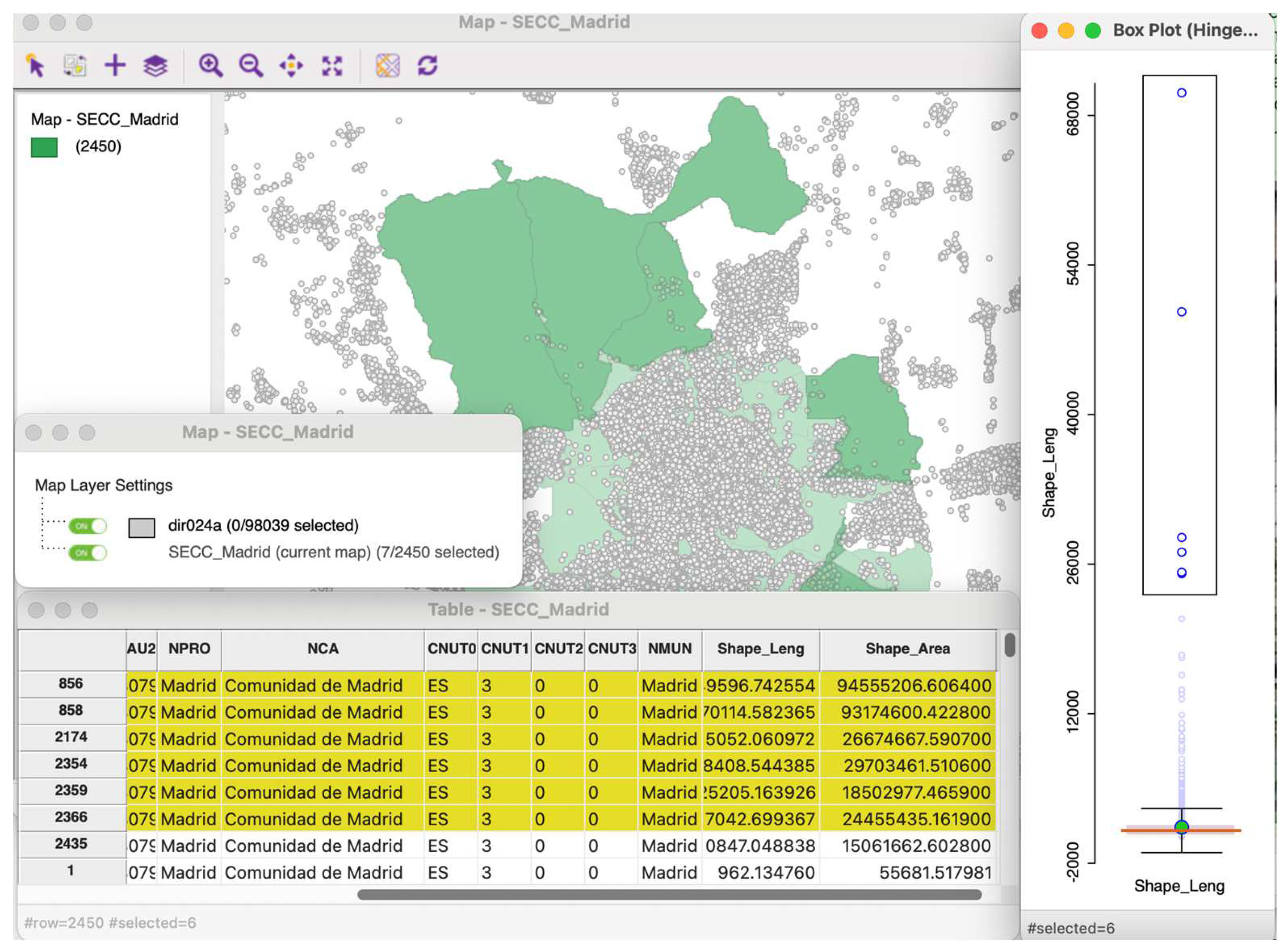
Figure 2.
Histogram of the X coordinate distribution of the metro stations in Madrid, 2024.
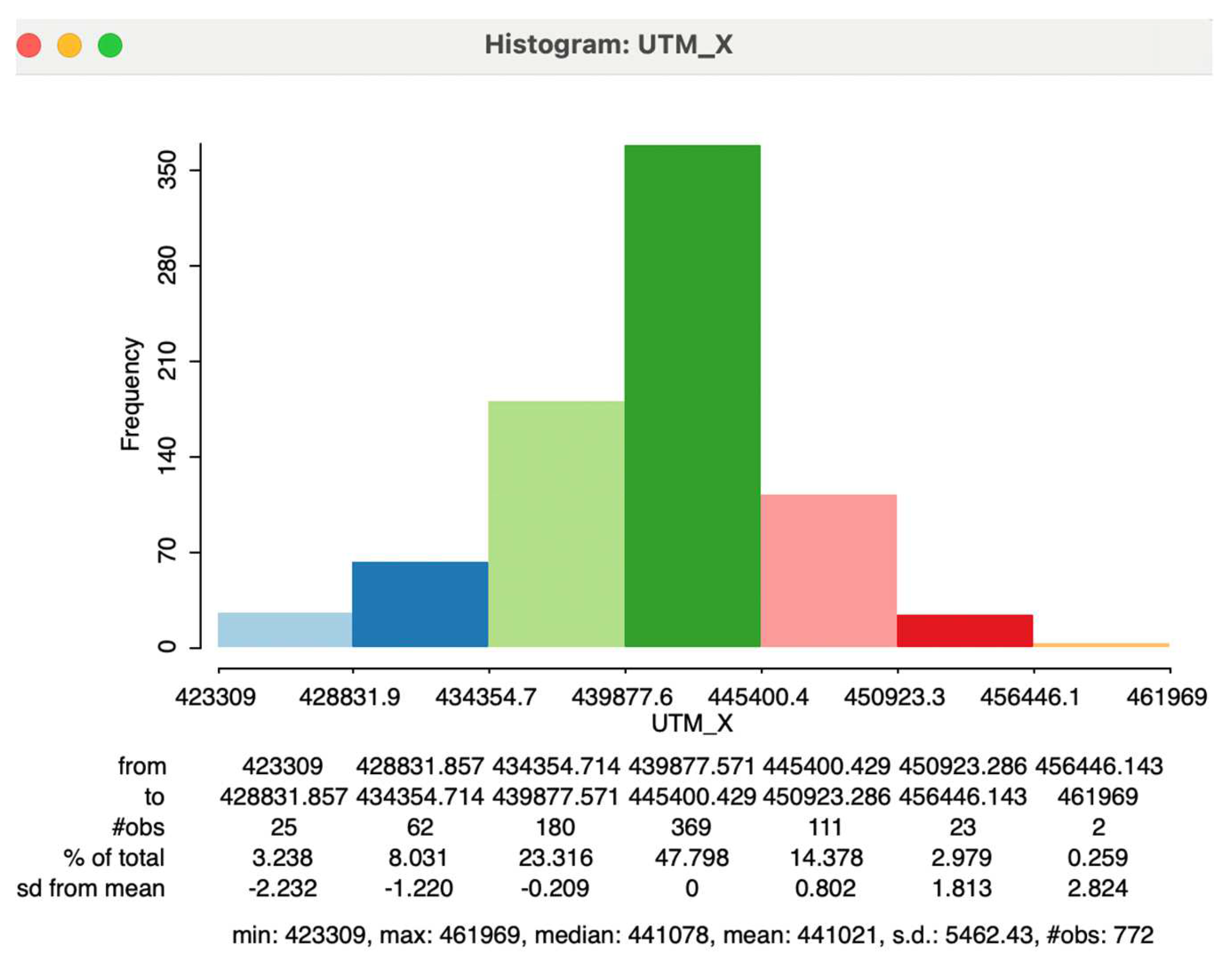
Figure 3.
Histogram and box plot of the shape length of census sections of Madrid, 2024.
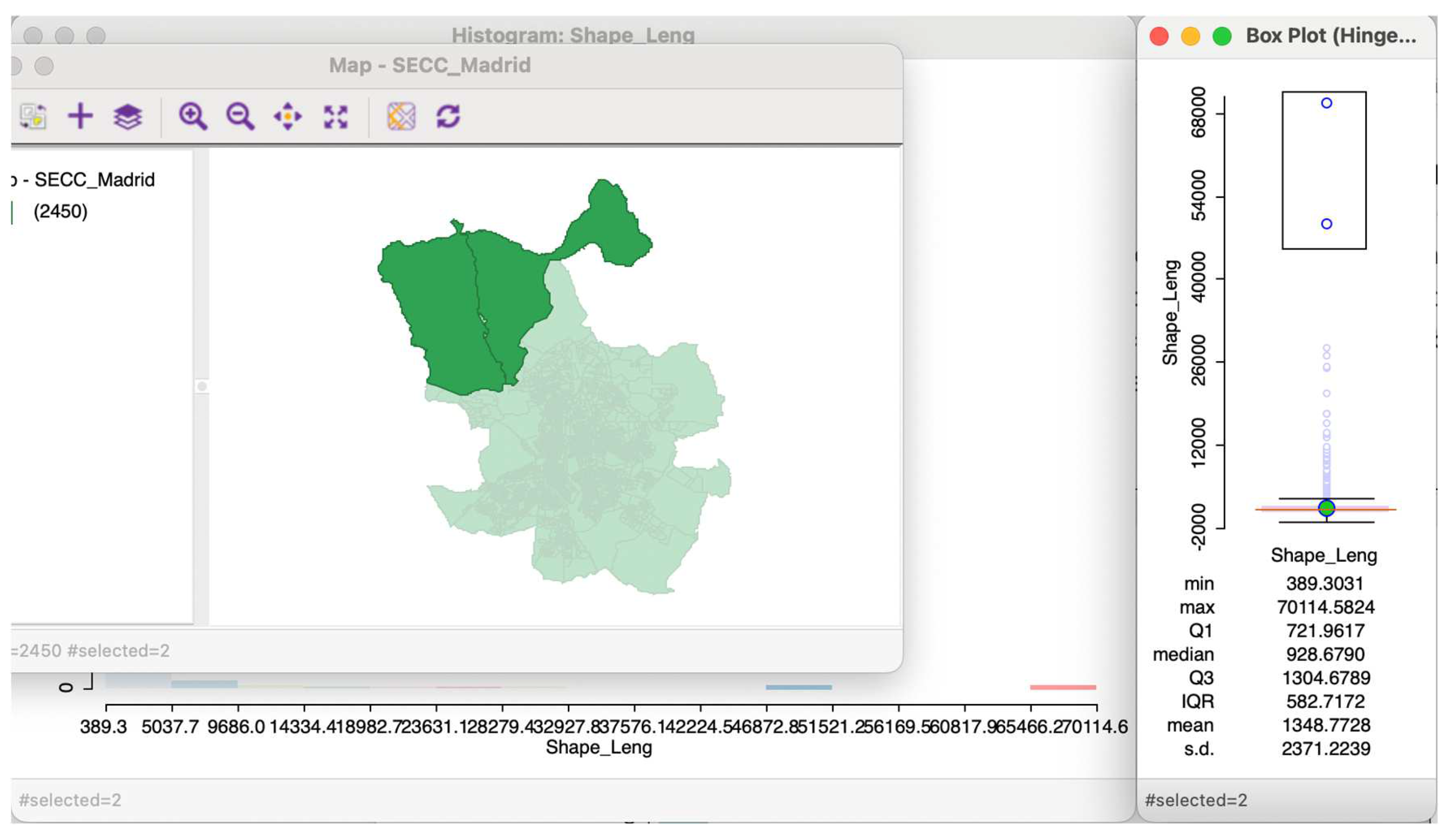
Figure 4.
Quantile map of the higher education rate of the Madrid neighborhoods, year 2001.
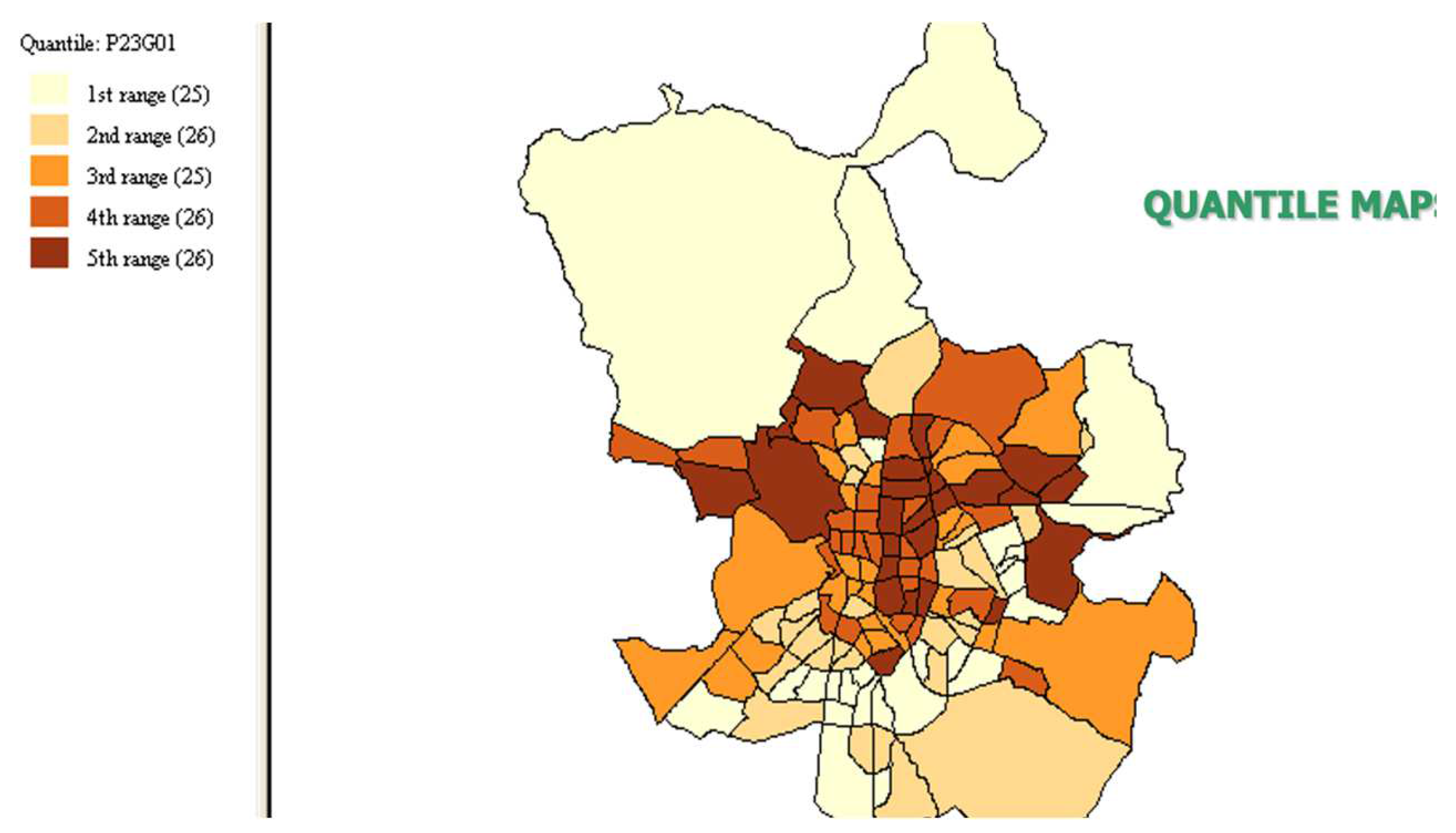
Figure 5.
Histogram and quantile map of phone lines of the Asturian municipalities.
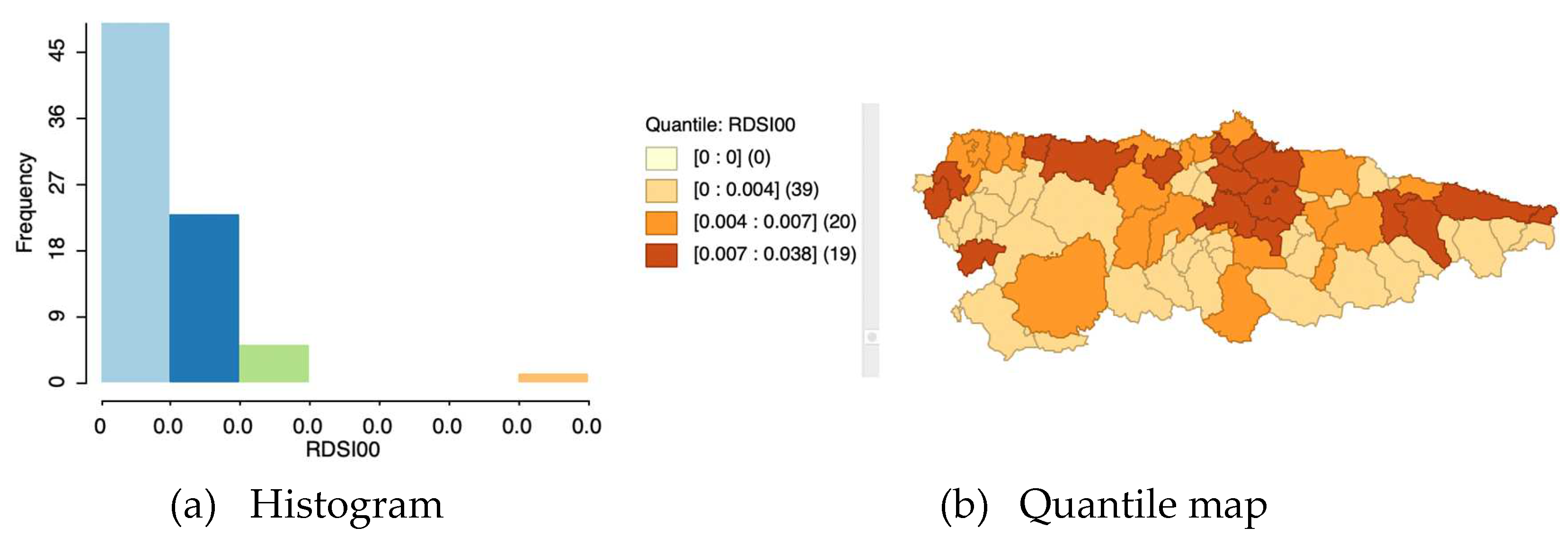
Figure 6.
Quartile vs natural breaks maps of house price per area in Madrid, year 2008.
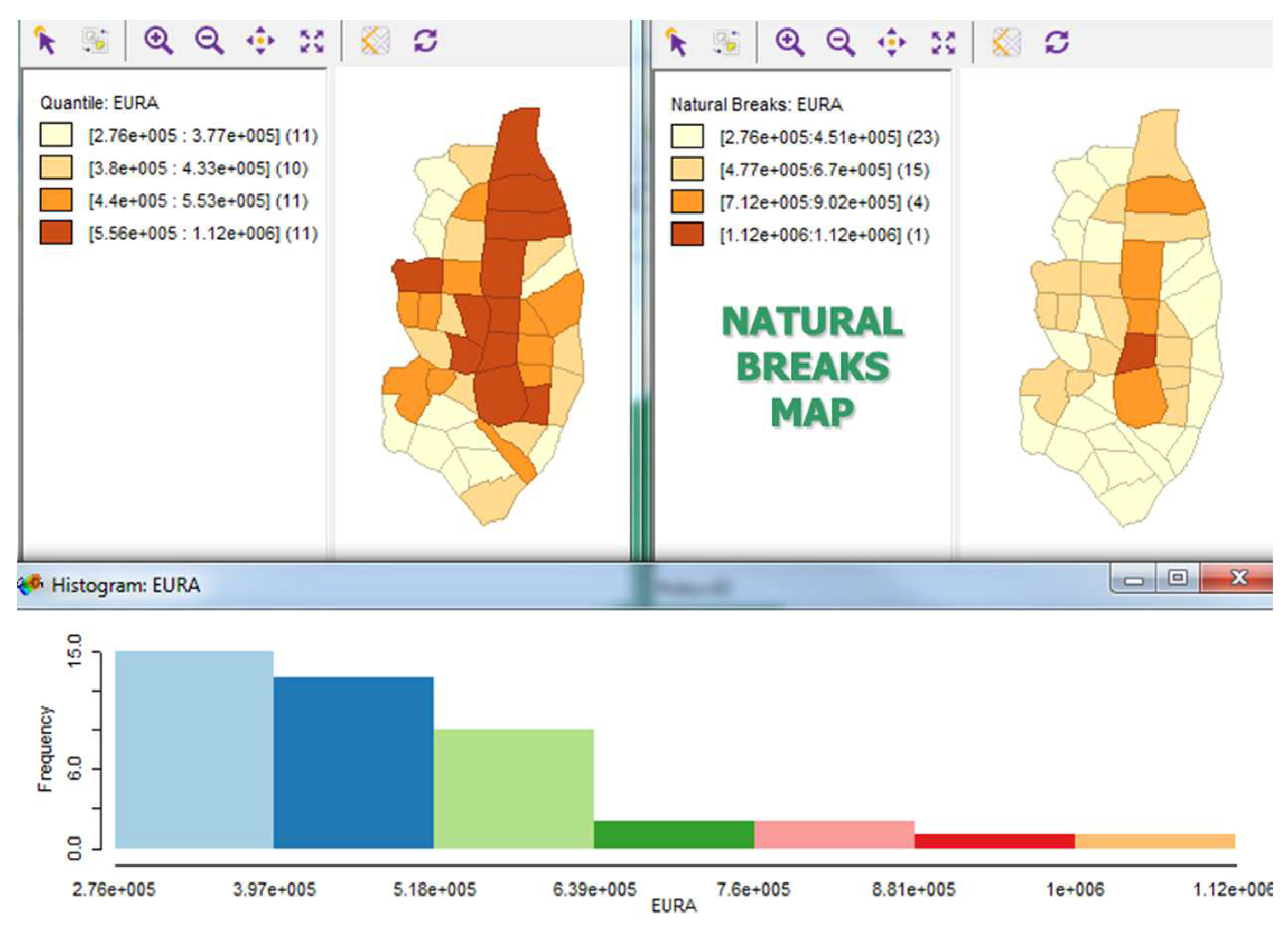
Figure 7.
Box map and boxplot of the unemployment rates in Central Madrid.
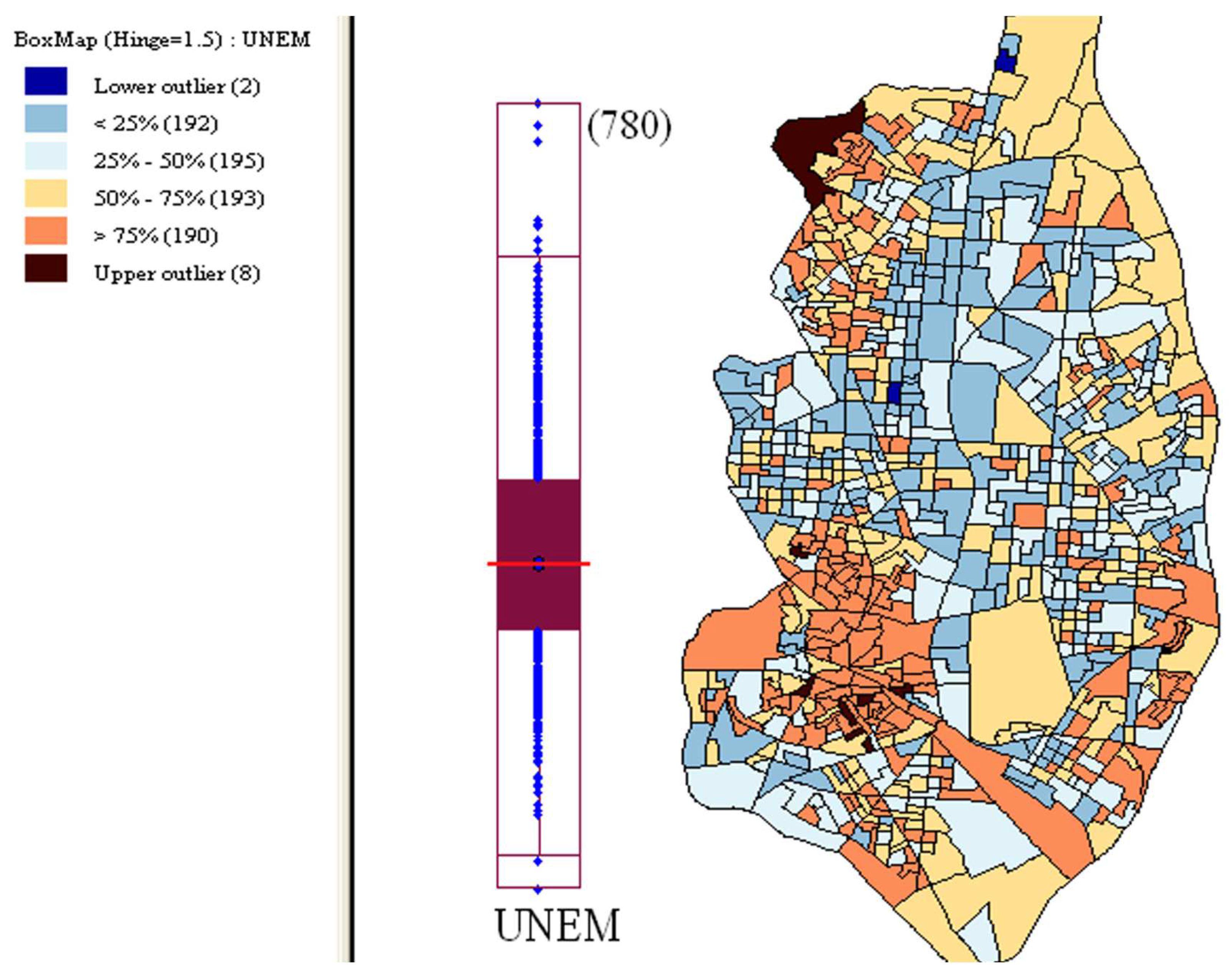
Figure 8.
Histogram and bar chart of the number of census sections of Madrid by districts.
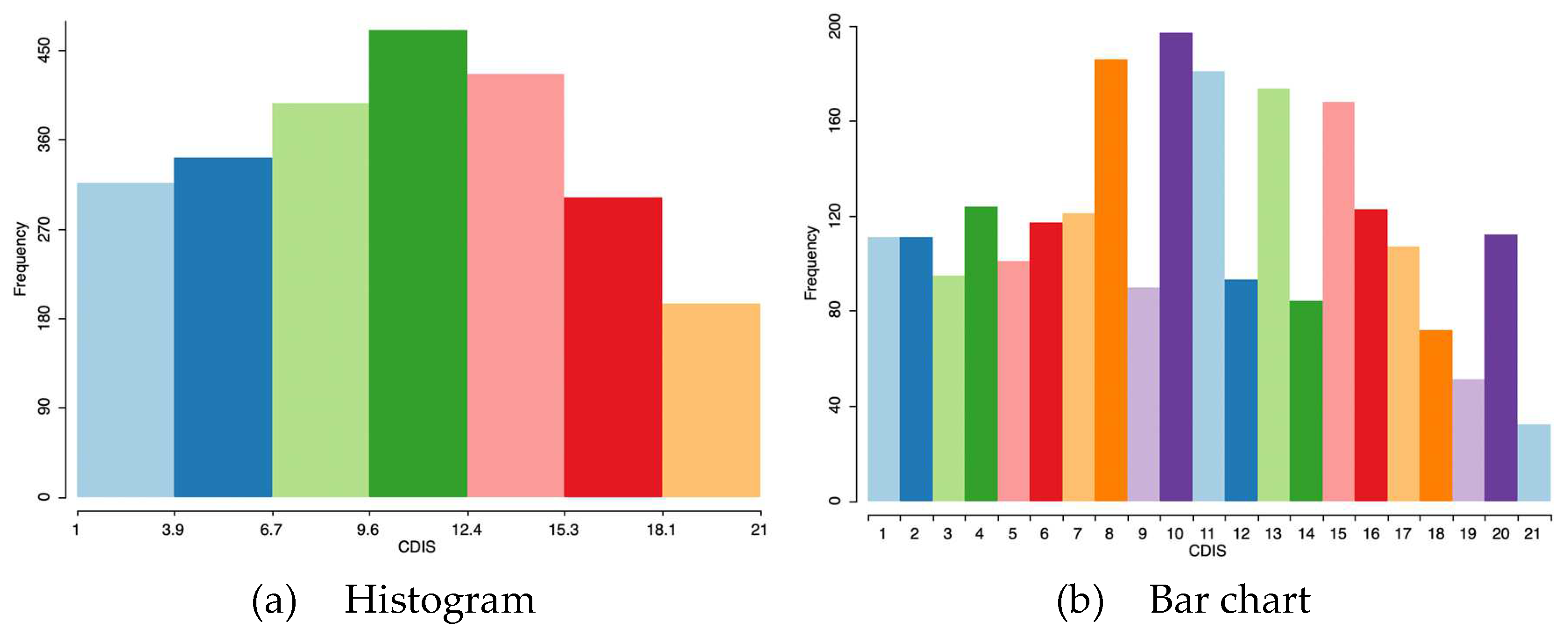
Figure 9.
Unique values map of the number of census sections of Madrid by districts, 2024.
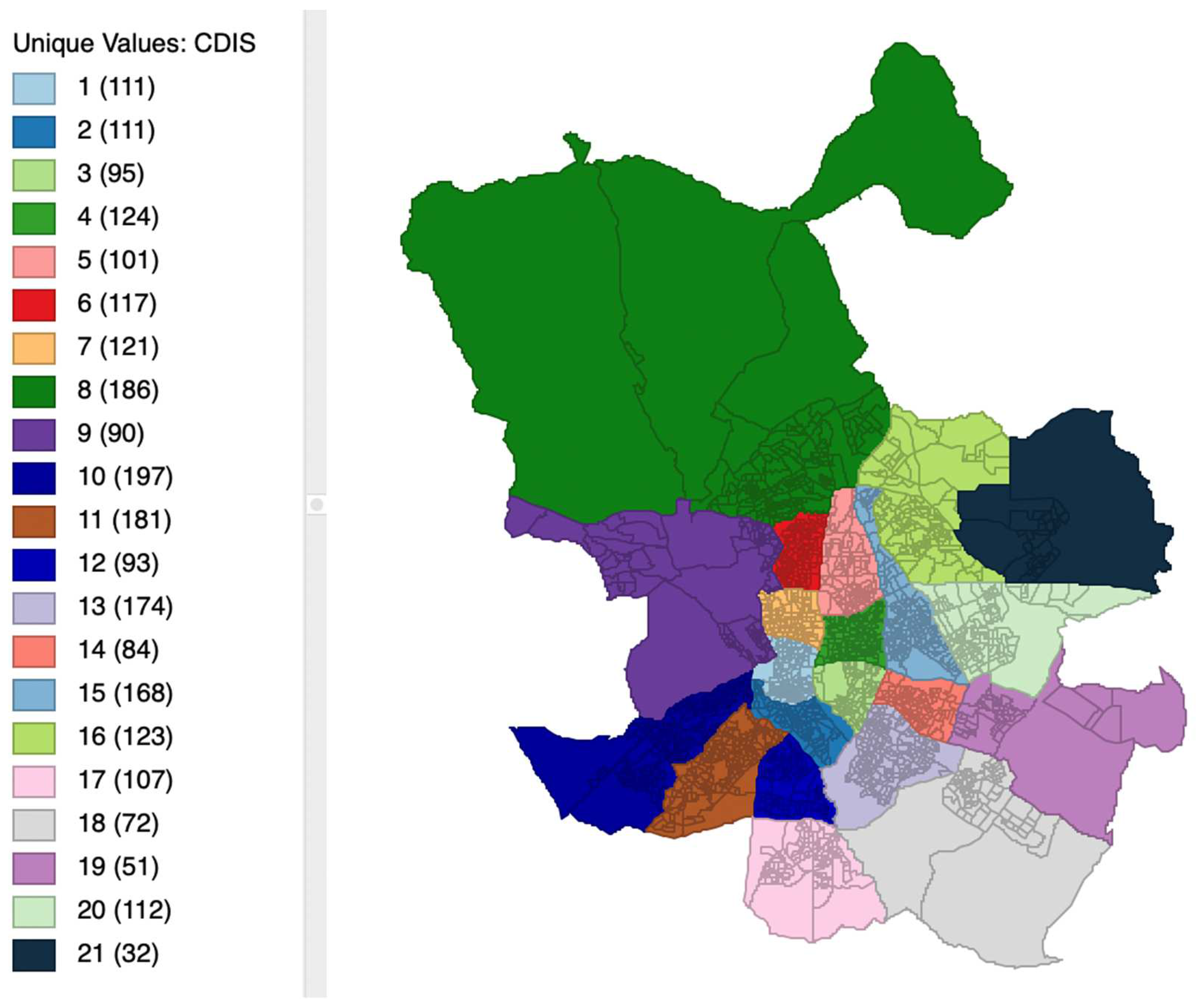
Figure 10.
Scatterplot of urbanization level on crime rates in the Spanish provinces, year 99.
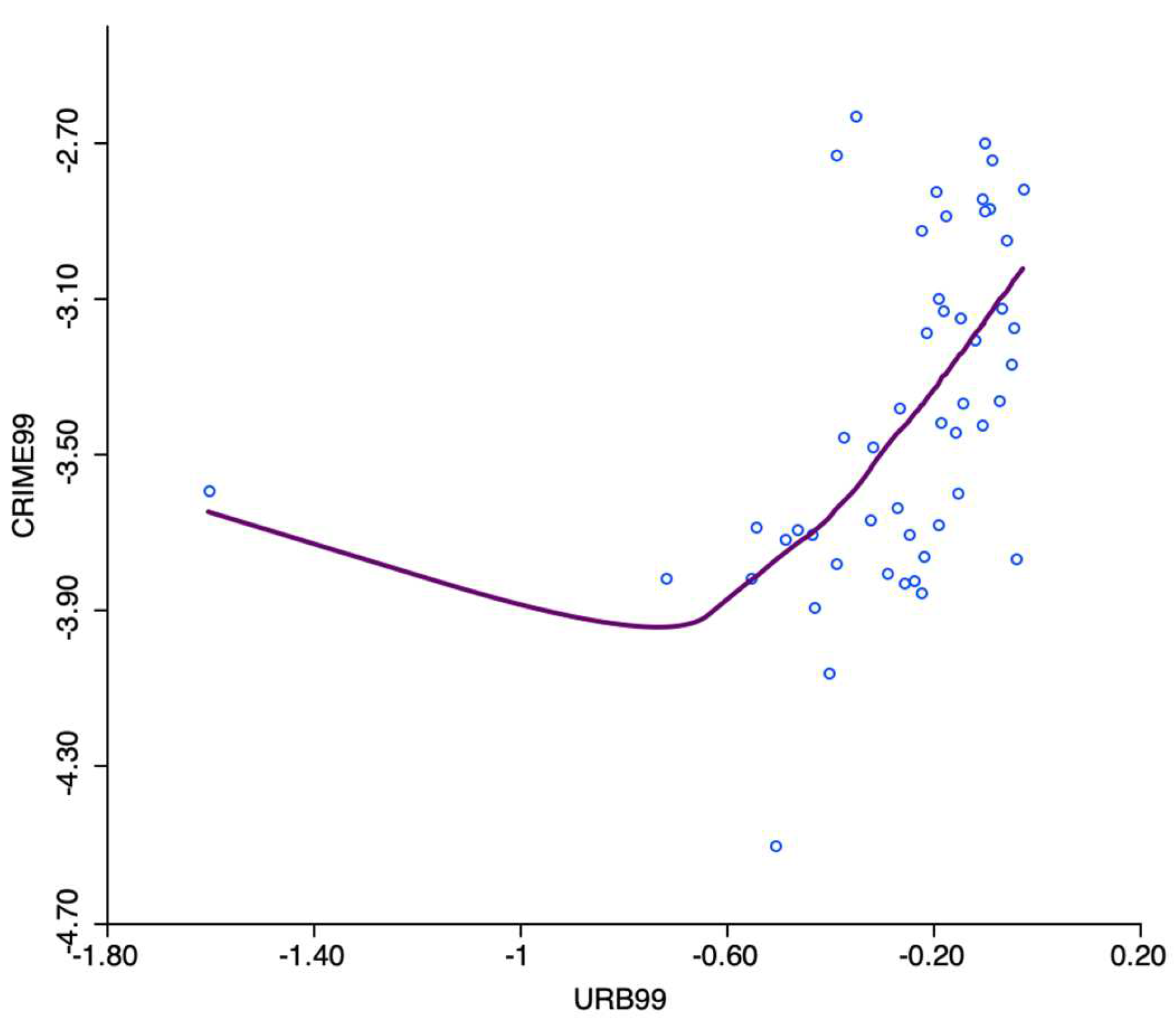
Figure 11.
Scatterplots of police clearance on crime rates in the Spanish provinces, year 99.
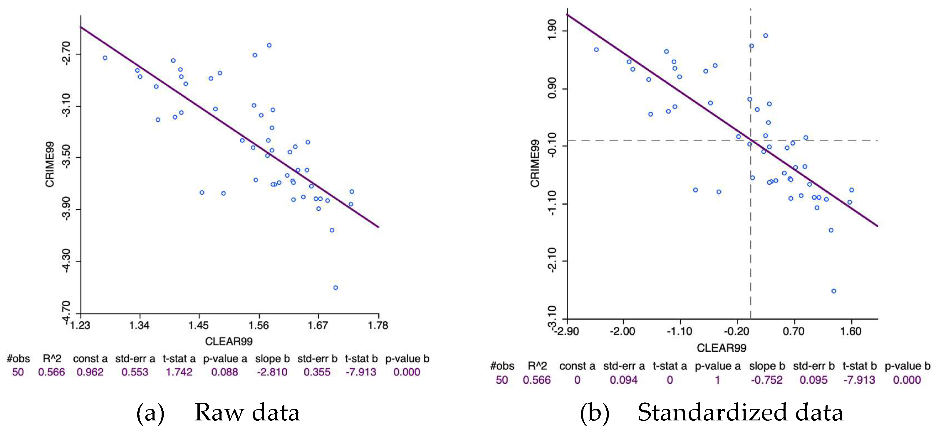
Figure 12.
Scatterplots of crime rates and some explanatory variables in the Spain, year 99.
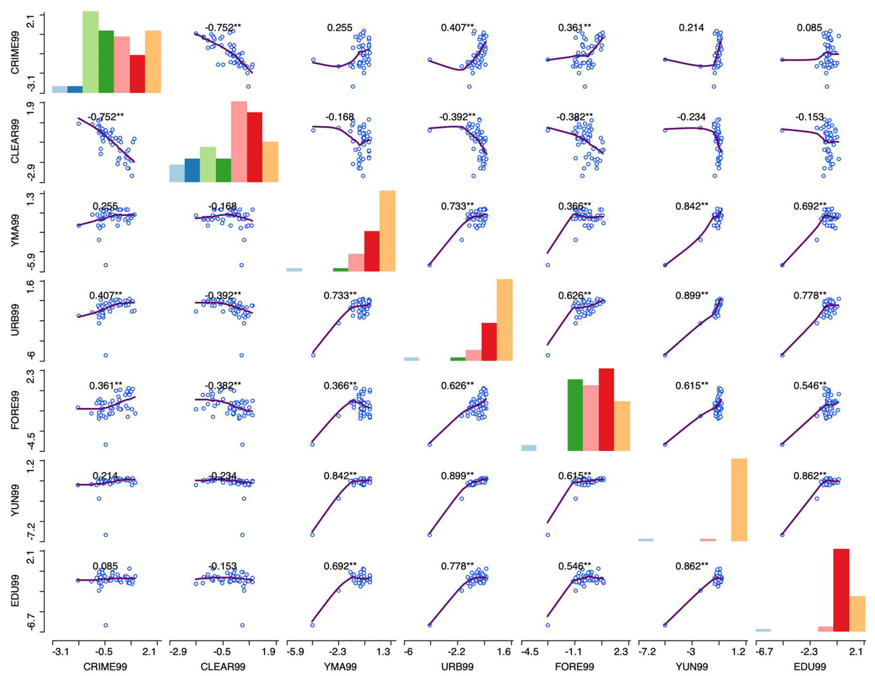
Figure 13.
PCP of GDP growth rates and some explanatory variables in Spain, 1985-2004.

Figure 14.
PCP of standardized GDP growth rates and some explanatory variables in Spain.
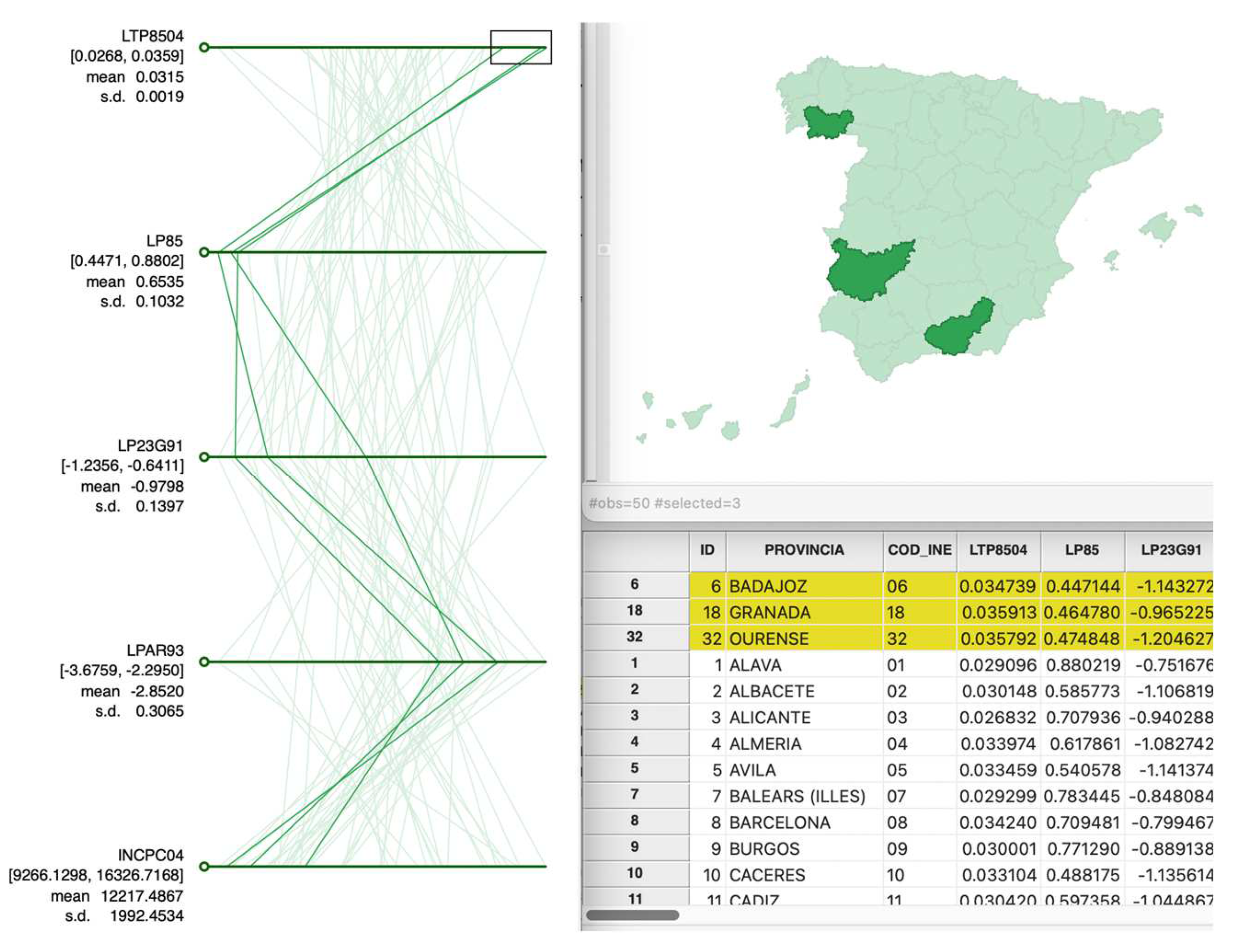
Figure 15.
Co-location map of census section length and area in Madrid, year 2024.
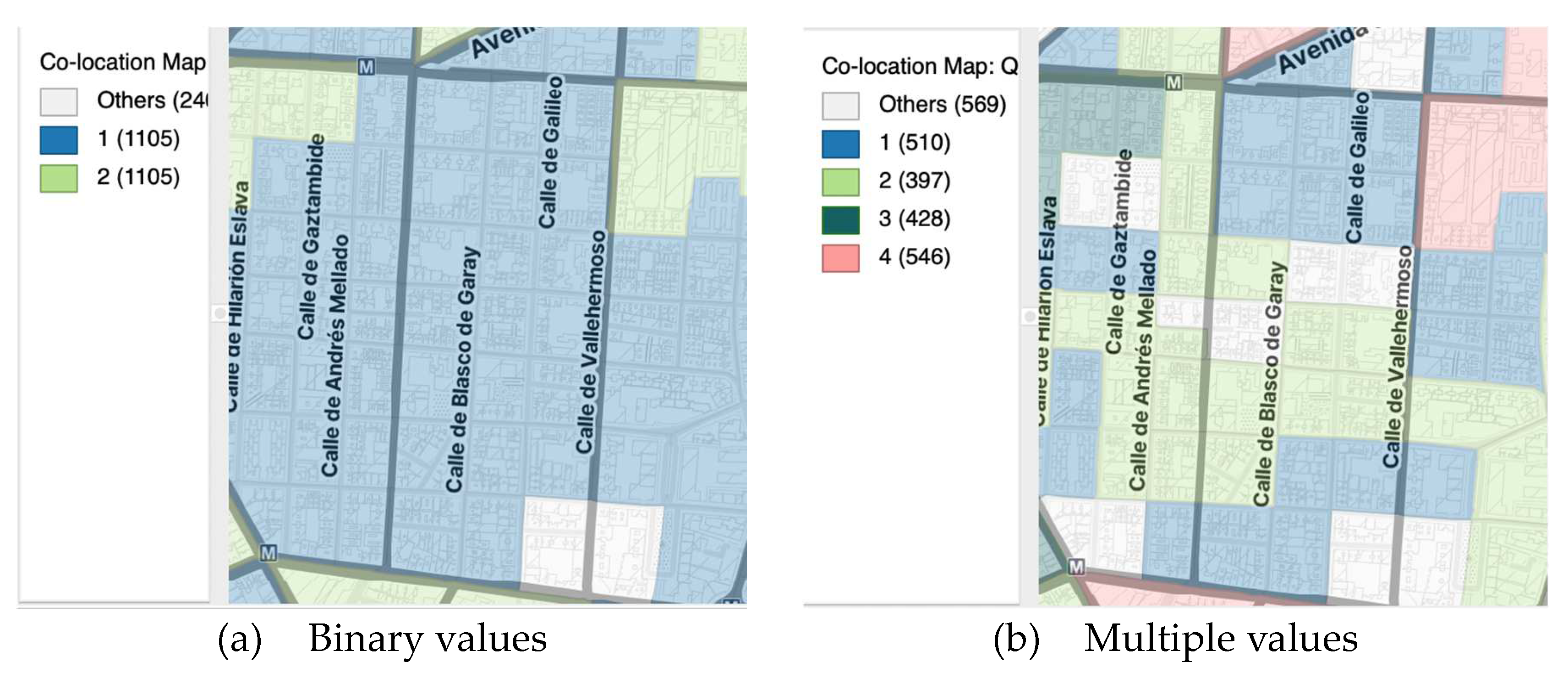
Figure 16.
Unemployment and Unemployment rate, year 2006.
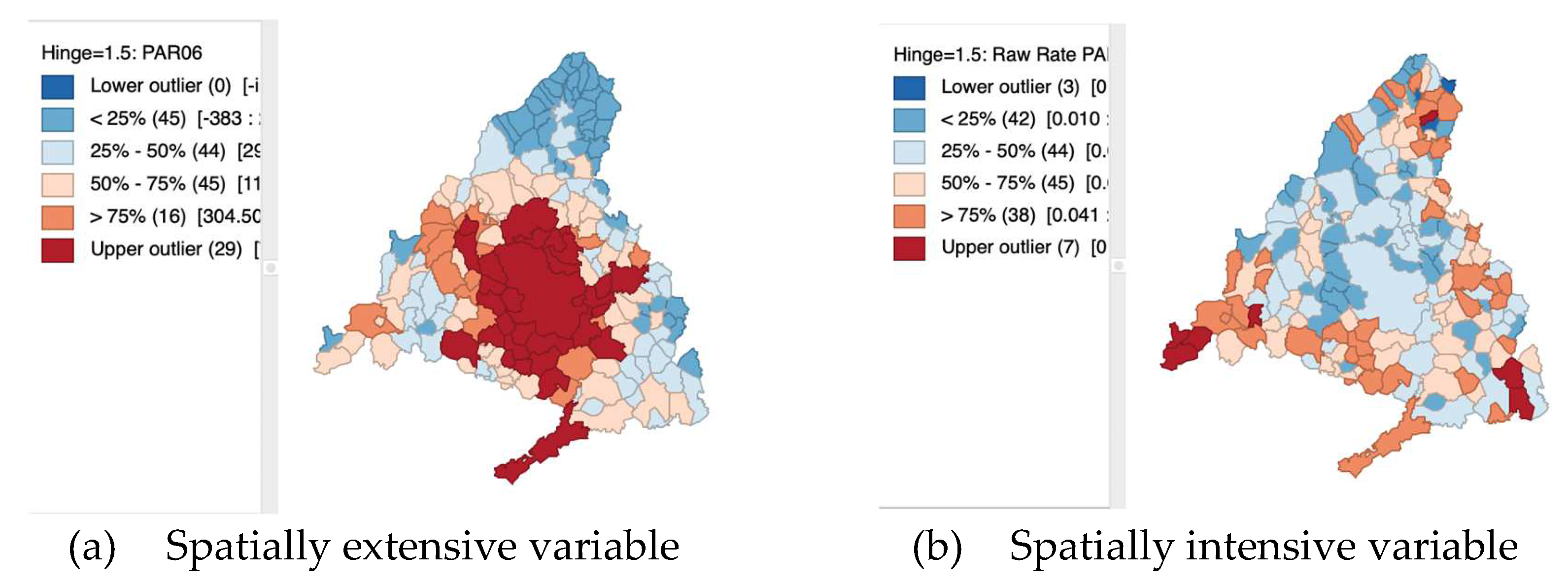
Figure 17.
COVID-19 incidence raw rate and risk map, Madrid Region, January 2021.
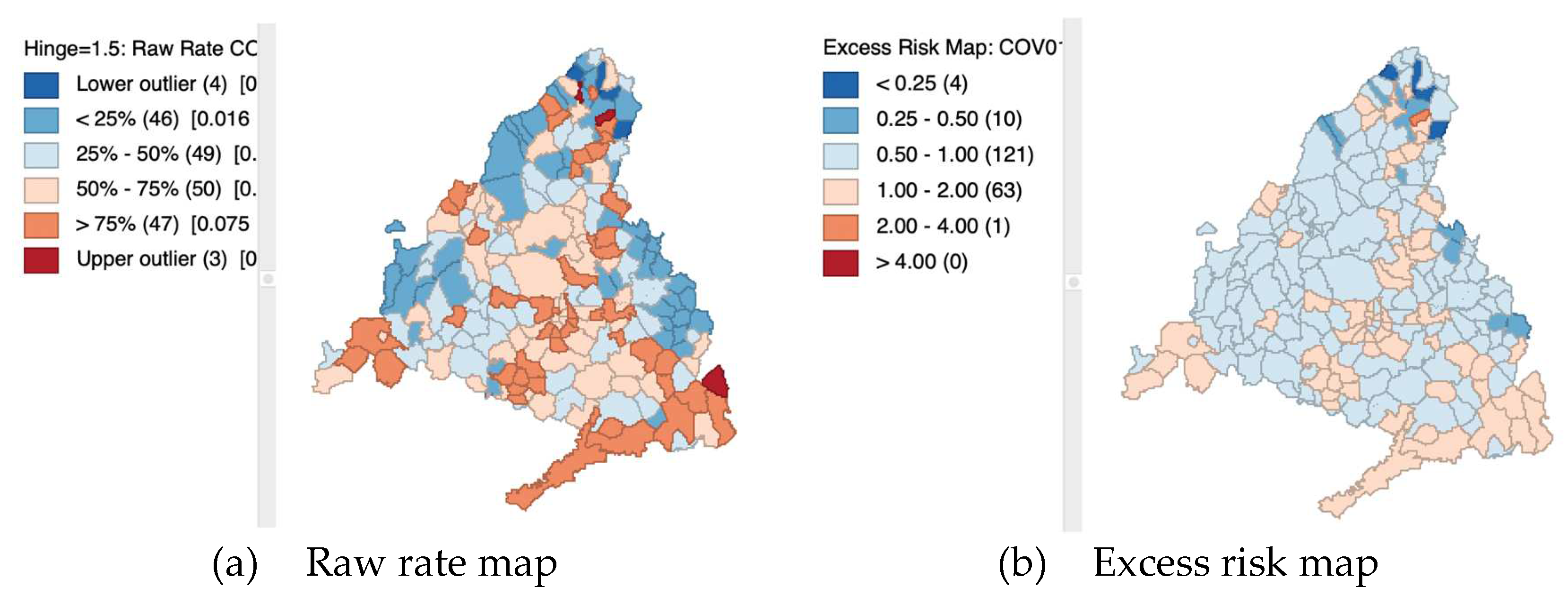
Figure 18.
Comparative raw rate vs EB smoothed rate maps. Unemployment rate, year 2006.
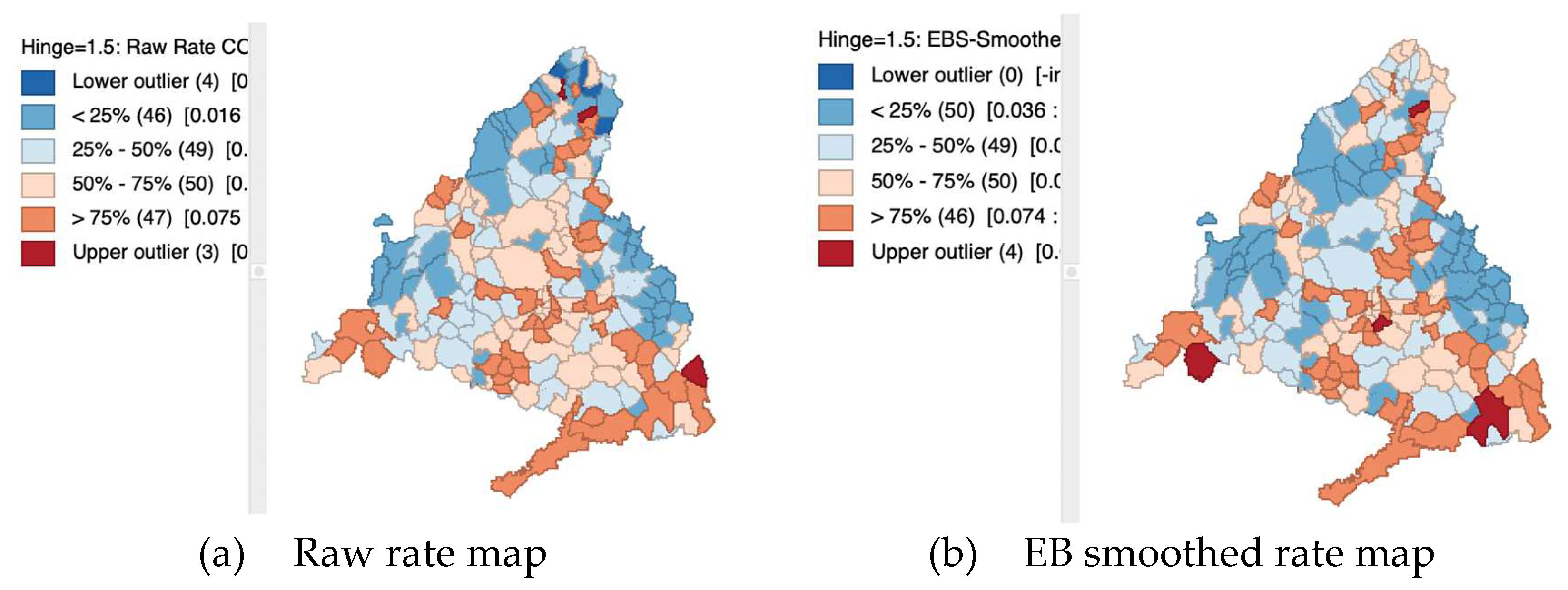
Figure 19.
Boxplot of the retail wage per hour in the USA states during 2012-2023.
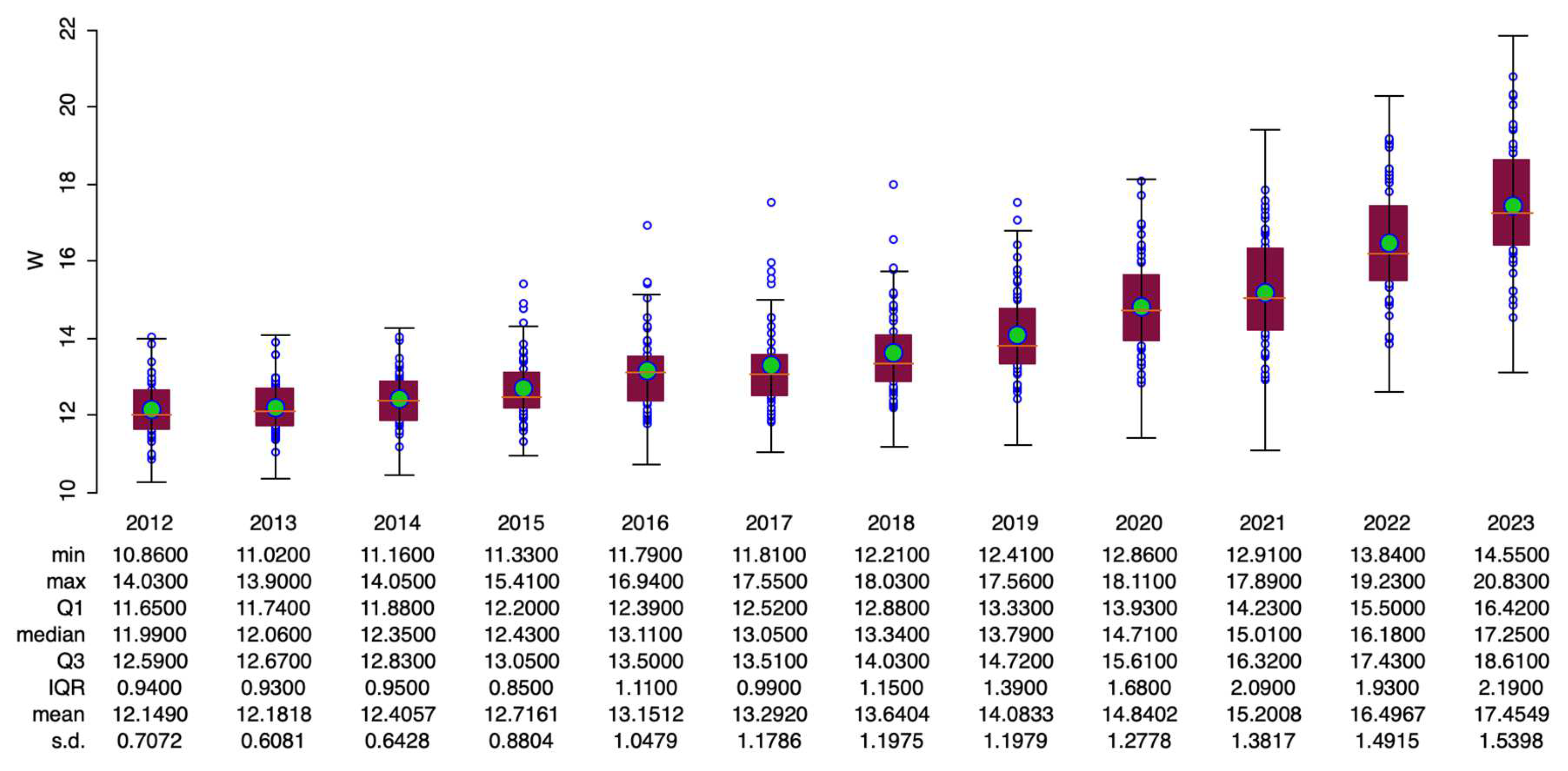
Figure 20.
Scatter plot with time-lagged retail wage per hour in the USA states.
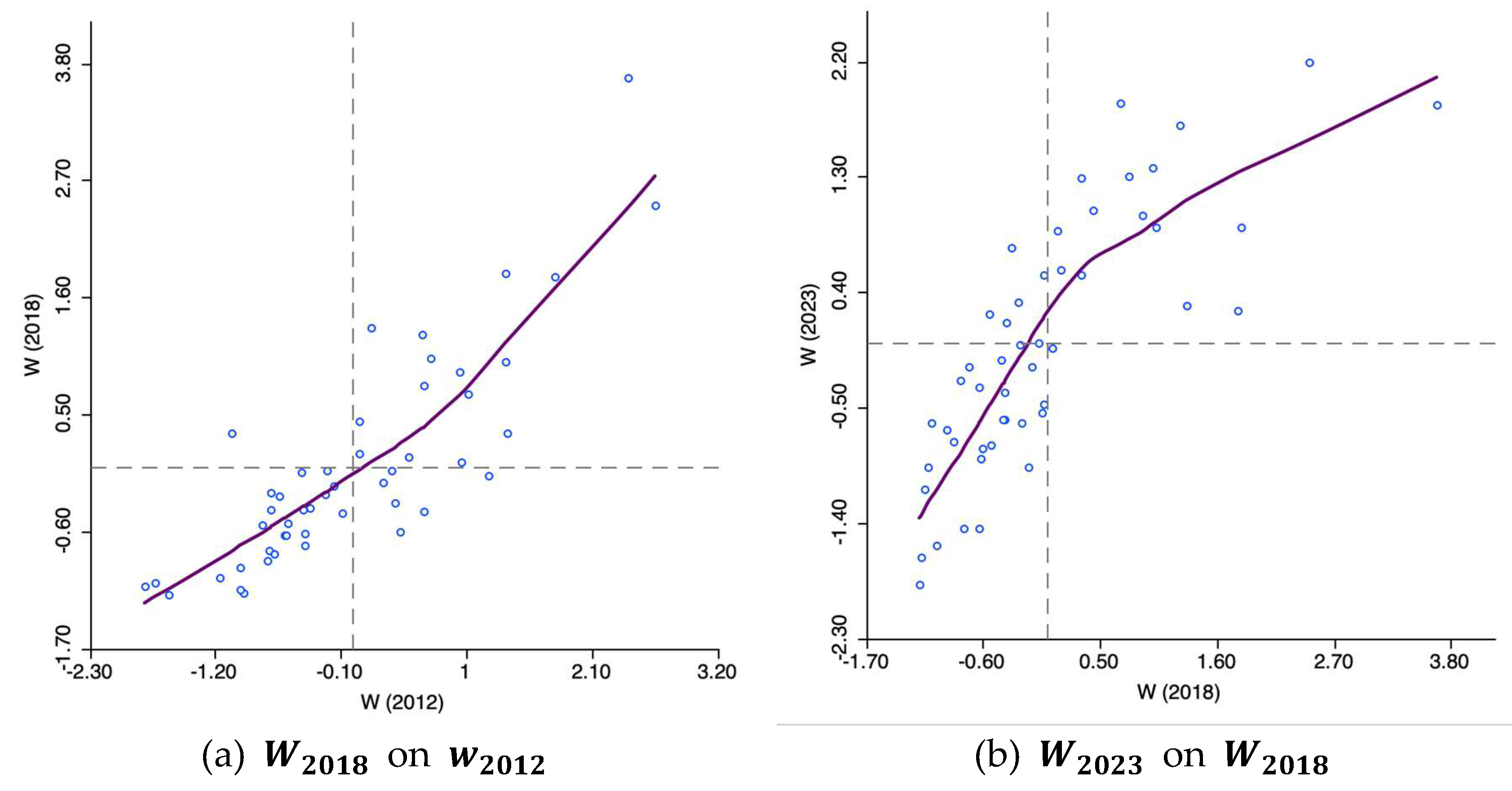
Figure 21.
Natural breaks map of the retail wage per hour, USA states, 2012, 2016, 2018, 2023.
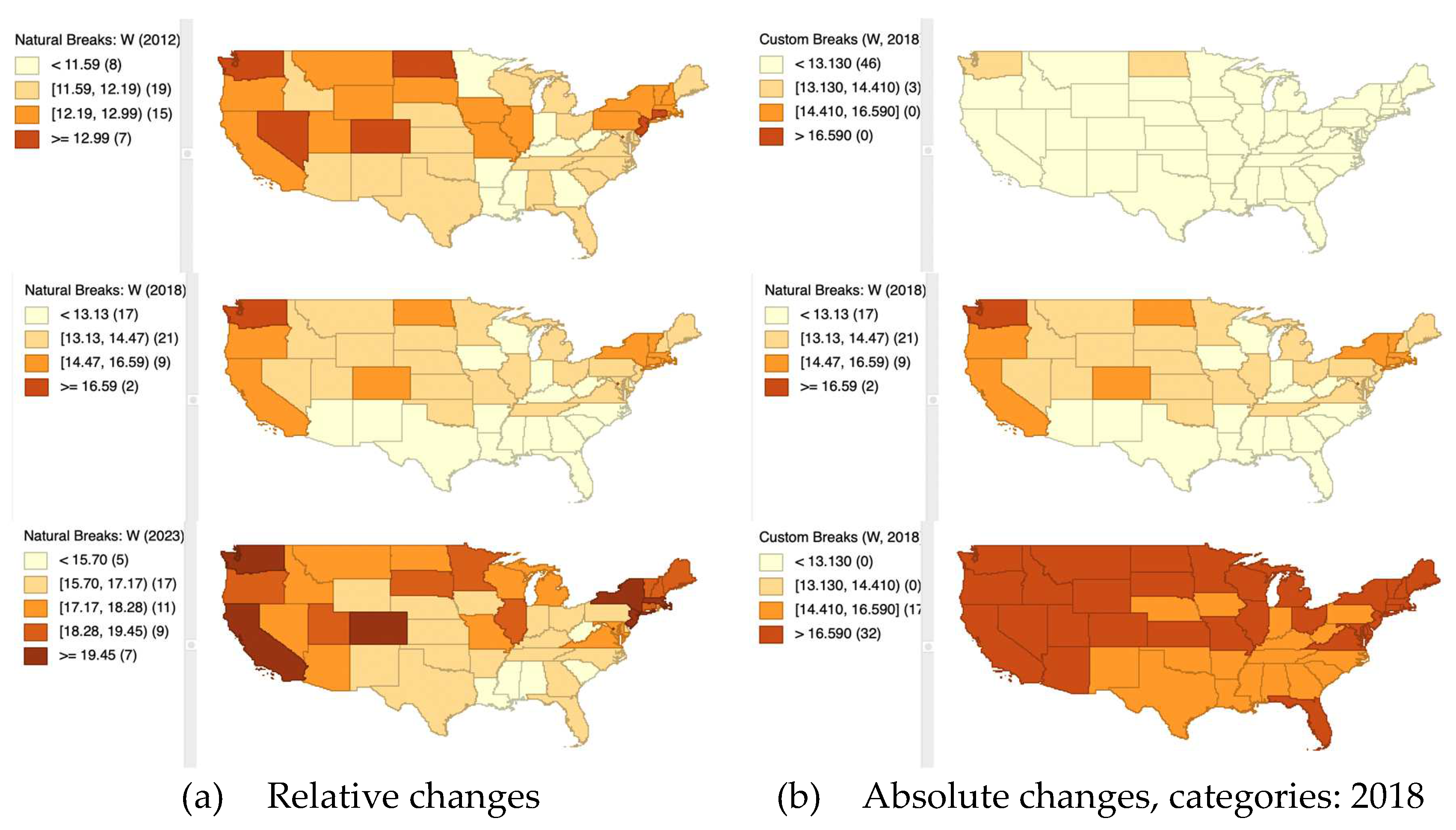
Figure 22.
Unique map of the USA states with more than 15,000 employees in Amazon (2021).
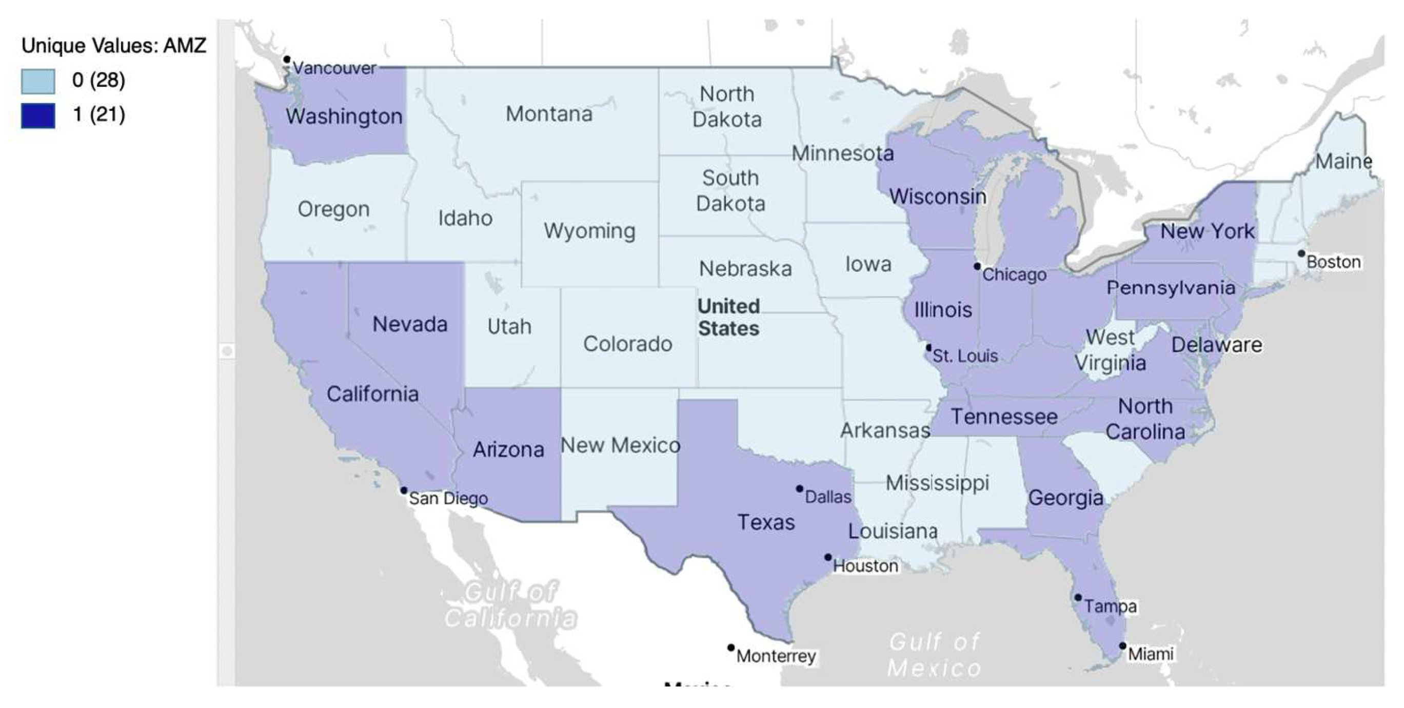
Figure 23.
Average chart of retail wages/hour for treated and untreated USA States, year 2016.
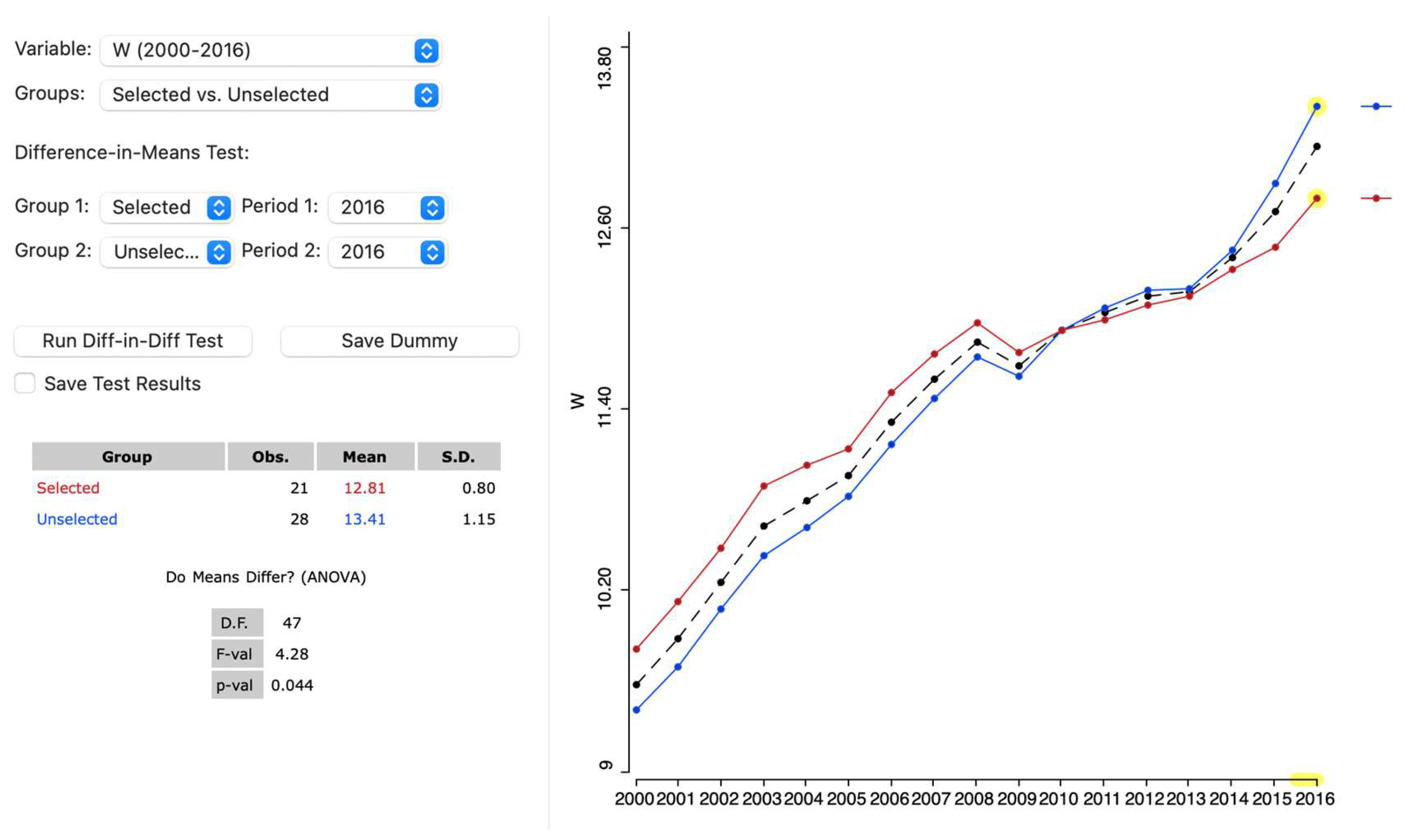
Figure 24.
Difference in Difference setup, retail wage per hour in USA states, 2000 to 2016.
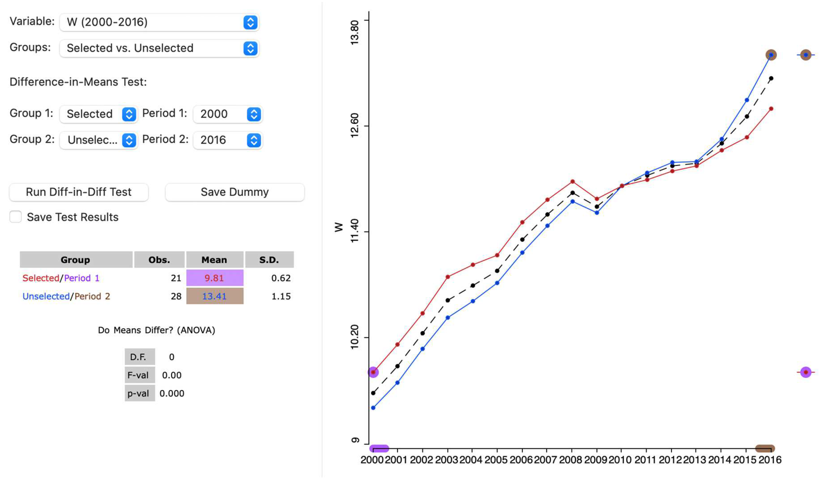
Figure 25.
Difference in Difference results, retail wage per hour in USA states, 2000 to 2016.
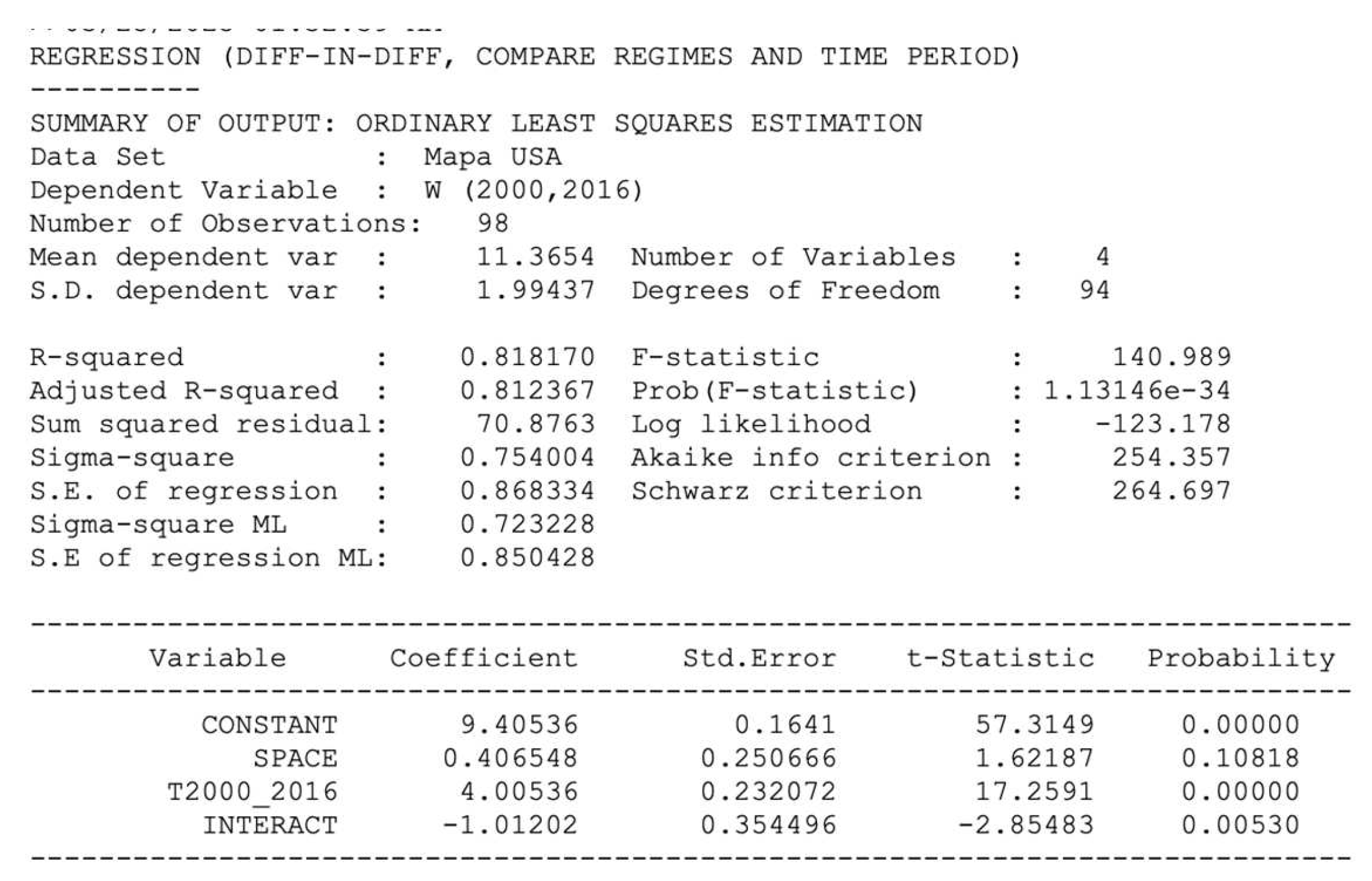

Table 1.
ESDA tools suitable for dependent variable econometric models.
| Dependent variable | ESDA tool | Econometric model |
|---|---|---|
| Continuous | Histogram Box plot Quantile map Natural break map Box map |
Spatial linear regression models Spatial Expansion models Geographically Weighted Regres. Trend surface models Spatial ridge and lasso models Spatial Partial Least Squares |
| Discrete | Bar chart Unique values |
Spatial count data models Binary Spatial models Spatial logit models Spatial probit models |
| Rates | Raw rate map Excess risk map Empirical Bayes smoothed rate map |
Spatial beta regression models Spatial fractional response mod. Spatial logit, probit, tobit mod. |
| Space-Time | Box plot over time Scatter plot with time lagged vars. Thematic map over time Difference in means Difference-in-difference |
Spatiotemporal models Spatial panel data models Difference-in-difference models |
Disclaimer/Publisher’s Note: The statements, opinions and data contained in all publications are solely those of the individual author(s) and contributor(s) and not of MDPI and/or the editor(s). MDPI and/or the editor(s) disclaim responsibility for any injury to people or property resulting from any ideas, methods, instructions or products referred to in the content. |
© 2025 by the authors. Licensee MDPI, Basel, Switzerland. This article is an open access article distributed under the terms and conditions of the Creative Commons Attribution (CC BY) license (http://creativecommons.org/licenses/by/4.0/).
Copyright: This open access article is published under a Creative Commons CC BY 4.0 license, which permit the free download, distribution, and reuse, provided that the author and preprint are cited in any reuse.


